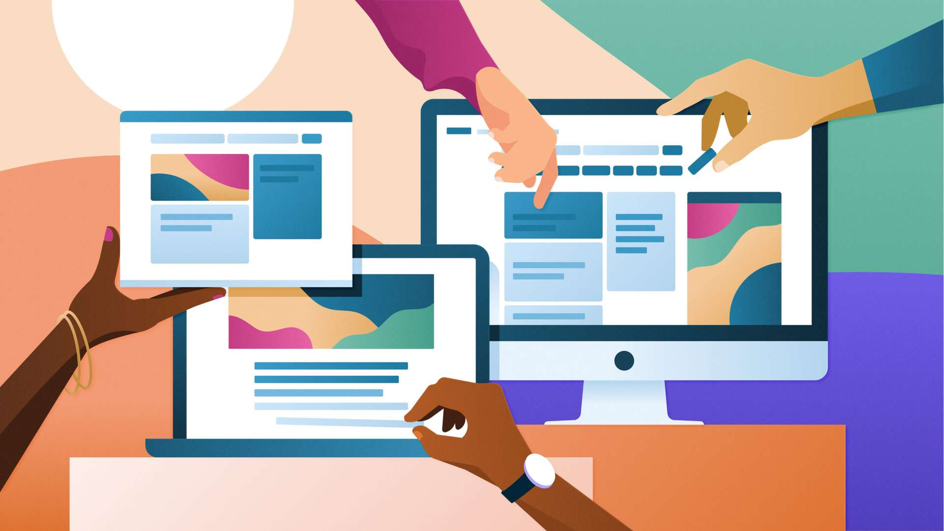
Since 2004, Indeed has become the world’s leading job site, a destination where job seekers and employers from 60 countries use our products and services in 28 different languages. From the company’s beginning, Indeed’s focus has always been on creating a brand that people trust. We expanded our designs piece by piece whenever we saw a way to make it easier for people to find work or hire, but never the entire system. Until now.
Today, we’re proud to announce the biggest update to Indeed’s brand identity in the company’s history. Designed to integrate the look and feel of our products and solutions, the new system reflects the pace of our evolution and helps us deliver on our belief that Indeed is here to help everyone get jobs. All people. All skills. All levels.
We’ve crafted a complete brand and design system where each moment in our product and marketing experiences feels distinctly like us. We’ve tuned each of our new expressions to support our commitment to inclusion and accessibility. Our identity includes:
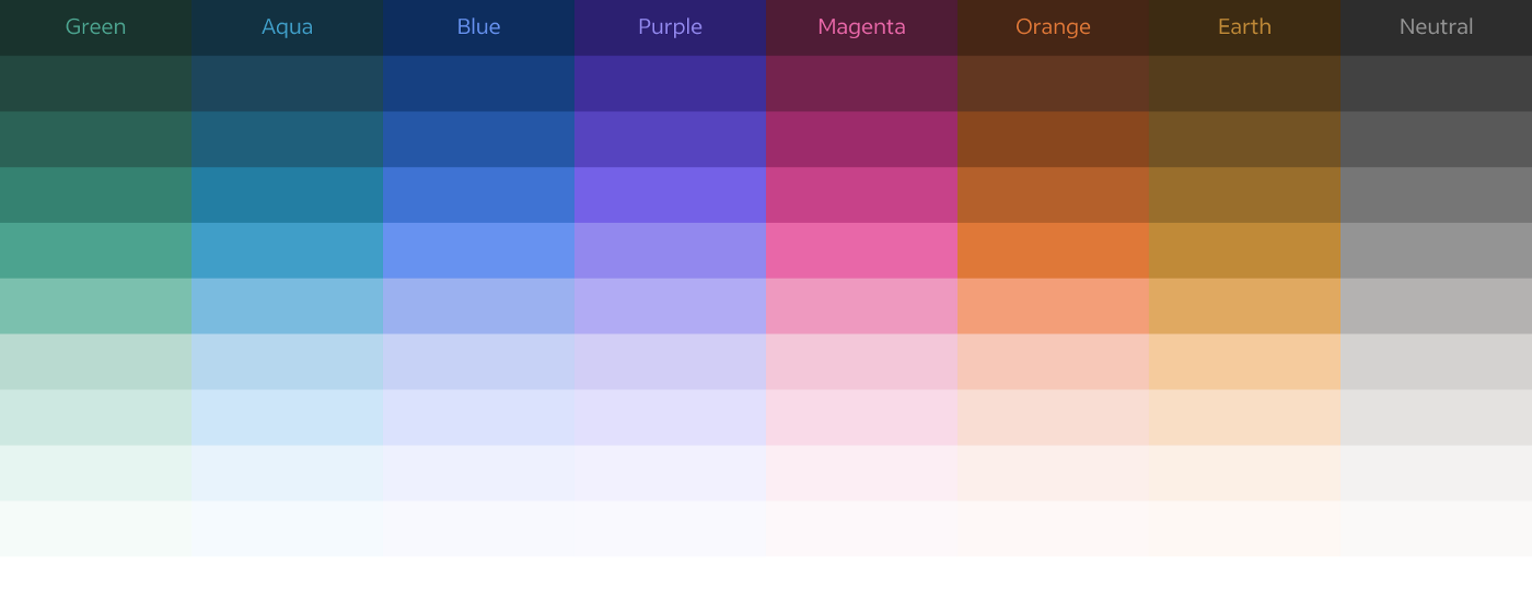
A dynamic color range
Designing a color palette that appeals to all, feels distinctive, and achieves our accessibility goals was no small feat. Through meticulous curation, we crafted a set of hues, tones, and contrast ratios to build a robust system that honors where we’ve come from and where we’d like to go. This range of colors not only provides enough grades for interacting with our product, it also accommodates the variety of ethnicities and skin tones that show up in our illustration style. Take a deeper look in our article on remaking Indeed’s color system.
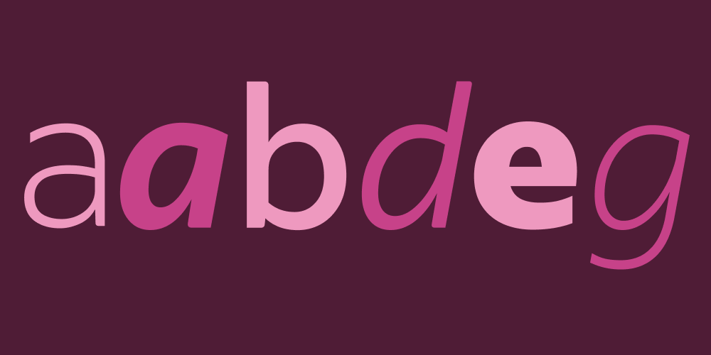
New type in all cases
Indeed Sans, our custom typeface, is contemporary and personal thanks to shapes reminiscent of handwriting. It adds warmth, clarity, and positivity to our brand voice in expressive moments, underscoring the empathic way we support people through some of the most exciting — and challenging — parts of their career journeys. Read the full story of how we created Indeed Sans with Dalton Maag.
For our products, we’ve adopted Noto Sans. The many languages it covers will help us reach people all over the world while maintaining a consistent style. This type’s open apertures, differentiated characters, and harmonized stroke weights across language scripts will make our products easier to use for people of all reading levels.
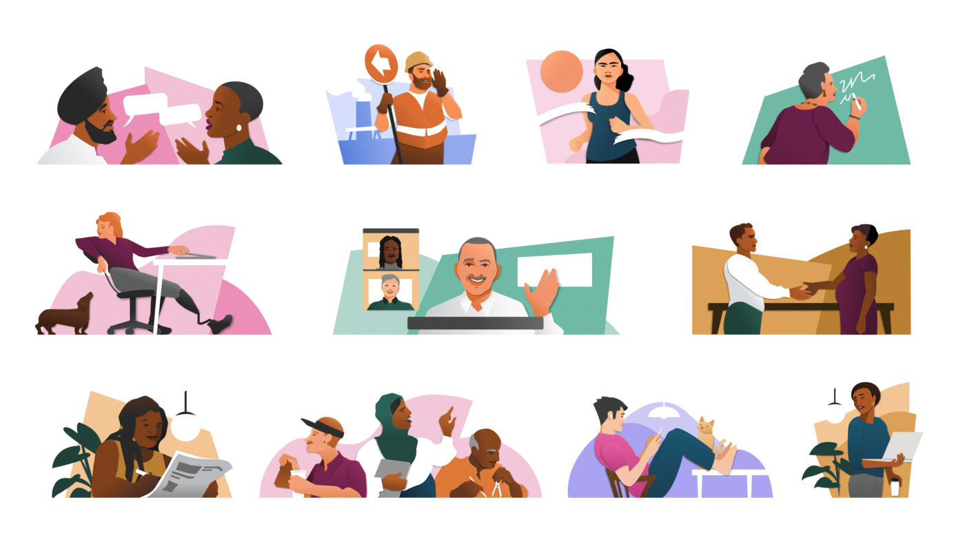
Kind and authentic imagery
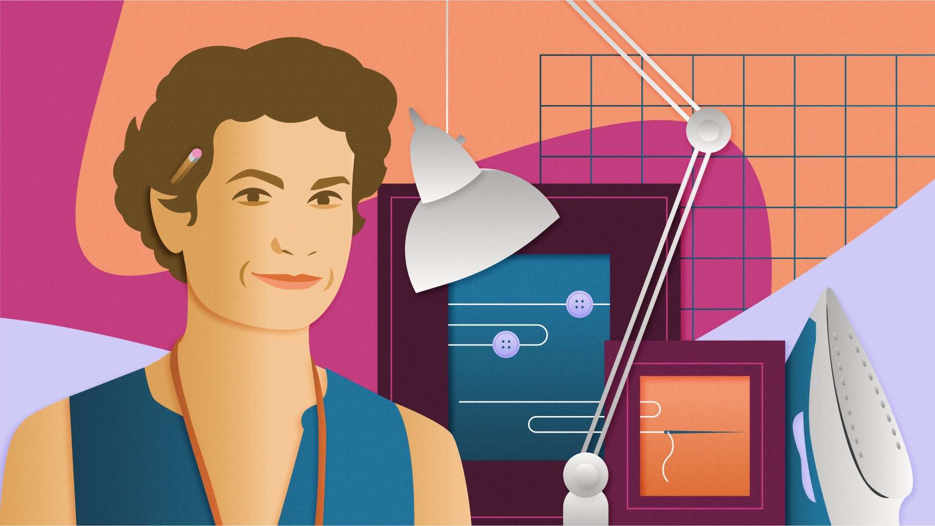
Our new Paper Stories illustration style takes its inspiration from real people representing the hundreds of millions who use Indeed every month. The diverse set of characters share the stories of the different nationalities, ages, ethnicities, abilities, and careers we serve. We hope every one of them will be able to find something of themselves reflected in our artistic approach. For more, read our articles about how we developed our illustration style and how we created a system to make it scale.
We represent the many different kinds of people, industries, and workplaces Indeed serves in our film and photography, which we shoot in a style that’s cinematic and natural, true to the realities of work in its many forms and to the variety of people we serve.
For the smallest corners of our products, we’ve reshaped our iconography to focus on simplicity and helpfulness in order to make our designs as easy as possible for people of all abilities to use and understand.
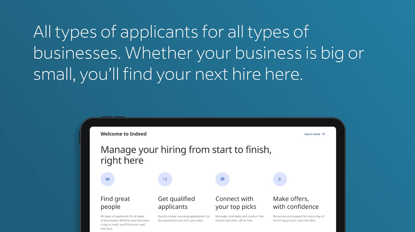
An empathic voice
Unified across product and marketing, our brand narrative is conversational and inclusive. We pair our voice with a flexible tone framework that helps us meet people where they are and in a meaningful way. From the big headlines to the tiny hyphens, we’ve also used accessibility standards to define our writing style guidelines. Ease of reading is always our goal.
Read how we built a recognizable voice and how we made sure the company could adopt and use it.

Guiding movement
A motion system with a simple, yet dynamic character brings our brand personality together. Intentional movements lead our audience forward and unify our brand expressions with fluid strokes. This interactive style is flexible enough to animate everything from the key actions people take in our products to expressive moments in broadcast media.

For the last 2 years, dozens of teams across the company collaborated to make our vision a reality. Building on our culture of data-driven design, we approached the brand identity work the same way we approach product design. We started by validating our creative concepts with user research and brand equity studies. From there, we conducted extensive quantitative and qualitative testing across our product — the main place people experience our brand. For a closer look at each of these steps, read our article, Meeting the Moment with a Brand System.
Through those efforts, we simplified our design and story, and created an experience that’s flexible enough to meet the needs of both job seekers and employers. Our dedication to quality and craftsmanship through visual, interaction, and content design has already made our products easier for people to use. And as the demands of the job market continue to shift, how we show up for people and the tools we provide them will adapt as well. In the months and years to come, we’ll continue to build on this foundation.
This initiative is not about following the latest trends in design — it’s about delivering on Indeed’s commitment to build a better world of work through our products and services. We’ve worked hard to design a brand identity that speaks to all and delivers the right opportunities so that better jobs can lead to better lives.
Some of the new designs have already launched, and more will be showing up in the coming months. But our work is never over. As we grow to serve more people, we’ll continue to iterate on our designs and identity so that no matter who you are or what you need, Indeed will work for you.
Welcome to the new Indeed. We’re glad you’re here.
