Most of us have likely sat in a room (probably our own) and thought, this could be organized better. You spend time tidying up, moving things around, and tossing out unnecessary materials. You step back and see a space refreshed, and it feels good. A week later, a few new things show up. Now you’re left wondering how to make space for them without messing everything up.
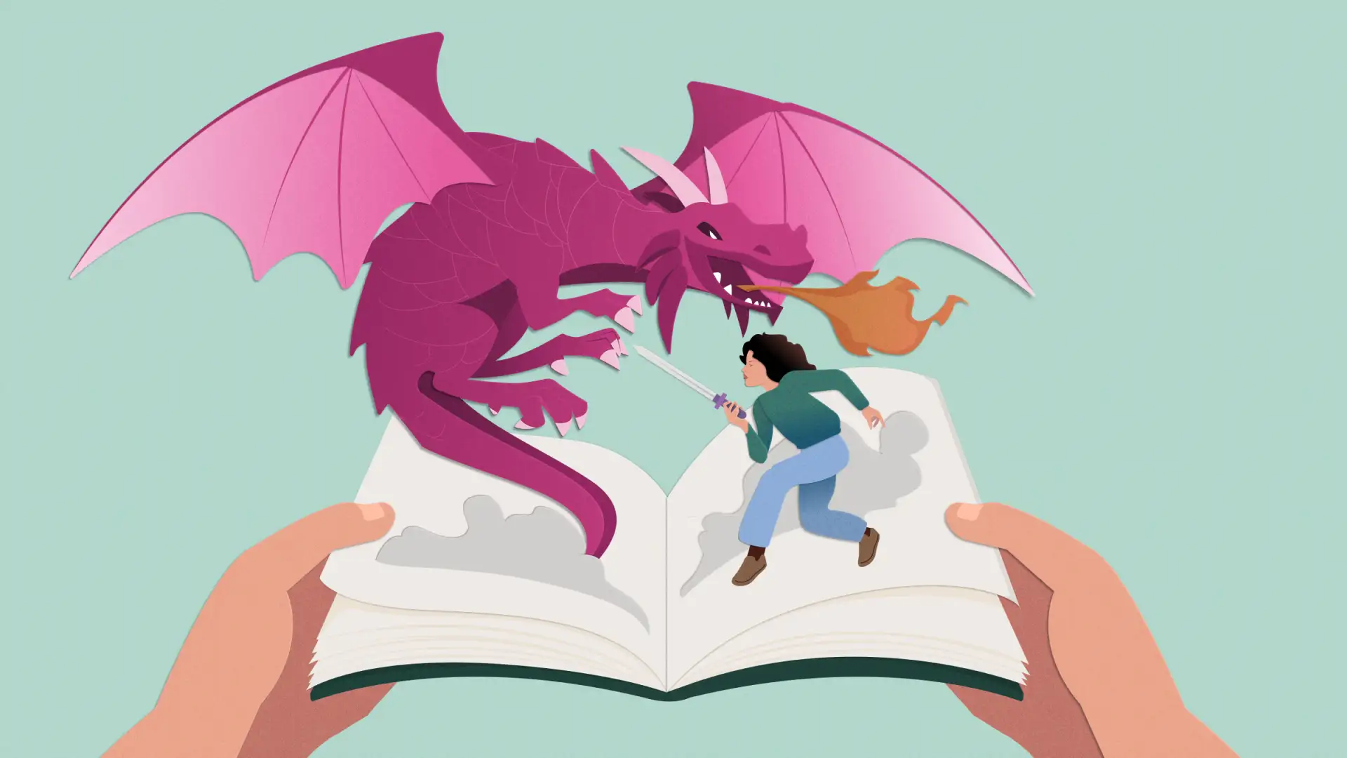
In the world of design systems, this organizational flexibility is called scale. And finding effective ways to scale can come with frequent complications. While your challenges may more often revolve around smaller components, bigger brand expressions like illustrations are no different. I’m thinking of that warm, inviting design on your homepage, or the helpful illustration on a 404 page that gets users back on track. As you continually improve your designs for your specific local or global audiences, your illustration library must also grow and evolve to meet users’ needs. This means building an illustration system that can scale alongside your company.
Laying foundational principles for your illustration system
To see your illustrations truly thrive beyond their infancy, they need to become part of a design system. This frees them to spread across a vast array of touchpoints, from product to marketing, allowing users to interact with them in ways that printed art doesn’t allow.
It’s common for designers who work closely on visual expression projects to feel bittersweet about seeing their work graduate into a tool for other teams. But we can avoid that feeling by remembering our job isn’t just creating a memorable moment. It’s creating systems that stay memorable.
At its core, your illustration system should build on strong foundational principles:
- The style (how your illustrations look and feel)
- The location (where your illustrations live)
- The purpose (why your illustrations exist)
Collectively, these principles can act as your North Star and guide every choice you make. Not only do they help ensure clarity for your users, they give internal teams the confidence to own how they use illustrations to support and shape your brand. They may be digital, but your illustrations depend on the people who use them to bring them to life.
Designing for the tone of your brand
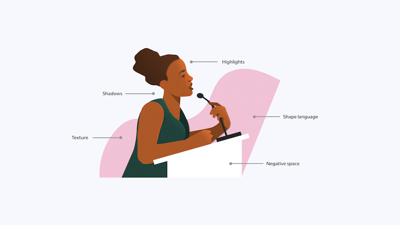
Our illustration style, Paper Stories, is rooted in human experiences and takes inspiration from the tactile feeling of cut paper. Designing physical representations in a digital space demands balance. We wanted our illustrations to look realistic, but the code behind them had to be equally practical. We needed to design and code for qualities like lighting, shadows, and texture. The complexity and weight of these elements can make file sizes too big and loading times too long, so we decided to improve them all. Here’s a breakdown.
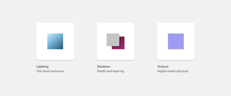
Lighting
From a designer’s perspective, it’s tempting to jump into blending modes or overlays (we did). But for developers, this presents hard-to-solve output issues across platforms. Not every browser can match the color properties that traditional design software has long been able to understand. Similarly, not every platform interprets shadows the same way. Using various styles like blending modes come with a lot of risk.
We also noticed that by designing with overlays, we were inadvertently creating an off-brand experience. For example, overlaying light or dark tones created new colors that strayed from our brand’s color palette. Instead, we switched to two-step gradients. These gave us the ability to match colors directly from our palette and stay on brand.

Shadows
With several designers working on these illustrations, we quickly noticed that each of us preferred slightly different levels of depth to achieve the effect of cut paper. The resulting visual mismatch weakened our united brand design, and the differences stirred up headaches for our developers because the code was inconsistent and hard to update. We needed a mathematical system of shadow types we could consistently apply to our design layers and eliminate the guesswork.
Working with Shaun Fox, a developer and UX director on one of our partner teams, we created a local style library within Figma that defines the primary constraints using blur and directional X and Y coordinates. Now, when we design new illustrations, we simply pick the shadow type we want and apply it.
“Assigning shadows from a distinct set of styles in Figma made translation to code much simpler. We leveraged a systematic naming convention to connect those styles with optimized SVG effects,” says Fox. “Having a common system between Figma and code then gave us the ability to create a simple in-house Figma plugin to export the SVG illustrations exactly the way we wanted.”
No more headaches for designers or developers!
Texture
Texture adds the finishing touch to our illustration style. People who interact with our brand may not consciously notice it, but the grain is what makes the surfaces of our illustrations so distinctly paper-like. We explored image overlays, custom CSS, noise filter plugins, and a few other important tools. Ultimately, we found that an image overlay was the simplest and most lightweight option to use.
I’ll be honest, texture is easily the most complex part of our illustration system, and we haven’t found our final solution yet. We’re currently using an image instead of an SVG. While it isn’t desirable, we can work with this method for now. As with any system, evolution is important. And the door to new ideas and methods should remain open.
–
Is this article helpful? Subscribe to get occasional emails with new stories like it.
–
Categorizing and scaling illustrations in your system
No design team will find a one-size-fits-all solution, but it’s important to continually evaluate what you’re working with. In our case, designing illustrations for high-impact product and marketing experiences demanded adaptable designs that could fit in small spaces—spot illustrations— and large ones—heroes.
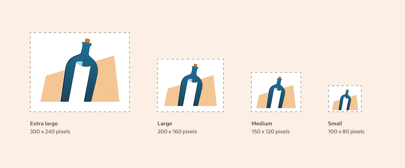
To ensure teams didn’t scale these illustrations out of proportion, we designed a responsive sizing system for spot illustrations. From our local library, teams can select spot illustrations in either small (100 by 80 pixels), medium (150 by 120 pixels), large (200 by 160 pixels), or extra large (300 by 240 pixels).
Within these spot and hero categories, our naming conventions make individual illustrations easily discoverable. Many of our illustrations fall into related categories that align with Indeed’s core themes, such as search, workplace, and interview. Naming illustrations can easily become opinionated, but it’s worth getting right—these designs ultimately serve your brand and the people who build it.
Naming conventions also help internal teams decide where an illustration fits into the brand experience. As product teams begin thinking about the kind of illustrations they need for their mockups, relatable naming conventions will be their starting point. Certain one-off moments may require highly tailored illustrations, but even these should still fit comfortably within your brand story.

Leaving room for your illustration system to grow
Illustrations deliver tremendous value to any digital brand. They function as visual weights that bring clarity, promote user retention, and add brand distinctiveness—especially when they include meaningful information. But as your brand and design systems evolve, your illustrations will need to do the same. By investing in a scalable foundation, you improve your ability to pivot during these changes.
Close partnership with design system owners is also essential. As UX Design Manager Louise Hannah on the Design System team puts it, “scaling elegantly means the illustration system can and will change, so you need to promote a mindset of flexibility over rigidity. The key is cutting through needless complexity, establishing ownership at each stage, and creating a collaborative environment so you can actually problem-solve and overcome the challenges you will face.”
As our product experiences continue to evolve, so do the illustrations. That comes with continual challenges. For us, in-product changes like illustration mirroring, padding parameters, sizing limits, and color usage continue to arise as we refine the larger product experiences. In marketing channels, occasional broken-product considerations have pushed us to understand how additional illustration styles can accommodate larger screen moments. International markets present their own unique challenges, too. To meet localization needs, we’re figuring out how to best format our illustrations into new patterns and colors so they function better within unique product layouts while maintaining a similar impact. My personal favorite is the opportunity to add motion design, which has quickly become a dynamic tool for expressing our brand by bringing illustrations to life.
Of course, as we do all of these things, we must stay true to the foundational principles that these illustrations live on: the style, the location, and the purpose. You may find yourself stumped many, many times. (We certainly have!) But focusing on these goals will keep you on track. As we followed our guiding principles, we solved unpredictable problems and developed even greater solutions along the way.
Just like cleaning up a room in our house, we organized our illustration library into a scalable space we can grow into. By putting in the time to develop a strong system for our illustrations, we enabled creativity in partner teams and set the brand up to grow ever stronger.