With the launch of Indeed’s new brand identity, our in-house team of designers reinvented every aspect of our brand, and color was a major influence. Color is the visual backbone that gives a foundational brand system personality, and it’s the expression that users interact with the most in the product.
Color builds associations, makes brands recognizable, and creates memorable user experiences in products. Through our rebrand effort, we aspired to build an extensible color palette that made accessibility a top priority and was distinct enough to show our evolution as a maturing company.
Starting from piecemeal colors
Our original identity focused solely on bright blue and orange as our core colors. Realizing that those two colors weren’t enough, we’d created an extended palette of secondary colors. But we’d done the work as a reaction, rather than creating something new with intention. Because we’d built our color system piece by piece, it didn’t naturally scale to meet our needs. Colors required different treatment across different surfaces, creating tension between different products and across marketing.
Some surfaces ignored the core colors completely, choosing to focus instead on colors from the rest of the palette. This presented a problem because the rest of our palette lacked the recognition of our core colors. It was hard to recognize a surface as part of Indeed without the blue and orange.
On the other hand, some teams used our core colors to the point of excess. Whenever there was something we wanted people to focus on, we used them. Bright blue and orange filled our interface, and often competed for a person’s attention.
Designing with purpose
Partnering with our senior leadership team, we conducted a global study of our previous brand design to see what brand equity our blue and orange color palette held. In the results, we saw an opportunity to build off of the original palette and create something fresh and inviting that still felt like Indeed.
We also interviewed designers across product and marketing to understand how successfully they had implemented our previous color system. After compiling feedback, conducting surveys, and reviewing screenshots and design files, our team chose three main goals for the next evolution of our color palette.
Accessibility
Accessibility was a primary focus for our company. Alongside the development of this new core palette, our executive leadership team required that we strive to be compliant with our accessibility goals so that our digital experiences were available to all. This was a key consideration as we developed our palette and a welcomed challenge to promote a more inclusive product.
Clarity
As a set, we wanted the colors in our palettes to fit together in a complementary way, rather than competing with each other. They would need a consistent look so that we could build one visually cohesive brand where users could easily identify the meaning and purpose of each color. At the same time, our system also had to have a wide choice of colors covering a broad range of applications in product and marketing.
Flexibility
We had to understand how colors were built, so we could fully control the outcomes. This would let us avoid flaws like visual gaps or inconsistent contrast across the range, freeing us to predictably combine and use colors without compromising quality.
Focusing on all people
As you can tell, picking a color palette for a global organization is no simple task. At Indeed, not only do our brand colors have to be distinctive and ownable, they also have to be scalable for use across product and marketing, all while complimenting the accessibility standards our product teams were looking to achieve.
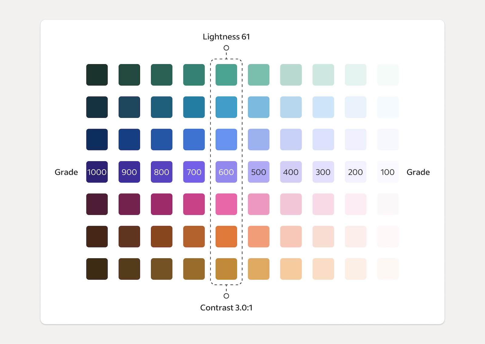
So we took a product-driven approach to designing this new color palette, using the core Indeed blue of our logo as our starting influence. We created a new, refined core blue, then designed each of the other hues and grades with consideration for our users and accessibility standards. The result was a deep palette that reached all color grades needed for our product design teams to implement through our design system.
The extensibility of this new palette also opened up new possibilities for us to represent multiple skin tones through our new illustrations style, Paper Stories. The vast amount of colors allowed our artists and illustrators to reflect a variety of ethnicities in their character design, so that our illustrations were relatable and approachable to every worker.
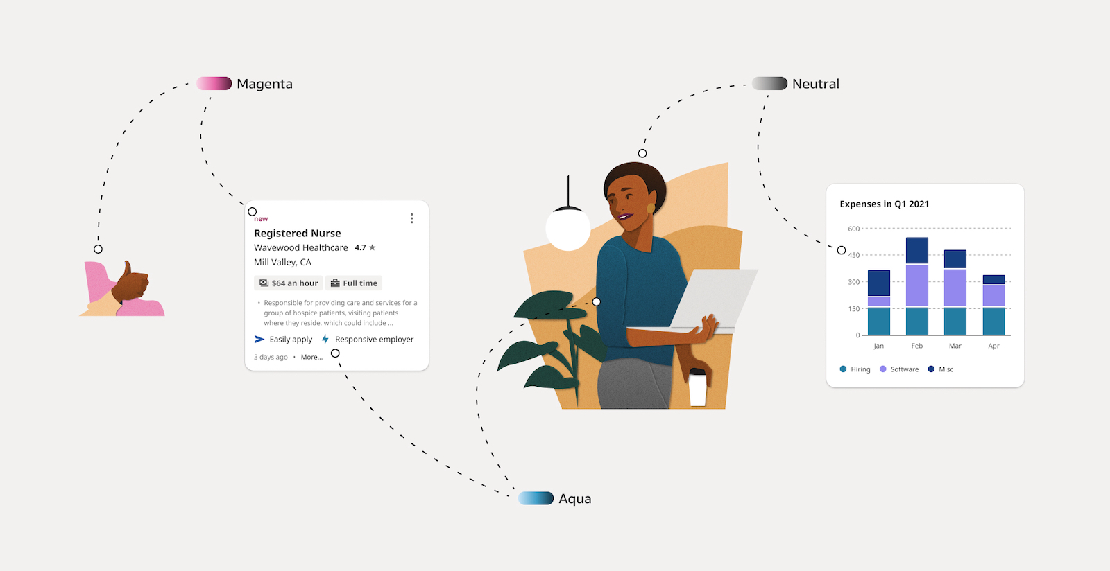
But a color palette that scaled across multiple use cases wasn’t enough. We also wanted to understand how people around the world saw our colors. Did our version of blue have the same meaning for people in the United States, Germany, and Japan? So we conducted another study focused on semiotics, an important tool for understanding how different cultures interpret and experience symbols such as colors and logos.
This study of our new color system proposal showed us the cultural impact it would have on our global audience. For instance, we learned that our new core Indeed Blue color conveyed leadership and formal responsibility in Germany, while it represented water, community, and care in Japan. These learnings, paired with our achievements in meeting the accessibility standards and doing extensive A/B testing in product, gave our executive leadership the confidence to approve the companywide rollout of the new color palette as part of our brand identity.
Making context king
A major theme we returned to throughout our entire brand initiative was purposefulness. We wanted our brand expressions to have meaning, to tell our story, and to fit into a larger system that mirrored the values of our company. Color plays a huge role in that, whether it shows up in our logo, a background, or a button.
So we started by splitting our palettes up based on application and strategically applied color when contextually appropriate. The result was a three-part system: a core brand palette, a functional palette, and an expressive palette.
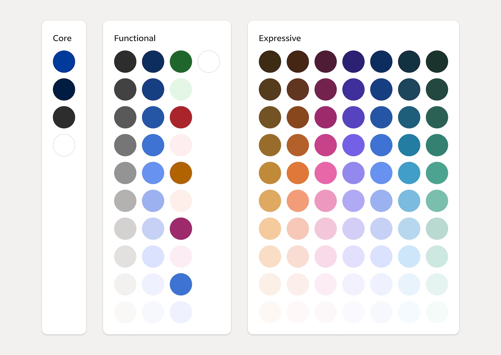
The names hint at this already, but breaking our use of color into three distinct palettes helped us better distribute each color and its grade across the whole design system. We were able to create unified visual patterns that look and feel like one family and function that way, too.
Our core brand palette is a mature evolution of the colors that helped Indeed succeed. We dialed in our two brand blues to be accessible hues that are distinct to high brand moments in the product and throughout marketing.
Our functional palette is built for our product experience. The colors support each other to create seamless flows, highlighting what’s truly important and building clear visual patterns.
Our expressive palette expands on the first two, creating a deep library of rich colors that could scale across digital and print. This same color range also allows our character designs within illustrations to have a library of inclusive skin tones for depicting people in an authentic way.
Doing the right thing
When we first kicked off the discussion around redesigning our color palette, there were several moodboards we looked at that showed a range of colors. We considered everything from vibrant neon to stunning gradients.
But in the end, we thought about the people using our products and what it meant to them to search for a job or find the right candidate. That personal experience is at the heart of what we do.
We took our users and their environments as our inspiration and designed our system to support them as best we could, rather than trying to win design awards. We wanted to connect with our users in a real way by building an identity that helped people get hired or hire a candidate as easily as possible.
This was the evolution of our brand that felt right for us.
