

As the lead creative and owner of DeLeon Creative, I’ve collaborated with many businesses, entrepreneurs, and creative teams. For the last few years, I’ve been excited to work with Indeed and partner with their internal creative team on building a new illustration style. Our ambition is to make illustrations an integral and authentic expression of our new identity, and not just visual ornamentation.
Illustrations are a visual representation of a concept or message. They’re expressive tools designers can use to convey emotion, tell a story, and project personality. They can enrich brand narrative, add context to designs, and connect to audiences in a genuine way.
For the launch of Indeed’s new brand identity, I worked closely with their group of designers and illustrators to create a new style that represents Indeed’s core values. This aspect of our new brand identity was important to get right, especially for our leadership team. Illustration is an important piece of Indeed’s internal culture — custom illustrations fill the walls of many of the conference rooms in our offices around the world. Externally, each character, place, and job we portray is an expression of who Indeed is and the people that we serve.
Here’s how we did it, step by step. Our team rooted every phase in the development of our new style in Indeed’s mission to help all people get jobs. And it shows: each illustration in our library of over 200 images (and growing) creates memorable branded moments that support our message and our users.
Preparation: Understanding our brand
The first thing we did was dive into our brand’s culture. We wanted our work to represent Indeed’s core values of authenticity, inclusion, and helpfulness. Our goal was to bring those brand attributes to life in a genuine way. We collected examples of illustrations throughout Indeed’s product and marketing to understand how they were being used. At each stop, we identified moments where illustration had the greatest impact in our experience. And we considered how we could connect with our audience and inspire them in a meaningful way throughout their job search.
Concept: Making a visual connection
One of our biggest challenges as a global brand is finding ways to connect with a broad base of users. We serve people of all backgrounds who are on many different journeys.
To engage this diverse audience, we focused on creating believable scenes. And we defined a set of principles for our style and final assets. The work has to be:
- Diverse in its representation by including all sorts of jobs and people of all kinds and backgrounds
- Uplifting and kind, so that it conveys a positive and aspirational tone and builds on people’s abilities and strengths
- Intentional in its support of a clear message that adds context to our experiences
- Focal, so that it draws attention to a specific subject
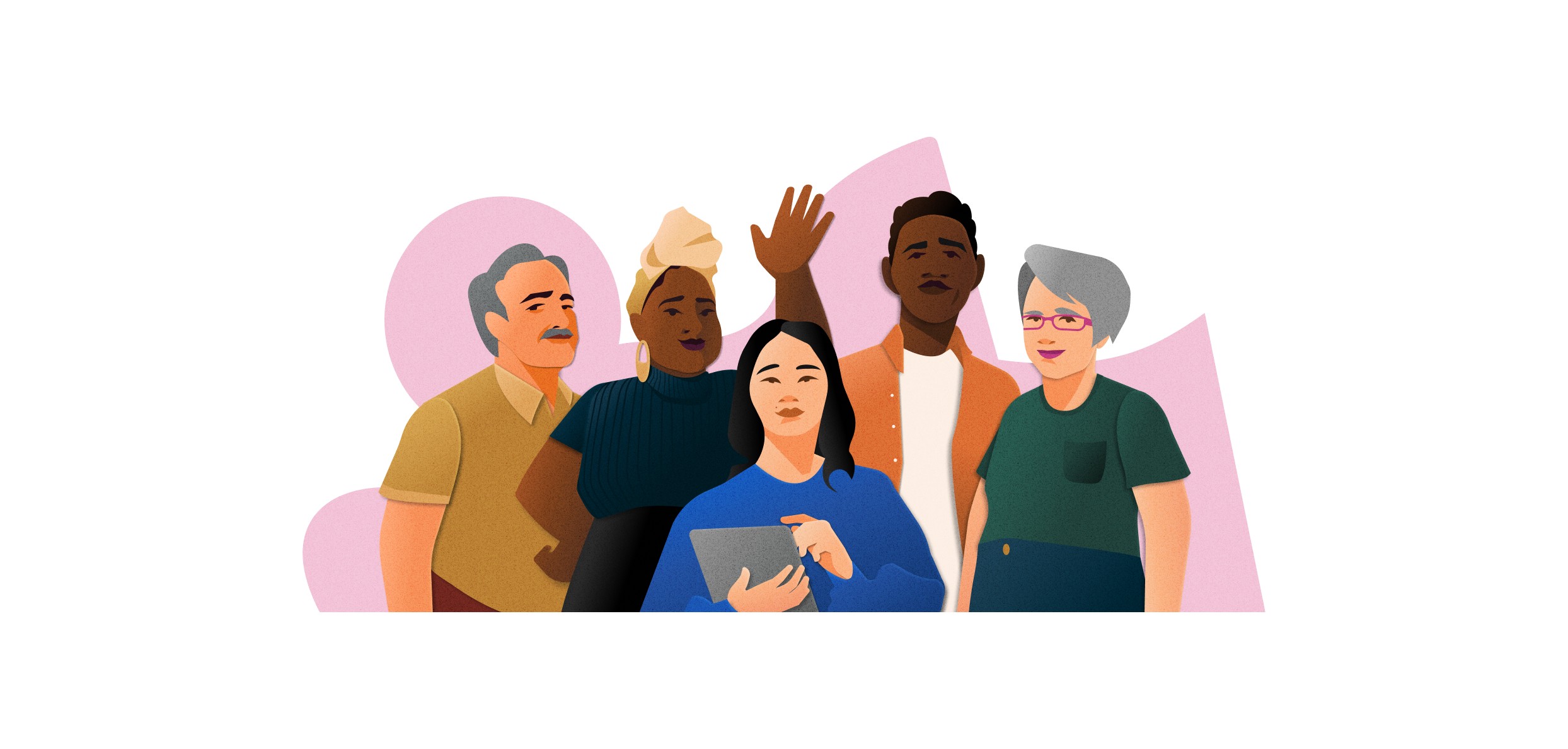
To start with, we decided to make people the most high-fidelity part of our style. And we looked to photography as inspiration. “We tried to make the people we portrayed realistic by starting with images of real people,” says Sean Loose, who led the character design. “I went through a bunch of images to see how many faces I could draw as I figured out how to work with the style we were developing.” It was an important early exercise, he says. By the time our illustrations were final, the characters in them were composites of many different kinds of people doing their work.
We also made it a point to make the illustrations culturally aware. That meant doing research to find meaningful demographic and employment references. In some instances, we tailored our illustrations to a specific industry, market, or subject. To keep it real, we examined every detail to best portray human features, emotions, gestures, environments, and objects.
Our illustration style succeeds because it can adapt to support different messages and purposes. By showing scenes our audience can identify with, we tell people we understand them. Relating to our audience helps to build trust in our brand.
Technique: Adding a human touch
We call our approach Paper Stories, because it draws on the look of paper to evoke a tactile, real-life feeling. We build our compositions from pieces that have a cut and layered look with depth and dimension. Slight imperfections, shadows, bevels, organic shapes, and texture emphasize their handmade appearance. This analog touch adds warmth and personality to our otherwise clean digital product.
Illustrations that show how the paper story illustration style comes together through shape, shadow, texture, and more.
At the same time, this approach makes portraying humans a little complicated. “The Paper Stories look adds a sense of realism, but it creates a challenge when we need to make the people look like more than little paper dolls,” says Loose. Many small elements come together to bring the characters to life. Blocks of color on faces create shadows that add depth. Hair flows in natural shapes rather than geometric blocks. And body parts look proportional. “There’s definitely some simplification happening, but everything is in its right place,” says Loose. “The small details are what make these people look more like people.”
We celebrate individuality in the big picture as well, by representing people of all kinds, ages, and abilities. “When you’re trying to be authentic to drawing everybody, that also means that proportions aren’t always going to be the same on everybody. We incorporate different body types, varying heights,” says Loose, the same people you’d expect to see on an average day at work.

Color is a central part of this effort. It makes the illustrations stand out and reinforces their uplifting tone. Every illustration’s hues have a specific connotation that conveys emotion and supports the design’s message. Case by case, we choose color combinations that are bright, harmonious, and balanced.

We also use geometric and organic shapes as backgrounds to emphasize our style. Like hand-cut pieces of construction paper, the shapes add a layered background pattern similar to a collage. They also frame our compositions, grounding them and adding a sense of dynamism.

Composition: Putting our style into practice
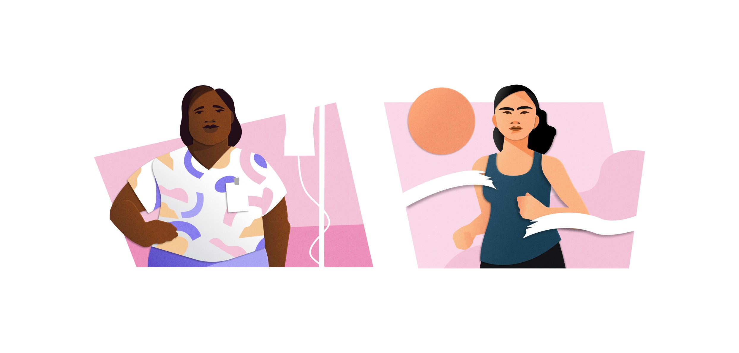
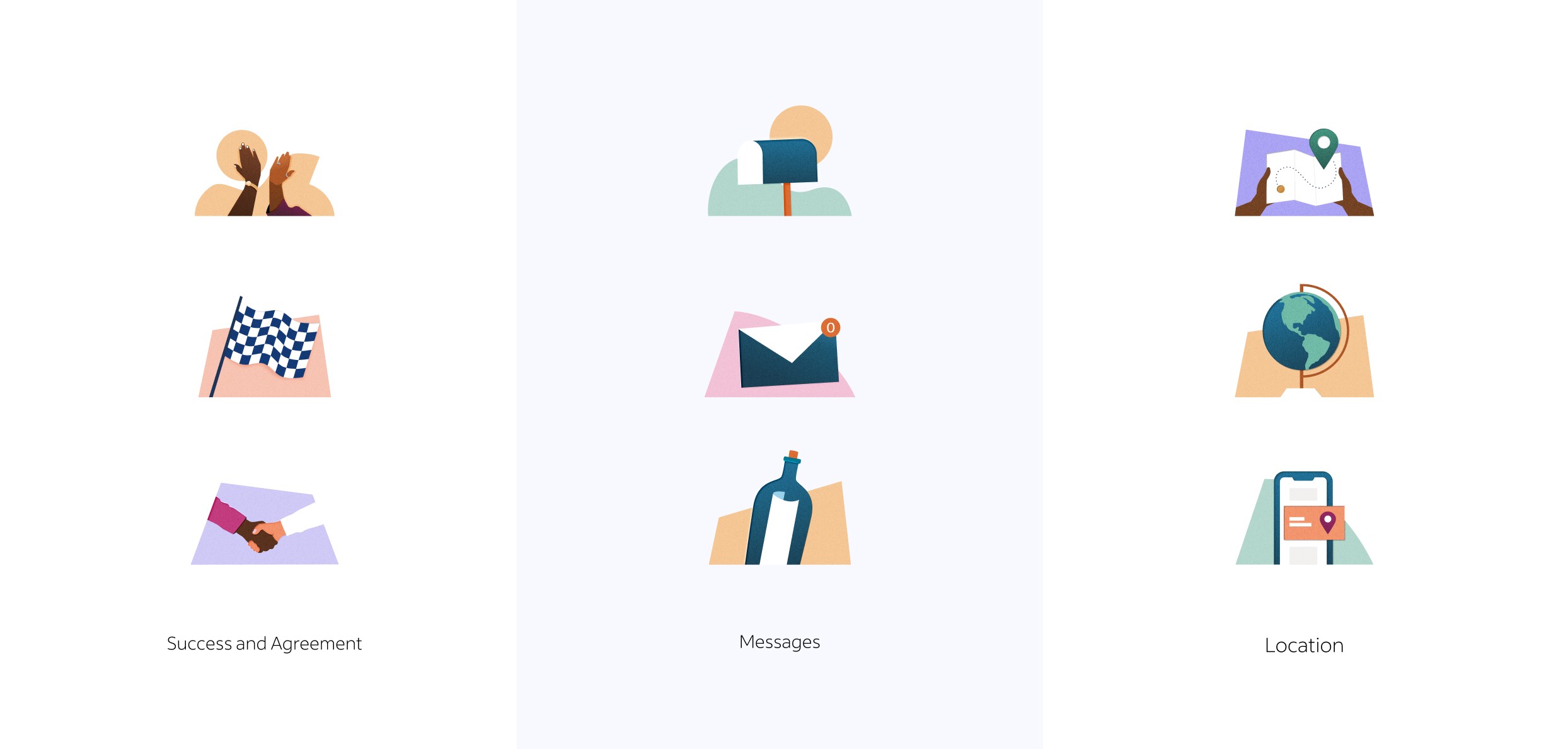
We use our illustrations in two ways. Spot illustrations show up in product to support and simplify complex messages. By nature, these small images present common concepts that a wide audience can understand and read within the limits of a product space. We understand that we can’t count on one image to work in every context, so we built variations on frequent themes. This gives our system flexibility to adapt to different subjects, markets, and applications.
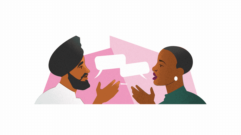
Our hero illustrations tell meaningful stories that celebrate the Indeed community. We make them approachable by showing characters’ work lives in an encouraging way. And we maintain a feeling of authenticity by using real scenes as sources of inspiration.
Empathic character design makes a difference as well. “Part of the practice is being really authentic about emotions and the situations that we put people in,” says Loose. “What are their emotions and their motivations — what’s their life like? It sounds kind of silly to talk about that in the context of a 404 error, but that’s what we’re thinking about. We’re making stories. Yes, you can hit an uncanny valley when you put people’s eyes in the wrong place just slightly. But an illustration also feels off when somebody’s smiling while they’re searching for a job, which isn’t something people normally do.”
This true-to-life approach speaks to our goal to meet our audience where they are. Perhaps you can relate to some of the scenarios below:
Result: Creating a single story with multiple perspectives
This work wasn’t done overnight. It took over 10 months, 120 pieces of inspiration, 250 hours of video calls, several talented artists, and countless cups of coffee to find the direction that best embodies Indeed’s brand. The dedication paid off. Our illustrations connect with our audience where they are in their journey. They add meaning to our designs, create a personal connection with our users, and tie into our values as a company. We crafted something relatable that goes beyond visual appeal to show what our brand stands for and represents the millions of people looking to get hired and hiring for their businesses across the world.


