From the start of our work on Indeed’s brand identity, it was clear that typography would be an essential part of the new Indeed. Across our products and marketing materials, type plays an important role in telling our story as a brand, through the words that we use and the way they’re displayed.
Over the course of a year, we created a new type system, with Indeed Sans as its centerpiece. Developed with the design studio Dalton Maag, this custom type is a distillation of Indeed’s voice and a new starting point for our brand. Here’s how we made it, and what we learned along the way.
Defining our type system
Our initial type audit and explorations made clear that a new approach to typography would present both challenges and opportunities. At the time, Indeed was mainly using system font versions of Helvetica for both product and marketing. While this approach is fast, flexible, and free, it lacks consistency and isn’t particularly distinctive. We knew from our brand equity research that our type was neither recognizable or ownable. And our marketing partners told us that they needed something more flexible and expressive.
In the early stages of our process, we explored whether it was even possible to meet all of our needs with one font family. There were few options with global language support. Of those, only a few were distinctive. None of the options were completely ownable. And most were extremely expensive to commercially license for Indeed’s number of global daily pageviews.
To help tackle all of these challenges, our team made a framework for separating use cases. We split functional uses in our products and expressive uses in our marketing into separate categories. This helped reframe all of our brand expressions, especially typography, where we decided to use two typefaces. For expressive uses like advertisements and signs, we chose a commercially available, warm, geometric sans serif as a placeholder. And we agreed on the global, open-source Noto Sans for functional use on Indeed.com and across our product surfaces. We quickly validated Noto Sans through testing on our homepage, and began implementing it into our product design system.
These two tracks of work gave us a good picture of where we wanted to go. So we began looking for the right studio to collaborate with on a custom typeface. We chose Dalton Maag because of their extensive experience developing custom typefaces with global language support, their perspectives on accessibility (Jacobs), innovation (Darkmode), and sensitivity to brand (ABB Voice). Their robust and responsive team, and experience working with large organizations helped as well.
Taking our custom type from broad concept to fine details
By the time that we started work with Dalton Maag creative director Bianca Berning and font developer Pablo Bosch, everyone was working from home full-time because of COVID-19. Through workshop sessions on Zoom, shared Google docs, and active collaboration, testing, and feedback in Figma, we were able to bring multiple teams and stakeholders together in an iterative design process.
Dalton Maag’s approach felt familiar for many of us. We started with a collaborative brief that incorporated our brand strategy, desired qualities, and research. Then we held an initial workshop that helped uncover new insights and get everyone on the same page. Through multiple rounds of presentation, testing, and feedback, we landed on one strong direction. Each time around, we refined and expanded the character set and design details. Approaching the project this way allowed for a fast, inclusive process that explored many stylistic directions. And it helped focus the work on the core qualities we wanted to communicate: authenticity, empathy, expertise, and optimism.
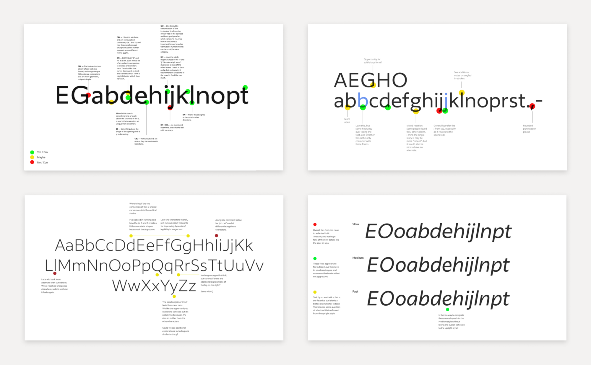
As our team aligned on one strong direction, a humanist style with elements of handwriting, Dalton Maag continued to iterate, refine, and expand the typeface. We added nuance to characters like ampersands and punctuation. We adjusted design details like the contrasting soft and sharp shapes in the lowercase letters a, b, and d. And we strove for a balance of distinctiveness and frequency in the more unique letterforms. The character set grew from 15 letters to a full working base, which gave us more flexibility to test the typeface in real applications.
With the base character set coming together, we began working through the details to push the overall style of the typeface. We explored headline treatments, legibility at small sizes, and font weights. We spent time deciding how far the italics should lean. Last, we dug into the finest points, spacing, and the kerning between specific letter pairs. All of these details shape how the type works on the page. This was a particularly fun part of the process.
We also worked through an underestimated task: picking a name. We held workshops and came up with some creative and expressive ideas. But, in thinking through the full context in which the type would be used, we chose the straightforward Indeed Sans. It’s simple and makes the type recognizable as a brand element.
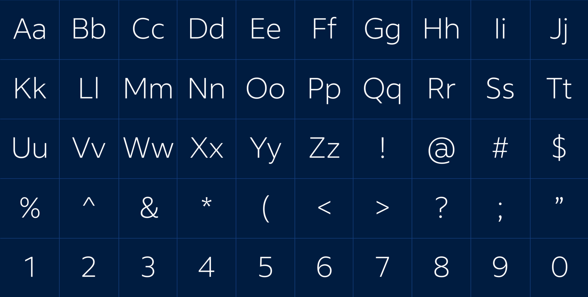
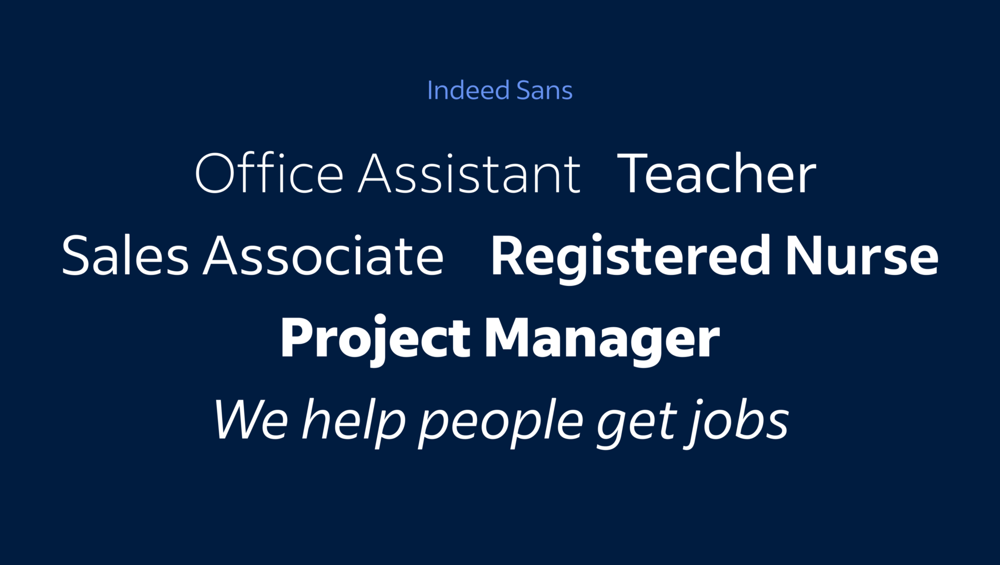
Introducing Indeed Sans
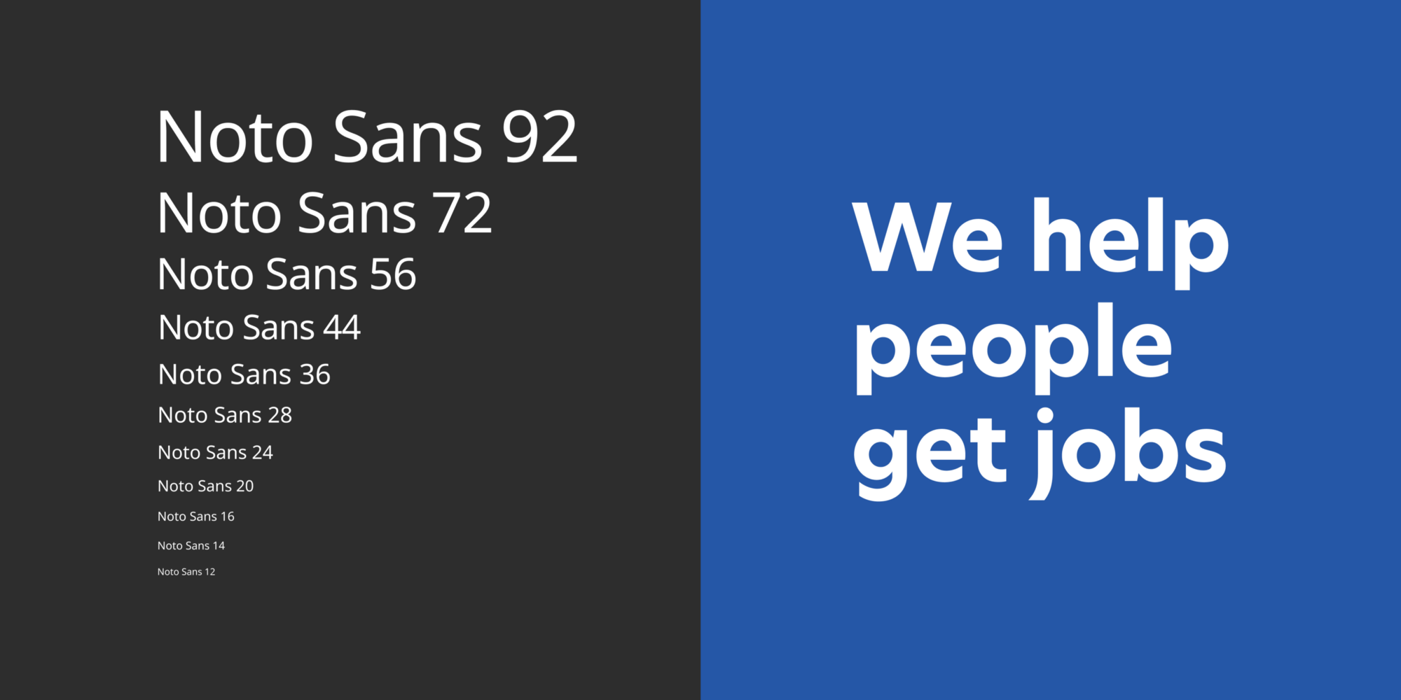
The new typeface we developed is a contemporary, humanist sans serif in five weights with true italics. It has generous proportions that are optimized for legibility. Its shapes are more organic than strictly geometric. And its styles range from light and sophisticated to extra bold and impactful. Together they achieve a warm, clear, and positive tone, a perfect tool for expressing our brand to a variety of audiences.
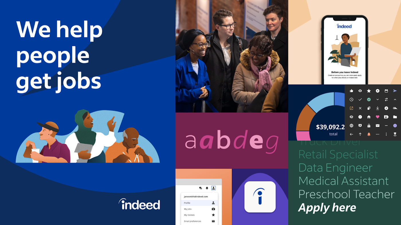
In February of 2021, we launched Indeed Sans along with our new brand identity across two big projects. For Super Bowl LV, we created a television spot called The Rising that used a flexible typographic treatment to emphasize the inclusivity of our mission statement. We also launched a new brand microsite at Indeed Design to showcase the new typeface alongside our identity’s other brand expressions. In the months and years to come, we’ll continue to build new ways to use Indeed Sans in our product and marketing experiences.
Four lessons we learned
Through creating Indeed Sans, our team learned a lot about what it takes to develop something a brand can truly own. We came away with a set of valuable advice:
First, start as early as possible. Second, do the due diligence to ensure a successful partnership. Third, leverage type as much as possible to define your brand. And fourth, plan to roll out the typeface in ways that add momentum and encourage adoption of your brand system.