I’m a content designer. My focus is typically content architecture, words, and whether you need to use a period on that headline. So when UX leadership first asked me to create design principles for our UX organization, I was skeptical. Why should I be the one to define way the designers, researchers, developers, managers, and others I work with did their work?
But I quickly realized that building these principles would first and foremost be a content exercise. It would mean synthesizing hundreds of people’s philosophies about our products into a few one-liners everyone could agreed with and use to shape future product decisions.
Plus, who better to lead the work on organization-wide design principles than someone who does the nitty-gritty work every day? One of content design’s superpowers is taking large, complex ideas and distilling them into something useful — right?
In my experience, principles created by leadership can run the risk of becoming too lofty and not reflecting a team accurately. Back then, I knew our new design principles would need to completely represent everyone in the org, including folks from internal-serving UX teams who make things tick and the engineers who actually build our projects. Everyone under the UX banner would need to agree on these new design principles, even if they didn’t have a design title.
So I said yes. Our content team had recently got the whole company on board with an aligned voice and tone framework. So I took lessons I learned from that project and got to work. I’m proud of how my team introduced these design principles even though we still have much to learn from the adoption process.
Maybe your team can learn something from our experiences, too.
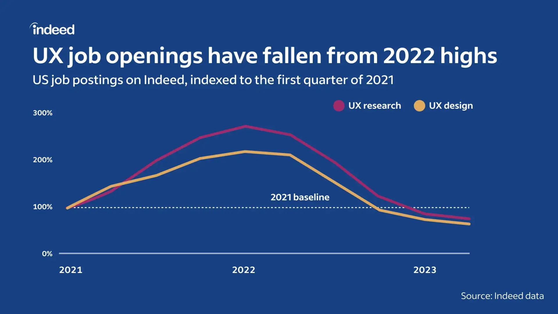
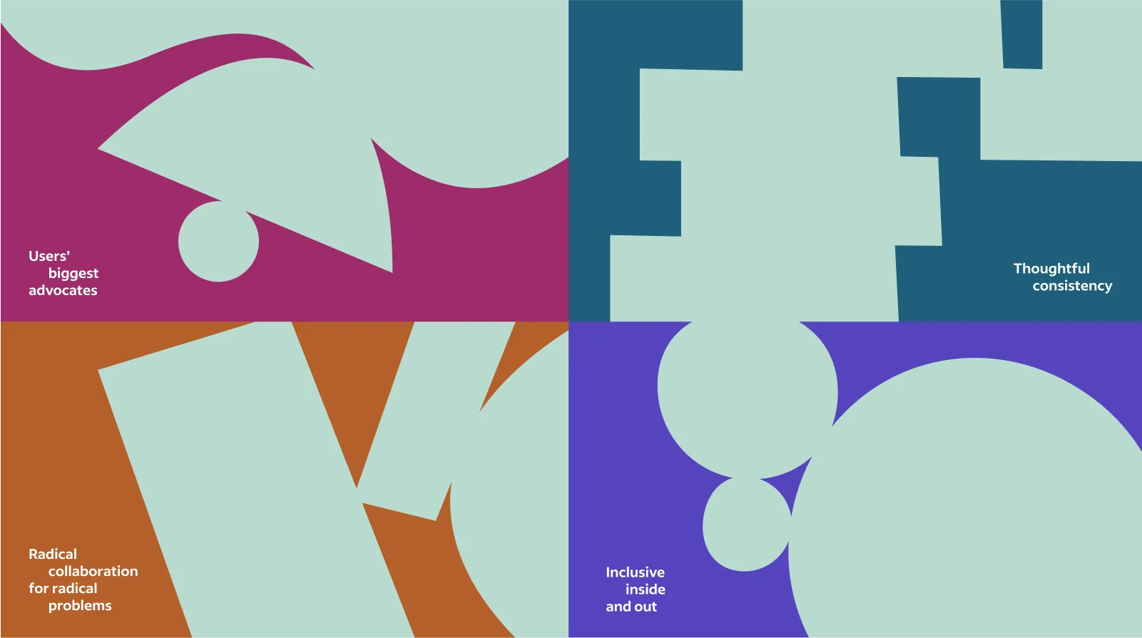
Indeed’s four UX design principles
First, let’s take a look at what we made. After months of hard work, these four design principles now guide our UX organization and product teams:
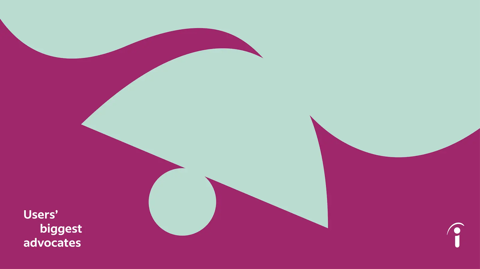
Users’ biggest advocates
We put our users first by solving the issues that matter most to them.
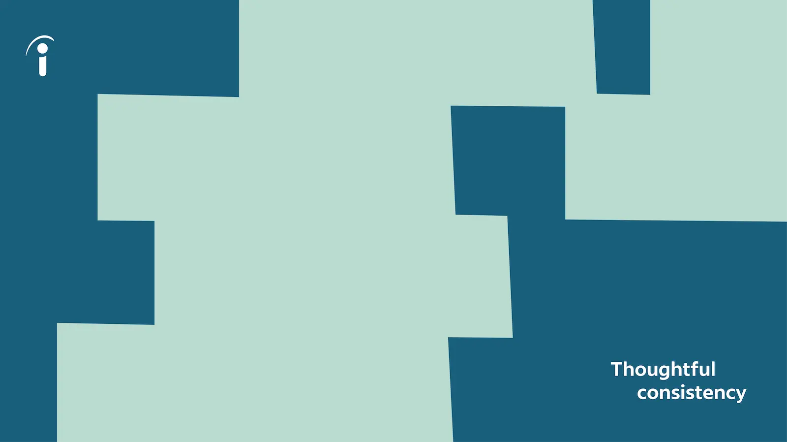
Thoughtful consistency
Thoughtful consistency promotes understanding, creates familiarity, and builds trust with our users, no matter where they are or what they need to do.
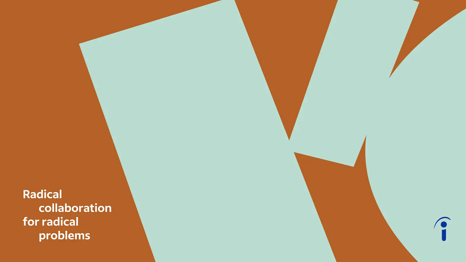
Radical collaboration for radical problems
Strong partnerships with a focus on cross collaboration and clear paths of communication ensure we are solving problems holistically.
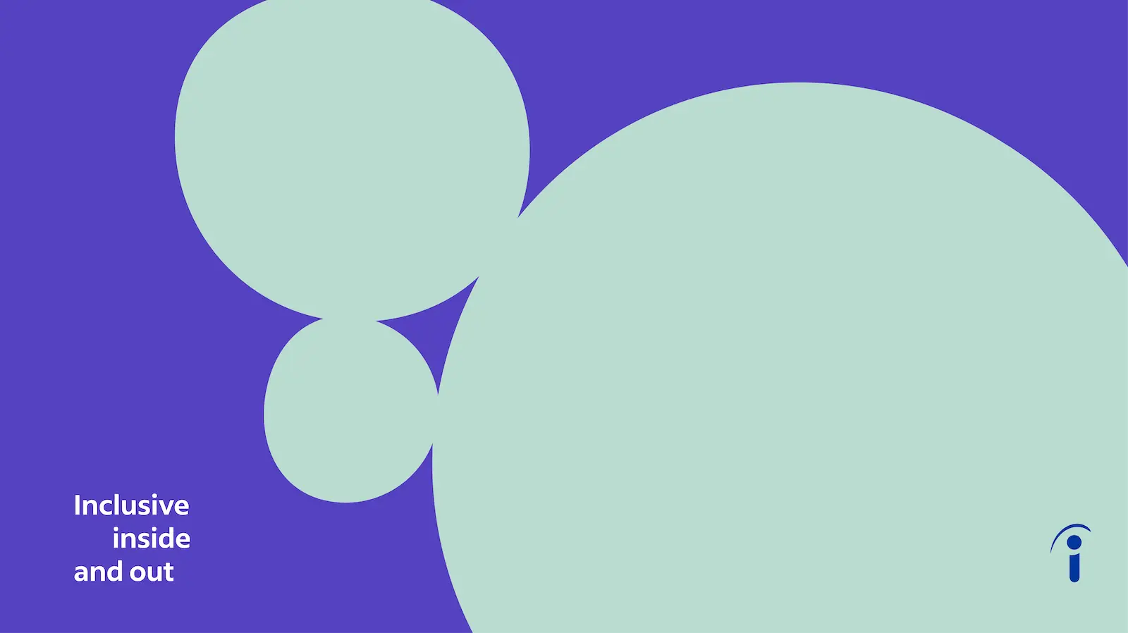
Inclusive inside and out
Our mission to help all people get jobs starts with a workplace where all people feel safe, welcome, and can contribute their best work.
These four principles are the result of months of audits, research, workshopping, and evangelizing. And the work is still ongoing. But here’s my best advice if you’re in the midst of a similar project.
Don’t sleep on the discovery phase of your design principle initiative
Any time you’re trying to get hundreds of people to agree on something, expect an uphill battle. One way I made this work smoother was by equipping myself with as much information as possible. I approached creating design principles from scratch like I would any new product initiative: Learn everything I can first, then ask questions until I get annoying.
Survey the UX organization
My team started with an org-wide survey to get a feel for how comfortable folks were with design principles in general. Had they used them at previous companies? Did they use some now? (And send me the link, please!) I also interviewed the different UX members that I worked with regularly and anyone in leadership who showed any interest in helping.
In my teammates’ experience, principles had the potential to culminate in one of a few outcomes: a big win that became a cornerstone of product strategy, a major flop decided by people in power, or an improperly socialized and forgotten vanity project. Asking big questions everywhere I could helped me gauge my colleagues’ attitudes toward the prospect of adopting design principles and learn what’s worked before and what hasn’t.
Early surveying also uncovered a content designer’s previous attempts at writing design principles, which felt like the writing on the wall. What could I do differently? Feedback on those principles claimed they were “too UX-y” and difficult to translate to both product and content. And many people sent their different team decks to my inbox, all of them using variations of the word “principle”: value, things we hold true, unifying pillars. Take your pick. My work was cut out for me.
After I interviewed leadership and finished my own research, I boiled down basics to this: Good design principles are easy to remember, easy to use, and specific to each of the companies using them. It would be silly to adopt any other tech company’s design principles here at Indeed because our users have unique needs. Good design principles mean something specific to each person who aligns their work to them every day.
Break down your results to identify needs
Your team can design its own surveys according to your needs. I made sure my survey asked targeted questions based on preliminary conversations, clearly stated how results would be used, and didn’t take too much of the participants’ time. Results from my research and analysis showed that Indeed’s design principles would need to be:
- Performative externally. Design principles had to look good and make the company look good.
- Useful internally. Org members should actually want to use them. This meant big conversations starting with everyday UX professionals and working up to leadership—and not the other way around.
- Concise. They would do well to follow best practices for blog article titles and run 3 to 5 words. Think Intuit’s Design for Delight Principles.
- Actionable. Each principle would need to take a stance that added clarity and not more ambiguity for leadership making decisions about those on the ground. My favorite example of this is Atlassian’s Design Principles.
- Specific to our organization. The voice and tone of the principles had to match the company’s framework. I like Amazon’s Leadership Principles as an example.
Run a workshop with the people who will use the design principles
After research, it’s critical to include as many people as possible in the creation process. I developed and held a remote workshop for our organization. Something similar might work for your team.
First, I asked our leaders to nominate a representative from each of their teams who would take part in shaping these design principles. Keeping leaders involved and invested through every part of the creation process is key. Then, workshop participants followed me in a few exercises so I could get some meaningful feedback. Here’s an outline of the workshop I used:
- Ask participants to come prepared with two design principles they feel they use in everyday life.
- Offer an excess example design principles to your participants during your session. You can source these from research, surveys, popular terms, any existing design principles your company currently uses, and other resources you find along the way. I invited an internal UX member who had made design principles at their last company to come speak with us about that process. We also opened with a summary of our discovery phase so everyone was on the same page.
- Divide all of the participants into smaller groups. Give each group an identical pool of cards that include the principles they came prepared with and the ones you brainstormed beforehand. In my case, these included existing principles I found, and principles recommended by leadership. I invited participants to remove or add any principles as they liked.
- Ask each group to sort their cards into categories and label them as a team. Since our team includes people from all over the globe and varying levels of writing skills, I ensured two content designers were present in every group to support any English-language and writing needs. If you have the resources, I encourage you to make your workshops accessible in this way.
- Take a vote from the groups on which principles should make the top cut.
- Narrow down the principles with the whole group. We aimed for four. Then divide back into groups and spend the rest of the time filling out a slide template to make the principles more robust and actionable.
- Prioritize and triage which principle comes first. My research showed that our principles’ order mattered because it needed to tell a story teams could buy into.
- Review each combination with the whole group, and give them time for feedback.
- Take a final vote on which principles participants feel are most impactful and memorable.
- Prepare a stellar brief that will sell leadership on the impact of the new design principles in the big picture.
Workshops can feel like a big undertaking during this kind of project, but they return valuable feedback. Take it one step at a time, set clear goals for your participants, and pause frequently to check in and get feedback during the session.
After you’ve polished and finalized your design principles from the workshop votes, it’s time to share what you built for a few million rounds of feedback. And then they’ll be done!
Share your design principles everywhere
By the time I finished the first draft of design principles for the workshop, I had talked to or surveyed at least 150 people in Indeed UX. Keep in mind that spreading the good news of your shiny, new design principles doesn’t only happen after you have a finished product in hand. The evangelizing you do throughout the product gets people excited about your project and will eventually feed into the final push: Design principles are here and ready to use!
My team presented the principles in our UX global all-hands meeting to a group that knew these principles were coming and were excited for them. Building this anticipation is also part of the work. Considering our audience, we also knew the visual design would need to grab everyone’s attention and carefully reflect the heart behind the content. So a great mind behind our illustration style created some promotional materials, too.
Design principles are for everyone in UX
If you’d have told me a few years ago that I’d be creating principles to unify the design work of hundreds of my coworkers, I may have laughed at you; at the time I was writing product descriptions for an eyeglasses company.
But accomplishing this work alongside many other talented people helped me realize something important: Good design comes from the people who practice it. And these values truly grew from everyone’s contributions. This project taught me how necessary it is to make design accessible and motivating — not just for users but for the people who make good design happen every day.
Folks who had never met before formed relationships in our workshop. Some learned about new teams they didn’t know existed. It would have been easier and faster for us to run a workshop with just leadership, but would those principles have stuck? This workshop ensured that the people making the principles and the people using the principles are the same.
These principles reflect the collaborative work of hundreds, but we still have much to learn. We rolled out these new design principles late in 2022, so I’ll have to write another article about how they’ve unified our work and benefitted users.