Designing for a global audience while collaborating with a team that speaks primarily English is a challenging but crucial consideration for UX designers. English is still the most commonly used language online, but the ratio of English content to content in other languages continues to decrease every year. This only highlights the growing importance of creating products and services that users can access in other languages and markets.
Designing for users in many parts of the world is more than just inclusive; it’s necessary for any product to prevail in our rapidly advancing and interconnected world. In this article, I’ll explore how UX designers can improve their work by considering users of other cultures, languages, locations, and backgrounds.
The role of UX on the path to globalization
Delivering a seamless user experience to a global audience requires an understanding of how different markets access, consume, and interpret products and information. When UX designers reframe and question their assumptions, they can better understand users across the world who have differing experiences and needs.
Users benefit exponentially when a design team adopts a globalized UX approach. Considering a global audience will help:
- Build trust in your brand by listening to and connecting with users from all different backgrounds and experiences
- Broaden the impact and reach of your product by becoming more relevant in other markets
- Promote inclusivity by being more considerate of cultural expectations and local norms in each market
- Improve user experience overall by creating more intuitive interactions made for specific individual markets
The user experience of a global product is only as successful as its ability to rise above barriers in local markets. Providing correctly translated content is a great start, but holistic globalization considers the entire product from the start of the design process.
Globalize throughout the design process, not just the end
Throughout the design process, UX designers can make a few key adjustments that will ultimately offer better solutions for international users and markets. Collaborating early and throughout the design process helps teams identify the most relevant design considerations and ultimately benefits global users.
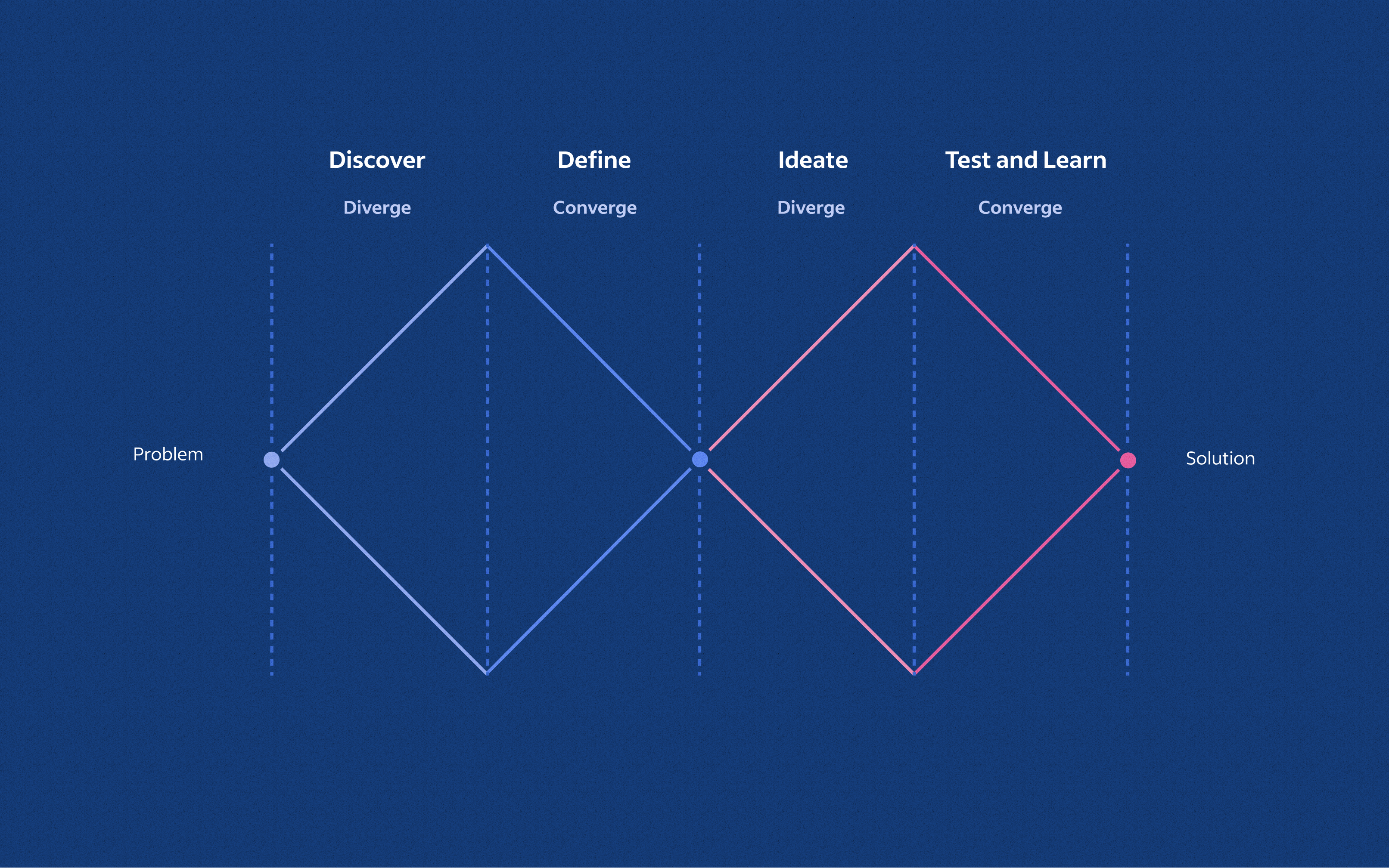
Discover
During this phase, consider whether varying challenges or needs exist for users based on their locations. This is the time to identify the most pressing challenges for international users in particular.
Define
As you gain clarity on design requirements and strategy, determine whether any further testing or user research is needed on an international level. If the upcoming product or solution will benefit other markets, work with your team to define minimum requirements so you have a firm understanding of international constraints during the next phase.
Ideate
UX designers can approach globalization holistically by following some best practices that guide and prepare designs for meeting the needs of global users. These best practices will help other teams later adapt the product for their markets. In areas like text translation and formatting, inclusive design choices can deliver flexibility with product interactions and content.
Test and learn
Testing and moderating global-ready features can help you learn about users in other markets, but results can also teach you how to keep improving on your team’s globalization process.
By keeping an open and adaptive conversation about internationalizing designs, teams can help each other avoid unnecessary work and effort later on.
How to make your designs global-ready
Globalization goes far beyond translating content into other languages. Smart, global-ready design choices combine localization and internationalization processes. Think of internationalization as generalizing a product so it can handle multiple languages and layouts. Localization then adapts the product for a specific market.
UX designers create the foundation for a more seamless localization process by designing a flexible initial solution. Market experts can then serve specific local users with more culturally aware and contextually relevant updates.
With some thoughtful guidelines, Indeedians design with our global teams and users in mind. These guidelines may help your teams, too.
Text translation
Translation is perhaps the most obvious aspect of globalization because adapting content into local languages is a crucial step toward catering to a global audience. For teams designing in English first, keep these tips in mind to prepare your designs for translation.
Plan for text expansion
Translating from English to (almost) any other language will cause the text to expand and take up more space within your designs. Keep in mind how the overall layout will adjust when text length expands. To quickly check if your designs will still work in a target language, you can double the English text by copying and pasting existing content within the design one extra time. This should give you a good idea of how much space to incorporate for non-English text.
In addition, sometimes multi-word phrases in English translate into a single long word in other languages. This could cause issues for components with constraints, like buttons or interactive elements. If this is the case, collaborate with your localization team or content experts to determine if a replacement translation could work instead.

Account for character size variation
Like word length, character width and line height will vary after translation, too. Chinese, Korean, and sometimes Japanese characters can be counted as two English characters in width. Thai and Arabic use taller characters, so ensure that line heights are flexible and won’t look too cramped once translated into those languages. Even some languages that use the same alphabet as English, like Italian, can still expand up to 300% of the original English phrase.
Focus on plain language
Jargon, colloquial expressions, slang, or idioms (like “call it a day”) don’t make sense during the translation process. Avoid ambiguous language, and enlist the help of content designers or copywriters who are familiar with the translated languages if needed.
Formatting
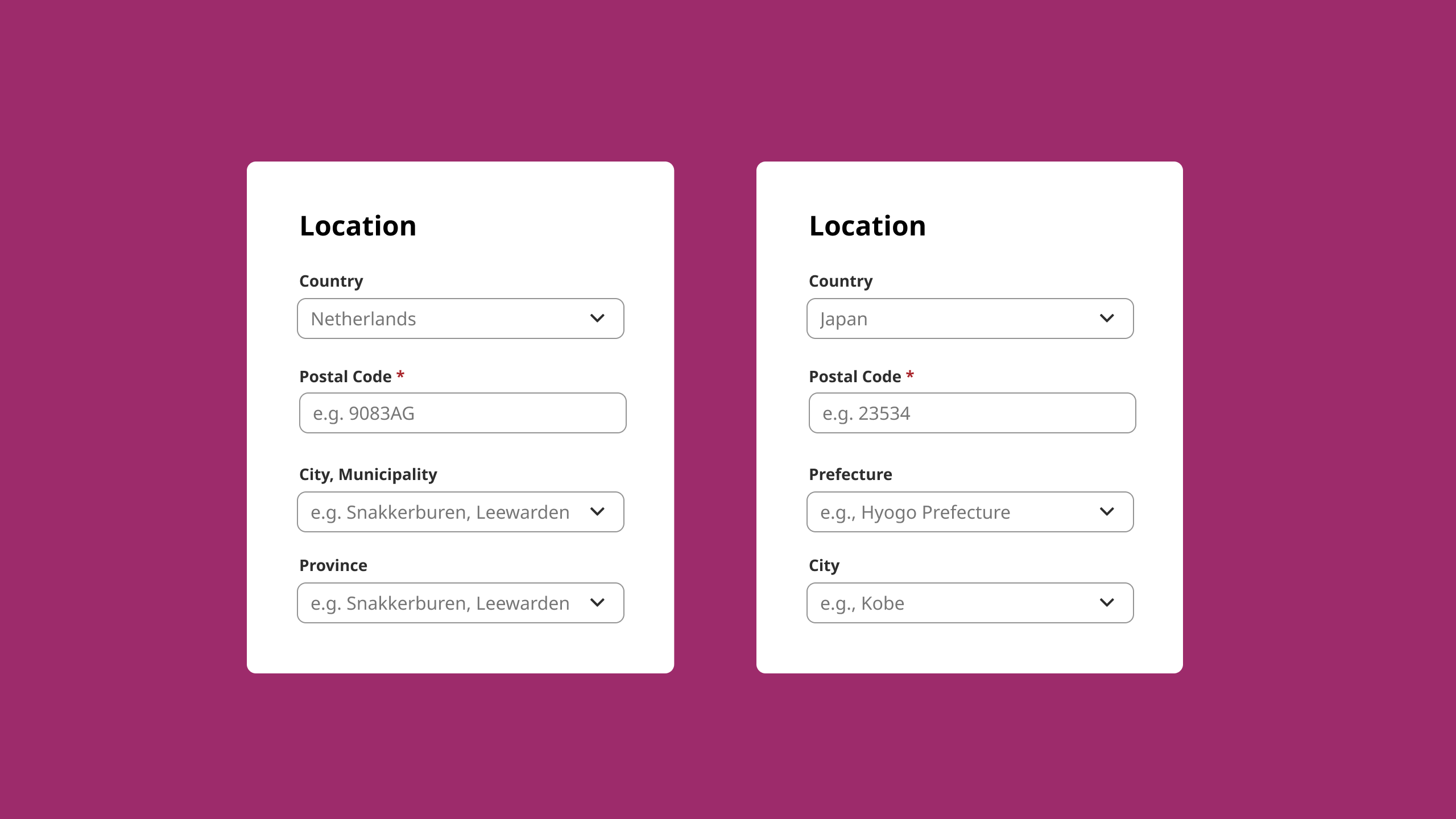
Forms and fields vary greatly across the world. For example, in Japan, pronunciation fields follow each traditional name field. Elsewhere, designers may need to include several input fields for currency within the same country.
Fields will need to be adaptable
Fields for date and time, currency, address, name, measurements, phone numbers, and more, will need to be adjustable. For users in Japan, a last name generally comes before a first name. It’s also common to fill out phonetic name fields to help with specific pronunciation.
Forms will have unique field orders
Address forms won’t always follow the pattern common in the USA (street address, then city and state, then zip code), which moves from the smallest to largest entity. Japan uses the opposite structure, listing details from largest to smallest entities down the page.
Currency symbols and placements differ across countries and languages
Using a period to indicate cents (as in the USA) isn’t a standard practice across markets. A comma is standard with Euros in places like France, Germany, and The Netherlands. Additionally, placement of the Euro symbol can vary. Germany and France include the symbol after the number, but Ireland uses it before.
Flexible content and interactions
Patterns familiar to users in one location may not be intuitive to those somewhere else. User needs and expectations can vary greatly across cultures, so it’s best to incorporate as much adaptability as possible when designing.
Stay consistent with information hierarchy
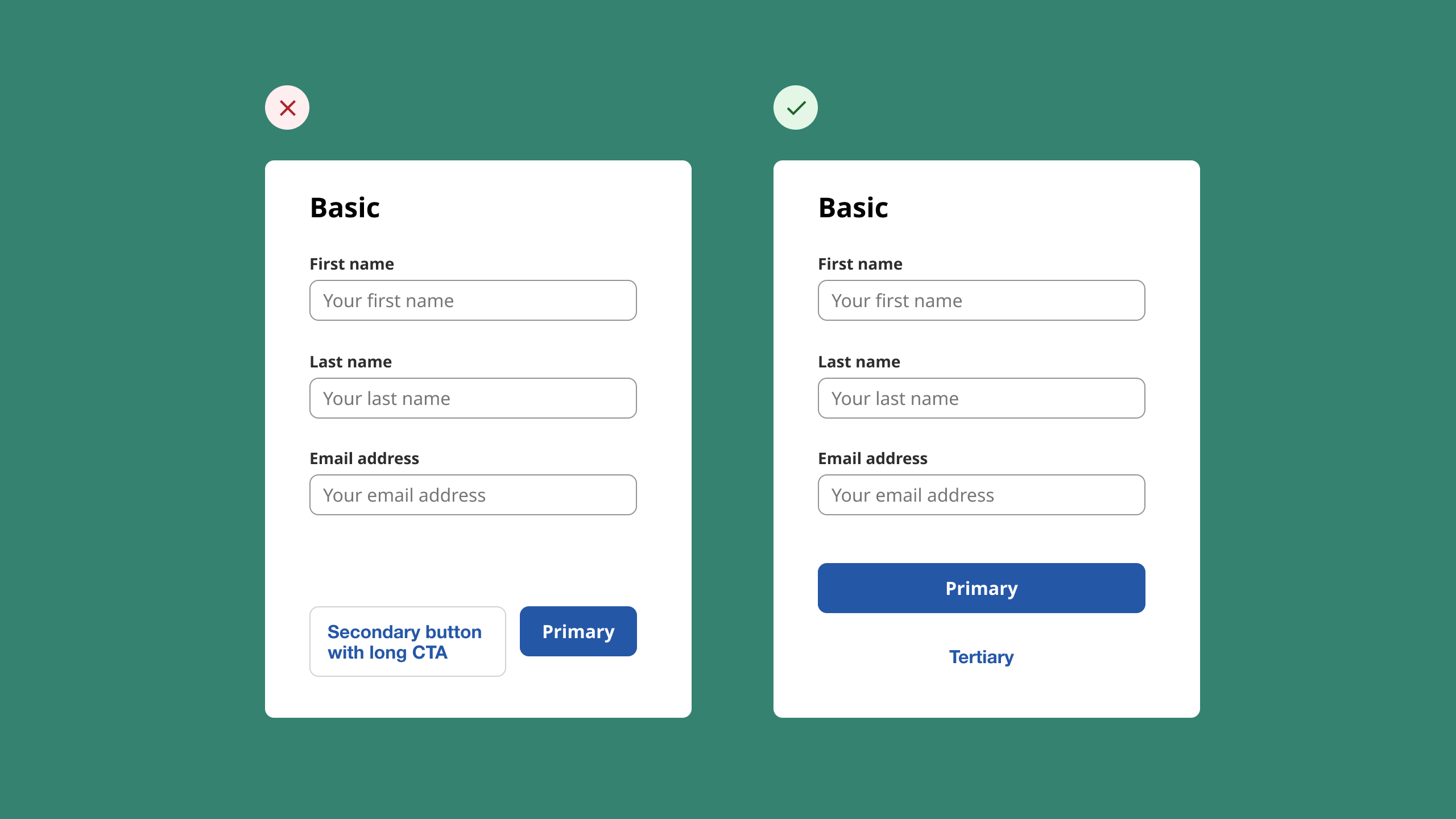
A primary and secondary button side-by-side will create two shorter buttons. This might be acceptable in English designs because text length is often shorter. But a narrow column of text in other languages could cause a broken language experience after translation. Instead, opting for a wide button on top, with link text below, can keep the hierarchy consistent and clear after translation.
Plan for changes in word order
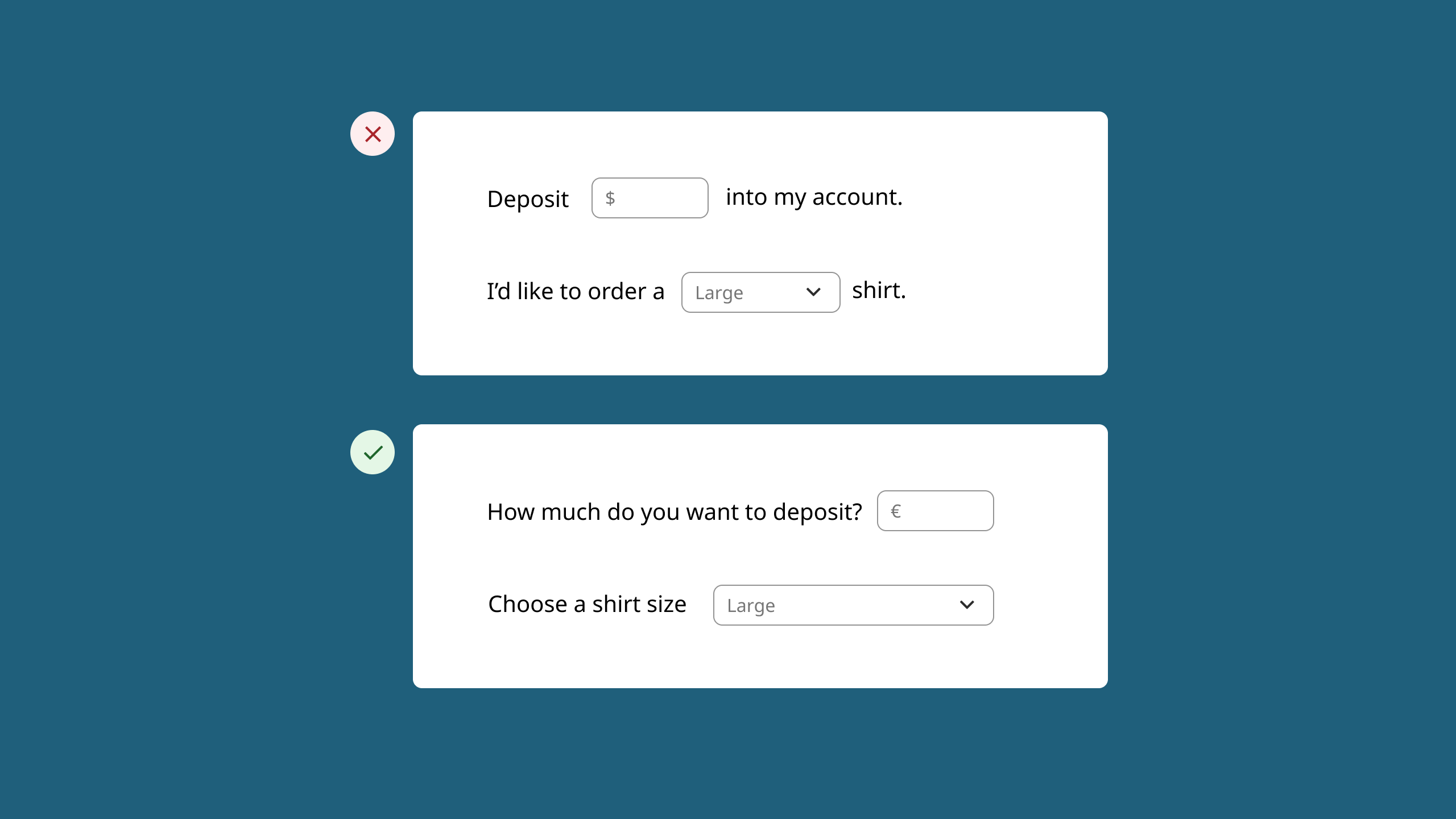
Avoid using interactive elements within sentences. English word order might allow for placing intuitive inputs or selections within a sentence. But after translations, the structure of the sentence will likely change and these elements would no longer make sense. It’s best to design these components as an external input instead of incorporating them into the sentence structure.
Keep in mind mirroring for right-to-left languages
Languages like Arabic and Hebrew read from right to left. This can impact not only the layout designers will mirror, but also how designers will accommodate certain interactions or icons.
Imagery and colors
Cultural perception of illustrations, colors, and imagery within designs can greatly affect the experience and success of a product if not adapted to local expectations.
Images and symbols could be misinterpreted
Ensure that all illustrations are culturally appropriate. For example, an icon representing a real-life object in one location could look very different somewhere else.
Mailboxes in North America look different from mailboxes in other countries. Many symbols and images conjure different meanings cross-culturally, too. In the US, owls often represent wisdom, but people in some Asian countries may see them as signs of bad luck or foolishness.
Colors have different connotations
In the USA, red typically means danger, loss, error, and passion. However, for many in China, red brings up feelings of happiness and good fortune. In a simple example like representing losses and gains in the stock market, color might have big implications. If your designs depend heavily on color, consider and research what it might mean in other parts of the world.
Avoid images that contain text
Any images containing text will need correct translations for each location. It’s best to use general or abstract images so you can avoid the extra effort to localize them individually. If an image requires additional context, try placing the text before or after the image instead.
Design with the future in mind
Technology continues to advance and bring the world closer together. With each new design decision you make, prioritize the impact it might have on a global audience. Without a well-designed experience for all users, designers might miss out on the limitless and undeniable positive impacts of global-ready thinking.
Designers are in a prime position to represent positive business, cultural, and technological overlap. If you and your team are looking to cater more directly to international users, start by establishing internationalization processes, addressing your current design system, and creating design guidelines for UX that align with your globalization goals. Create a shared, localized form toolkit or library file that can house globalized elements mentioned in the guidelines. You might also consider developing a master checklist for designers to follow and complete before shipping designs.
For Indeed, staying global-ready means helping all people get more jobs in more places. What does it mean for your team?
