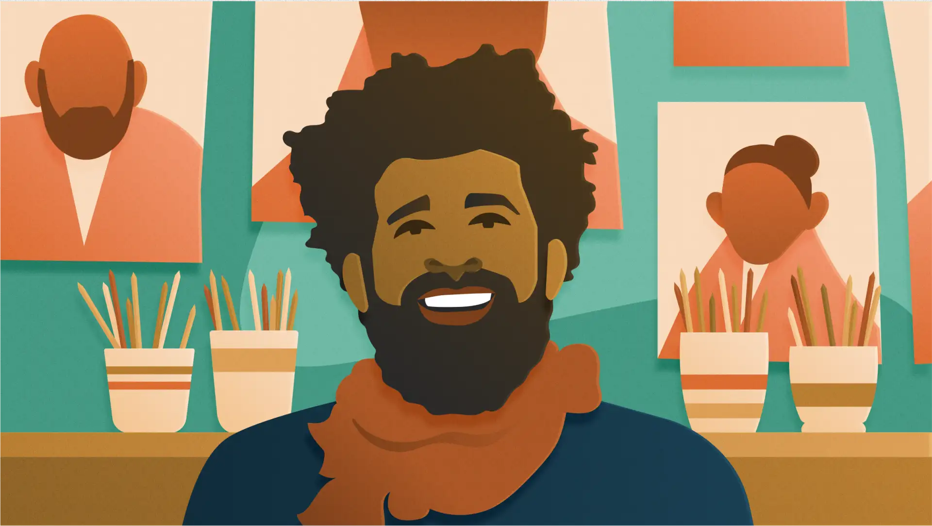
Ravi Vasavan is a London-based designer at the brand studio Koto, where he works on visual and verbal identity for brands across digital platforms. Vasavan grew up Deaf to Deaf parents, immersed in Deaf community, and throughout his work, he believes in including all perspectives in the design process.
“From experience, I believe that building genuine relationships is one of the most important factors in being heard: The better your colleagues know you, the better they will be able to understand when you’d like to say something, or give you an opportunity to say something,” Ravi writes. “And vice versa — the better you understand them, you will be more comfortable to be a more emphatic voice in the room.”
In spring 2020, Vasavan and Christine Sun Kim co-founded deafpower.me, a platform honoring Deaf communities. “The core idea of creating deafpower.me is to make the [Deaf power] symbol easily accessed and used, and as a visual springboard for a platform that will expand over time into something bigger,” Vasavan writes. So far, the project has included BLM resources and videos highlighting the work of Black Deaf creatives; for Vasavan, that’s just the start.

Do you remember any examples of design that felt especially effective (or flawed) to you as a kid or teenager?
My first conscious and real encounter of design that felt especially flawed would have to be public transportation when I was in early high school. Train delays or changes in platforms were only announced over the speakers, which meant me and my friends couldn’t figure out what was happening unless we asked others on the platform, or even sometimes followed them to the next platform. Out of frustration, my friends and I would often say, “They should have subtitles everywhere.” A few years later, they finally installed digital screens, but their only function was to show the next departure and stops along the route — the announcers would still relay more nuanced changes and updates on the speaker.
The experience was similar when I was on a crowded train, when I couldn’t see out the window and the digital screen inside the train wasn’t functioning. I would either miss my station or barely get off the train on time. The information still isn’t one-to-one between what is being spoken and shown on the screens in many places. It’s 2020 now, hey?
Why were you drawn to working as a designer?
It always made sense to me that I am visually oriented. With my immediate family and our languages, everything was visual. Both my parents were creative people, especially my father, who spent years working in visual merchandising in Singapore. My bedtime stories often revolved around him creating, making, and seeing things in his travels. I guess everything pointed towards being a creative, although I really didn’t care for specializing until late in high school, when I realised being a designer was a thing.
What does your creative process look like for a project at Koto?
At Koto we believe in having a beginner’s mind. This means we have no set process, but instead a broad idea of what clients are looking for. With that, our immersion phase plays a huge part in our process. We engage with a huge variety of people, from founders to new employees, from seniors to juniors. Through that we learn each of their needs and wants individually — we never take the same approach, and we pride ourselves on that.
I was struck by something you said in an interview — that the team at Koto works together so well because everyone has such an emphatic voice. How does this work at Koto?
This is a great observation and question. As cheesy and corny as this may read, I have not worked with a team that has such a strong dynamic inside and outside of the studio. Personally, I think it’s down to the fact that a lot of us build friendships outside, which lends itself to the studio, an environment where we can be candid as we are at the pub with our banter. As mentioned, we don’t stick to the same process each time, and we work closely and iteratively. We don’t go away with the creative director’s idea and work in silos for weeks before presenting to each other on mount boards. There is implicit trust in each other.
Can you tell me more about the importance of considering different perspectives in design? What that looks like in your work?
At Koto, our body of work is seen as a collective effort. Every individual has contributed and shaped the outcome. There is no personal signature coming through because we’ve worked closely and iteratively together throughout, producing work that is truly a blend of everyone’s approaches, perspectives, and skills. As a result, our work is not a product of a singular idea or vision from a creative director. That is the effect of having everyone’s opinions and voices matter.
Can you tell me about how and why you and Christine Sun Kim started deafpower.me?
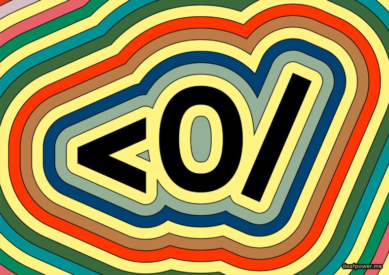
It’s important to Christine and myself that we always acknowledge that deaf power itself already existed before we started the deafpower.me project. It was either signed or written as <0/ or drawn/designed in various ways.
Early in 2019, I shared Able Parris’ Equality Symbol project with Christine, and the idea and purpose behind it really resonated with us. Personally, being a designer and being Deaf from a Deaf family, I’d say that it’s always been in my subconscious that I am looking for ways that would help share the history, languages, and values of Deaf communities all over the world. Combining that with Parris’ Equality Symbol website, Christine and I were very motivated by the idea of creating something that made it easy to access and use the symbol anywhere and everywhere.
We believe in the power of distribution. By making the symbol easily accessed and used by anyone, the more distributed it is, the more visible we are.
Can you tell me about the symbol?
It is based on the sign itself, which is signed with an open palm over an ear and with the other hand forming a closed fist in the air. Christine and I spent some time researching the history of the written form. We discovered that the original symbol was likely created by Eric Turevon, an underground Deaf ASCII artist, in the early 2000s. During his time at Gallaudet University, Eric designed the <0/ to promote positive Deaf identity and pride.
What’s the value of using the Deaf Power symbol, as opposed to the words?
Many of us are visually oriented and the idea of seeing how we sign <0/ as a visual symbol, not as a written string of characters, made sense. The ASCII reinforced that, and we are doubling down by turning it into an open source graphic symbol.
What do you hope deafpower.me works towards?
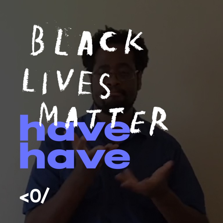
We would love to see this grow into a proper content platform where we can expand beyond the symbol itself and share the full complexity of our deafness and the depth of our identities. To do that, we will encourage our contributors to look into their past, present, and future, and to share their advice, histories, and stories. We have begun to scratch that surface with havehave.
Tell me more about havehave.
havehave is a phrase we, Deaf people, use in a few different sign languages, including American Sign Language, Auslan (Australian Sign Language), and British Sign Language. Although each language has its own sign for the word “have,” across languages Deaf people often sign it twice in rapid succession to signify they have something to share with you, e.g. advice havehave, history havehave, story havehave.
We launched our havehave visual project with a video by Dr. Joseph Hill, a brilliant sociolinguist and linguist whose body of work includes researching Black ASL. His video touches on the effect of Black Lives Matter and the importance of taking action and holding a space for deep and meaningful, difficult conversations.
Can you tell me about Deaf Power’s response to Black Lives Matter, and your ongoing work at their intersection?
Our initial response was to mobilize the platform and shift the focus towards to Black Lives Matter on Instagram and the website. It has become an ongoing engagement with the Black Deaf community, and non-white Deaf people by extension. More recently, we launched havehave to continue our work in this space and ensure that we do our part in dismantling the systemic oppression and racism in the society. Going forward, we want to engage with more Black and non-white Deaf people and give them the space to share their advice, history, and stories.
So much of your design work is as part of a largely hearing team, for a largely hearing audience. I’m curious about how it’s different to work with another Deaf creative, like Christine, on a project about the Deaf community and experience.
Strange you should ask this question, I’ve been working on it for quite some time. Two years and some, culminating in a talk, which I recently gave at Farewill, an online will-writing company where my partner works.
My approach to design is fundamentally hearing. As I was educated in high school and university, and within the industry over the past ten years, everything was delivered through the lens of hearing. As a result, and putting it bluntly, I have successfully suppressed and set aside my core identity — being Deaf and a person of colour — in an effort to think and work like others.
Explaining what it is like to work with another Deaf creative is quite difficult to capture in so few words, especially with Christine, who I click with on so many levels. But I’ll try. With her I was able to bring out elements of my deafness, and how I think as a Deaf person in ways that I never had before in the context of art and design. Prior to this, I have never worked on a project, let alone a personal project, about the Deaf community and experience. It’s brought on a lot of new learnings and understanding, and it has only affirmed my underlying need to merge two lanes of my being and thinking, as a Deaf person and as a designer, together more freely and frequently.
In short, when working with another Deaf creative, like Christine, we rarely need to explain to each other especially when working on Deaf related projects.
How do you think those ideas apply more broadly to audience and accessibility in design? I’m curious about how you think about the balance between looking to a designer’s own experiences and communities in their work, and looking to perspectives beyond their own.
At its core, it’s about ensuring that you retain your own identity and experience, and hold a space for it to come through in your work. Solo and collaborative personal projects are a great opportunity to do that in an unfiltered way. And at a personal level, as laborious it is emotionally, mentally, and physically, it matters a lot when you are able to share your disability, culture, experience with your colleagues. It’s not until the work has gone through diverse hands and minds that it can begin to encapsulate the audience and accessibility in a meaningful way. It is also important to find peers and leaders who are there to listen, support, and hold that space for you, and ultimately elevate you.