

Employers wear many hats, and it can be difficult to fit hiring into their schedule. Besides, finding new employees and understanding job market trends isn’t necessarily their area of expertise.
Part of Indeed’s work is to make the hiring process more efficient for employers. My team supports these improvements by developing automation tools, and recently we designed a virtual recruiting assistant to automate part of the hiring process.
Our virtual recruiting assistant included three key features:
- Data-informed improvements to the job posts to attract the job seekers with the right qualifications.
- A daily report of promising candidates for employers to review.
- Interview auto-scheduler based on employers’ availability.
While we knew that our tool could help employers make effective hires, we ran into many challenges in getting employers to use it. After 12 months, we ended up retiring the virtual recruiting assistant, but that doesn’t mean it failed. There’s so much that we learned during that year. Today, that knowledge continues to inform new automation projects.
Your team might be able to learn from our challenges, the adjustments we made to overcome them, and the wins we had. Come follow along.
Help employers understand automation
Automation is a relatively new concept for employers, and many of them are skeptical of its advantages. They simply aren’t always convinced they need automated tools. When employers work with a human recruiter, they can meet to ensure the recruiter understands their needs and ask for specific recommendations. With an automated tool, there are no humans to talk to.
In our user research studies, employers mentioned that they prefer a personal touch. A quote from our research findings says:
“…employers have inherently different expectations from a human recruiter versus AI, and are less forgiving of AI’s mistakes or annoyances.”
Helping employers understand what automation does and what outcomes they can expect can help your tool gain momentum in the face of these challenges. Here’s what I recommend.
Show, don’t tell
Research showed our team that even when employers understand automation, they’re reluctant to use it because it feels impersonal. We also learned that employers may feel automation puts key decisions out of their control, which highlighted a trust issue. So our first challenges were to earn that trust, help employers understand how the automation tool worked, and effectively explain how it could benefit them. We knew from our data that automation helps employers make hires, but automation is like going to the dentist—people understand that it’s useful, but they don’t necessarily enjoy it.
Employers wanted to know how automation would change the hiring experience, but automation is a complex process that requires lots of explanation. Adding new features increased the amount of explaining we had to do, and employers complained of information overload, misunderstanding, and fatigue. They gave up on the automation because too much information made it harder to understand.
We tried several ways to tell employers how our automation tool worked. But these solutions weren’t the most effective approach. When we started showing how the tool worked with illustrations—rather than explaining it with text—we increased the adoption of the paid features and helped employers get closer to making a hire. We also saw a significant increase in jobs with interviews confirmed by job seekers.
Automation is like going to the dentist. People understand that it’s useful, but they don’t necessarily enjoy it.
Here’s an example of how we simplified the explanation by translating it from copy to illustrations.
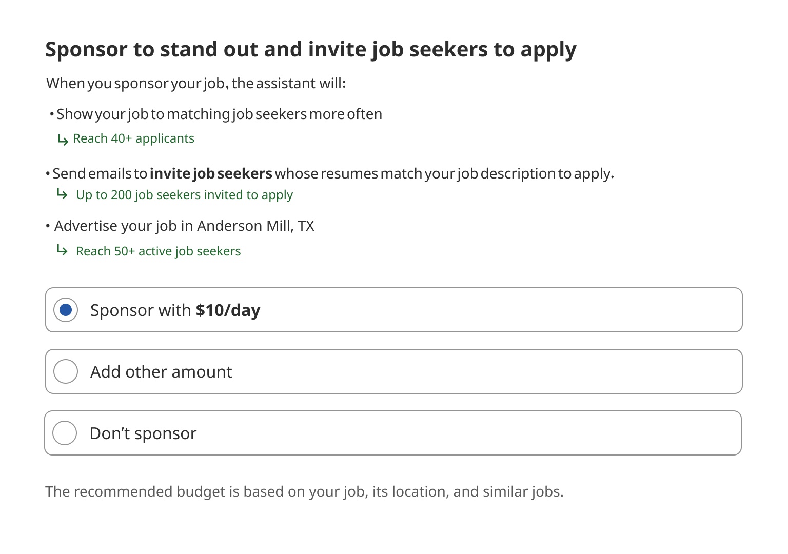
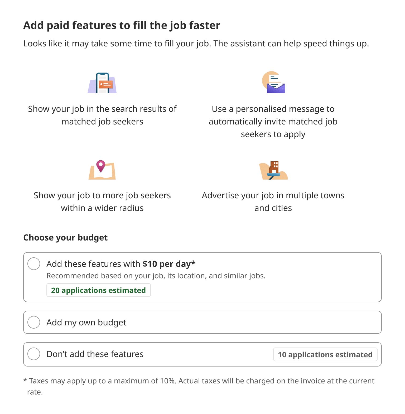
The more features the virtual recruiting assistant had, the more text was required to explain those features. Instead of explaining 10 complex features up front, we showed employers what a job listing looked like before and after activating the virtual assistant, making sure to highlight the updates. The new design presented a high-level overview and showed the exact details later.
The overview significantly increased opt-in. The job preview increased opt-in and reduced the number of job postings for which employers disabled the assistant. One downside of the overview: we saw employers adopting fewer features of the tool. We assumed the reason was a lack of explanation for why these features were necessary.
—
Is this article helpful? Subscribe to get occasional emails with new stories like it.
—
Share data to build confidence
Employers appreciated some of the suggestions our automation tool made, and they wanted to know which updates would apply to their postings. They also wanted to understand the reasoning behind the changes we were making. For example, in one prototype we tested, we encouraged employers to display the average salary and a salary slightly higher than the average in their postings. Employers told us they appreciated learning about these salary trends and understanding why Indeed was making those suggestions.

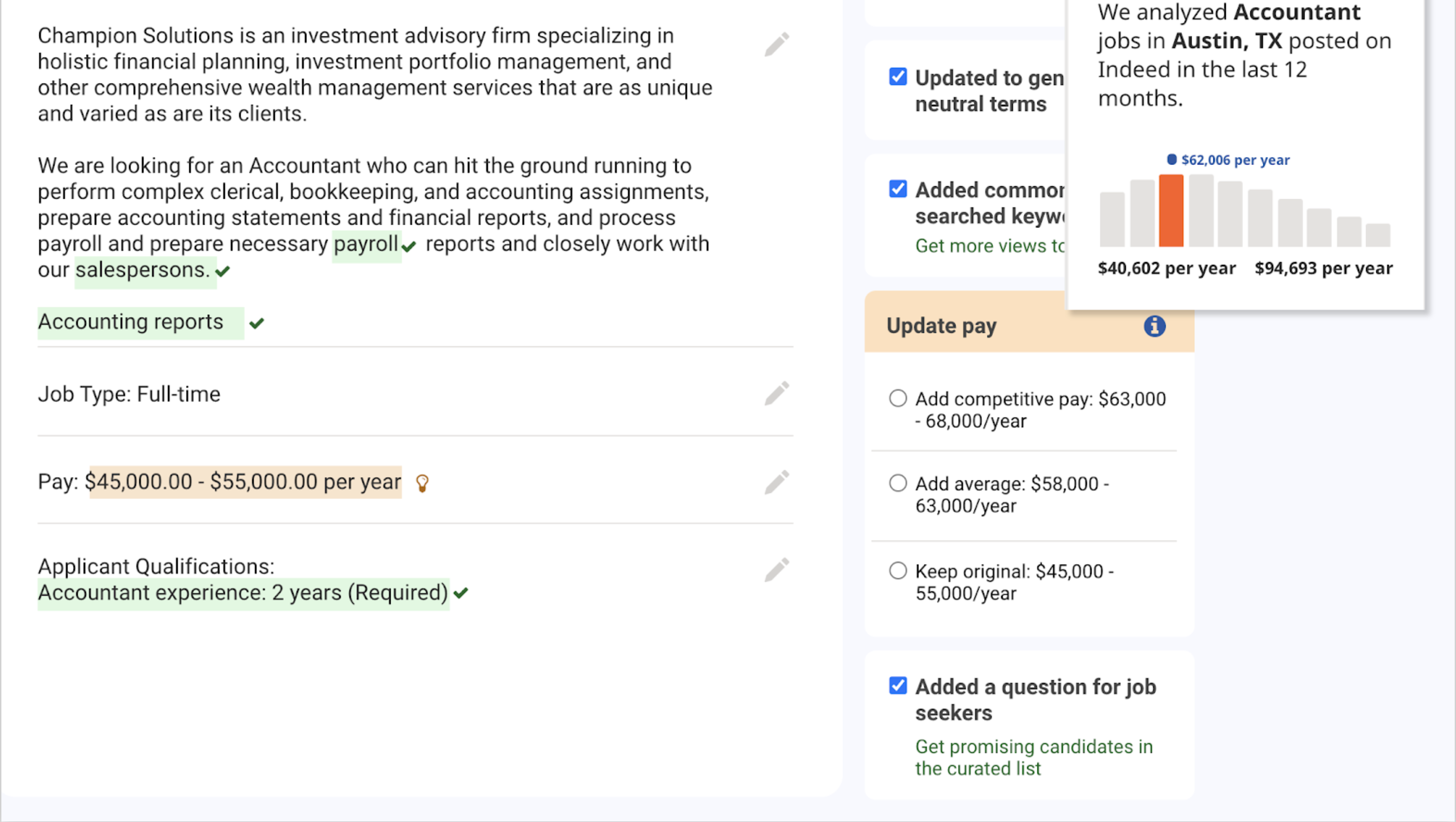
When we tested this feature in the actual product, the number of job posts that appeared with salary information increased, and salaries were higher than the market trend. This feature alone increased the number of interviews confirmed by job seekers. And our mission is to help people get jobs, so this felt like a big success!
Let users have the last word
Indeed posts a lot of jobs. We know the market trends and which keywords job seekers are searching for. But the employers are the ones who hire. They know what candidates they want, how much they can pay a new employee, and what kinds of experience they want the new employee to have. Sometimes the suggestions made by the tool weren’t helpful. For example, one user reported an inaccurate change by the virtual recruiting assistant, which altered the job title “Class A Truck Driver” to simply “Truck Driver.” The employer needed specifically class A truck drivers. Certainly, this must have been frustrating.
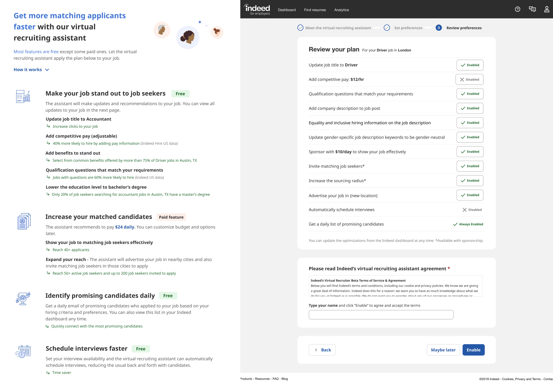
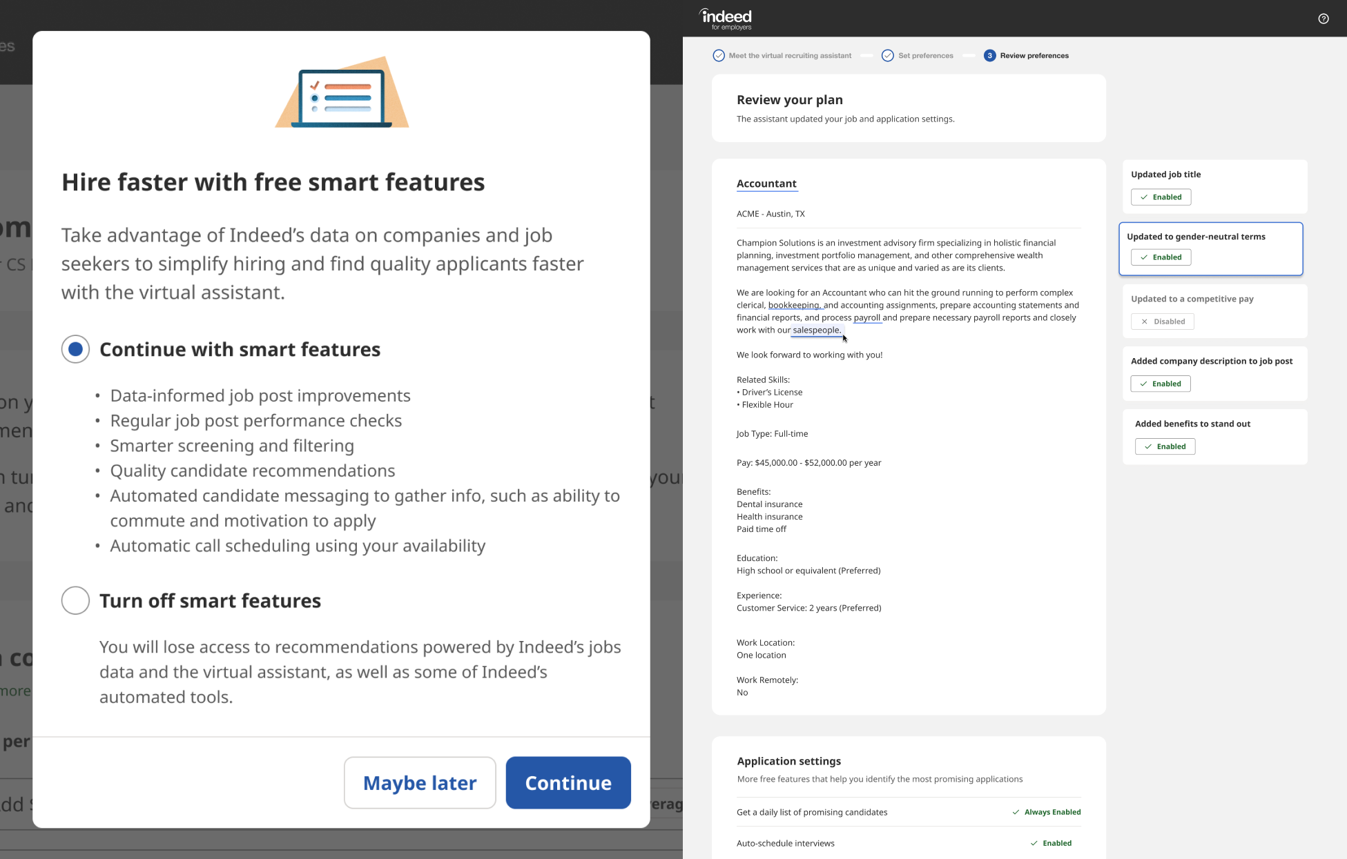
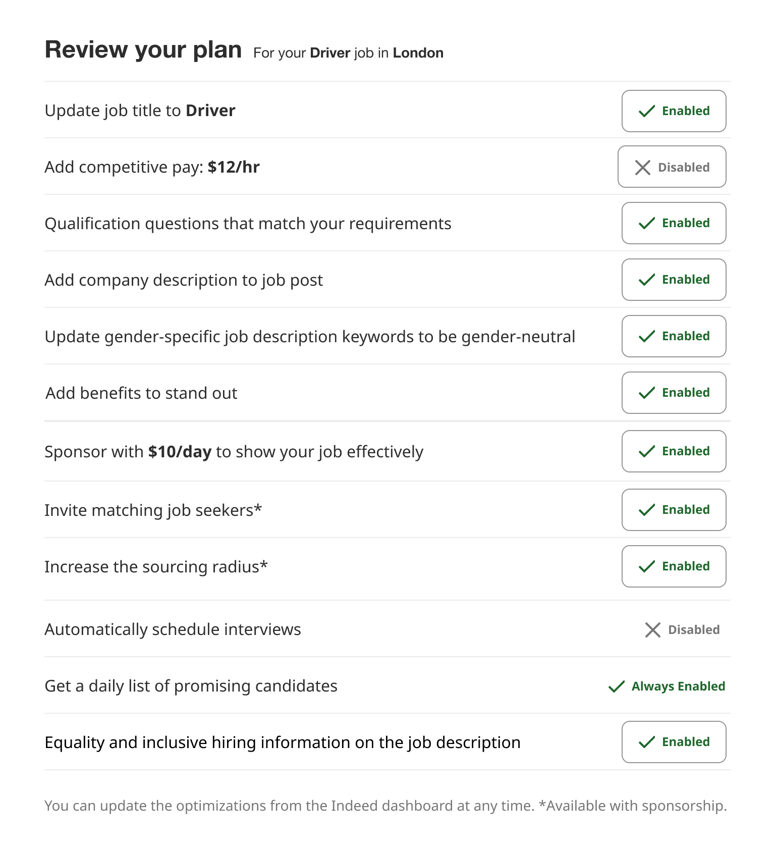
Employers believe their jobs and hiring processes are unique. If they don’t think the suggestions made by a virtual assistant apply to their goal, they won’t bother to turn it on. In our case, when we allowed employers to choose which features of the virtual recruiting assistant to use, more of them activated the tool. After hearing from users, we proposed a solution to allow employers to review and turn off specific features. Here’s what that looked like:
Accept the limits of automation, and have a recovery plan in place
Despite the many benefits of automation, we’ve learned that it can’t make every part of hiring better. For example, Indeed has the data for the market trends and can help employers understand how to use it to their advantage, but employers know their own needs best. We can help employers set realistic expectations and understand what’s required to land that ideal applicant, but we can’t make decisions for them. We can be aware that automation tools may make errors, and have a plan in place for when they do. For Indeed, this means monitoring how job listings perform, which helps us find mistakes so we can make suggestions that employers can accept or reject.
A year after delivering the virtual recruiting assistant to employers, Indeed decided to retire it and embed its features in the core employer experience instead of keeping the assistant as an add-on.
Now, our team is using what we learned to develop a new way of automating to save employers time and effort during the hiring process. Our experience with the virtual recruiting assistant taught us that it’s important to:
- Use visuals to quickly communicate the concept without overwhelming users with too much information.
- Suggest options while allowing users to edit.
- Test different methods and language to explain how automation works.
Employers want our expertise but hesitate to rely on automation. Still, we know that automation offers important benefits for our users, so we keep working to develop tools that make Indeed the most efficient and effective hiring platform for employers. You might be using automation to improve your product. These insights helped our team learn more about our next project, and I hope they can help your team too.


