

Prototypes quickly turn ideas into something more tangible and make it easier to communicate and validate your work. They aren’t expected to be a perfect or complete version of your product.
But they do ensure your solution works as expected and help you solicit feedback on your designs as you fine-tune them. And because time is always at a premium for product development teams, prototype designs offer a fast way to introduce the possibility of building something valuable.
Follow along as I share some tips to help you get started and set yourself up for success later.
Before you start prototyping, consider these three questions
- What’s the purpose of your prototype design?
- Who will use it?
- What’s the best tool to use to build your prototype?
If the purpose of your prototype is to test an early concept with your coworkers, you may just need a low-fidelity prototype. You may need a high-fidelity version if you’re testing a new feature and its usability with actual users.
What is fidelity, and why does it matter?
Simply said, the fidelity of a prototype design indicates how close a prototype is to the final product. Low-fidelity prototypes are rough outlines of the final product, while high-fidelity ones look and behave almost the same as the final product.
According to “Prototyping for Designers: Developing the Best Digital and Physical Products,” by Kathryn McElroy, fidelity is determined by five dimensions: visual, breadth, depth, interactivity, and data model. As fidelity increases, the dimensions of a prototype move closer to those of the final product.
- Low-fidelity prototypes: Usually, all five dimensions in low-fidelity prototypes are far removed from those in the final product. One example of a low-fidelity prototype is paper prototyping, in which you draw user interfaces on paper (or using a digital tool like Balsamiq).
- Mid-fidelity prototypes: In this case at least one dimension is almost identical to the one in a final product. Prototypes made in Figma are usually considered mid-fidelity. You can create designs with pixel-perfect visuals, but interactivity is still limited to some extent.
- High-fidelity prototypes: A high-fidelity prototype looks and behaves almost identically to a final product at first glance. In addition to visuals, it has other elements of the five dimensions that work as well as the final product. You can use tools like Axure or even code to build high-fidelity prototype designs.
Use high-fidelity prototype designs for all kinds of purposes
Although all levels of prototype fidelity are powerful when done right, I see a lot of value in high-fidelity prototypes. I’ve used Axure to create interactive high-fidelity prototypes that can simulate precise interactions for several years. So let’s review three cases where I created and used a high-fidelity prototype on our team at Indeed.
Case 1: Testing designs
When validating designs through user testing, there’s a difference between having participants interact with a prototype as they would with an actual product and simply asking them what they would do without the opportunity to use the product. You’re more likely to capture accurate reactions if participants interact with your prototype, especially when they believe it’s real.
I built a high-fidelity prototype in which participants can type in job-post information such as job title, salary, and job description. This allowed us to see what they typed first, what errors they made along the way, and other helpful insights. For example, in a design that accepts only numerals, we found that an error occurred when participants typed in salary information as text—like “five million yen.”
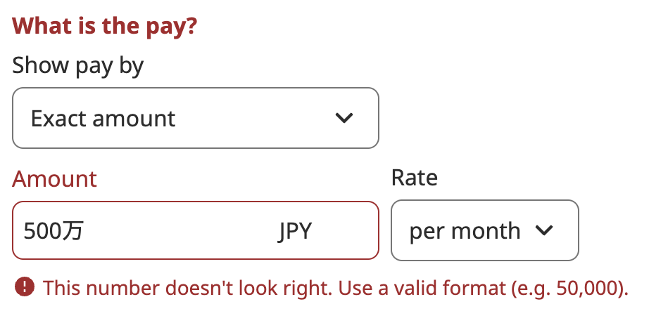
We might not have found the issue if we didn’t ask users to type in the amount. If we’d asked them verbally in a meeting what they think they’d type hypothetically, they would have called out “5 million yen.” This kind of feedback doesn’t clarify whether the user means “5,000,000” as numbers, “five million yen” as text, or something else.
Case 2: Communicating ideas clearly
As you proceed in a design process, you usually need more detailed specifications for how your designs work. Although major user-interface design tools such as Figma support a basic level of prototyping, it’s sometimes not enough to create a high-fidelity prototype with detailed interactions.
When I worked on a feature that progressively disclosed more information based on user inputs, I needed to clearly communicate how it worked in detail, including when and how information is disclosed, among other factors.
In addition to documenting the design in Figma, I built a prototype showing how information is progressively disclosed while users type. This allowed me to easily demo the feature with the team without much explanation.
This kind of detailed interaction is sometimes hard to document and communicate. You could create a text document or some flows to supplement designs. But the most intuitive method is to show a prototype with functional, detailed interactions as they work.
Case 3: Fine-tuning interactions
When designing interactions and interfaces, what users will see at major points needs clear definition (at the least).
For example, in the case where users type their email address in a text field, UX designers likely need to determine what users will see by default and what they’ll see after they finish typing.
But there are more interactions between those points. First, users move a focus to the text field, either by dragging a cursor or using a keyboard. Then, they start typing their email address and may type something that doesn’t look like a valid email address by mistake, which prompts an error message. And they need to move a focus out of the text field once again to confirm their entry once they’re done typing.
Remember that a user’s attention will be pulled in multiple directions during a product experience, so how you define each step really matters for keeping them on track and feeling confident.
When I worked on a job-preview feature for employers that previews how a job post will look, I created a prototype showing how it responds to scrolling and changes in the height of a viewport in a browser. This example is hard to imagine because designs change dynamically, responding to user interactions. Through several iterations, I was able to fine-tune the details, and it looked like this:
Sometimes, it’s hard to imagine what users will experience from beginning to end, making it difficult to pay attention to specific design details. A high-fidelity prototype allows you to try out an entire flow, which can help you work out the details of what users experience.
Advice for creating prototypes
Now that I’ve shared what I’ve experienced, here are some tips to keep you flowing through your work effectively.
Focus on your purpose, and don’t overdo it
A prototype should always have a clear purpose. That purpose determines which part of the prototype needs extra care. If you’re creating a prototype to test your designs, the features you test should be more detailed than the rest of your prototype. If you’re making a prototype to communicate ideas, you only need the elements that demonstrate your ideas.
A few times, I’ve realized I was focusing on creating a prototype for its own sake, adding unnecessary details for the purpose of the prototype. Once you start building a prototype, it’s easy to focus on fleshing out and finalizing it—but always ensure that everything you do is for a purpose.
Don’t spend much time building your prototype designs
Creating prototypes is fun. And early in my career, I spent a lot of time trying to make mine as polished as possible. But prototypes are temporary. Once they’ve served their purpose, they have no use, so don’t invest too much time trying to make them perfect.
Choose the right tool
I introduced a couple of tools here, but there are others that can help you build your prototypes. Each one focuses on a specific level of fidelity and has strengths in mobile or desktop experiences. Choosing the right tool will speed up the process and help you get the most out of your prototype.
New tools are always coming into the market, and most offer a free trial or an account with limited features. It’s a good idea to take advantage of these offers. You may find a great new tool to help you build your next prototype.


