Any product can be improved with the help of user feedback. However, quality feedback can be hard to get without the support of a dedicated UX researcher. During my time at Indeed, I’ve been on teams with and without a UX researcher. In both scenarios, I’ve learned effective ways for UX designers to collect and incorporate user feedback on their own. There are two methods—unmoderated user testing and in-product feedback—that I’ve found to be particularly helpful.
Unmoderated user testing
Remote, unmoderated testing helps catch usability and comprehension issues before your feature gets built. Consider using a platform like UserTesting to run unmoderated tests consistently. You can also streamline your test setup by creating a research-plan template that includes:
Research questions
Frame your questions around usability and comprehension issues for the most informative results. For example, questions like, “Do users understand how to X?” or “Do users understand what X means?” will provide your team with straightforward, actionable answers. Value-based questions, such as “Do users like X?” are more subjective and difficult to answer with unmoderated user tests.
Task flow
Define the tasks or features you want to test in your prototype. Organizing note-taking around tasks instead of participants makes it easier to summarize findings afterwards. For example:
Task 1: Find a job at Beta Experts that matches your desired salary
• [Issue participant 1 had]
• [Issue participant 2 had]
• [Issue participant 3 had]
Summary:
• [Issue observed across participants for this task]
A script
Once you’ve identified your tasks, write a step-by-step script users will see during the test. A good script asks open-ended questions that allow users to elaborate on their answers given their experiences, rather than close-ended, yes-or-no questions.
Tips for writing an effective script
My team often starts a script with a warm-up question to set the stage for the test, put users at ease, and gain some context on a recent personal experience. For example, “Please tell us about your current job search. What’s important to know when looking for a new job?”
Next, the script presents a series of task questions, where we ask users to perform a task or interpret some content. Here are some tips for writing effective task questions.
It’s ok to:
- Remind users to think out loud and explain their answers.
- Tell users how much time to spend on a task with a suggestion like “Spend no more than two minutes on this page.”
- Provide guidance for when users should move forward, with prompts like “When you see search results, move on to the next task.”
Avoid:
- Asking users to predict the future. Instead of “Do you think you would use this in real life?” ask, “Have you used this kind of feature in the past?”
- Yes-or-no questions. Instead of “Did you find X easy to use?” ask, “What, if anything, was easy or difficult about using X?” to learn the reason behind their decision.
- Leading questions. Instead of “On a scale of 1 to 10, how frustrated are you by the lack of filters?” ask, “On a scale of 1 to 10, how important are filters on this page?”
Finally, the script should end with a wrap-up question, giving users one last chance to reflect on their experience and provide feedback. You might ask, “If there was one thing you would change or improve, what would it be?”
If possible, ask a UX researcher to review your script to ensure quality findings. I also recommend running a pilot test to catch issues with your script or prototype that may be confusing for participants. Once you have a reusable template in place, it’s easy to launch new tests.
Indeed’s UX designers often work with design technologists to build high-fidelity prototypes that allow for complex interactions and integration of real Indeed data. These can be difficult to replicate in tools such as Figma. Over time, our team has refined a process to user-test prototypes and collect feedback every three weeks, allowing us to efficiently validate designs before they’re implemented.
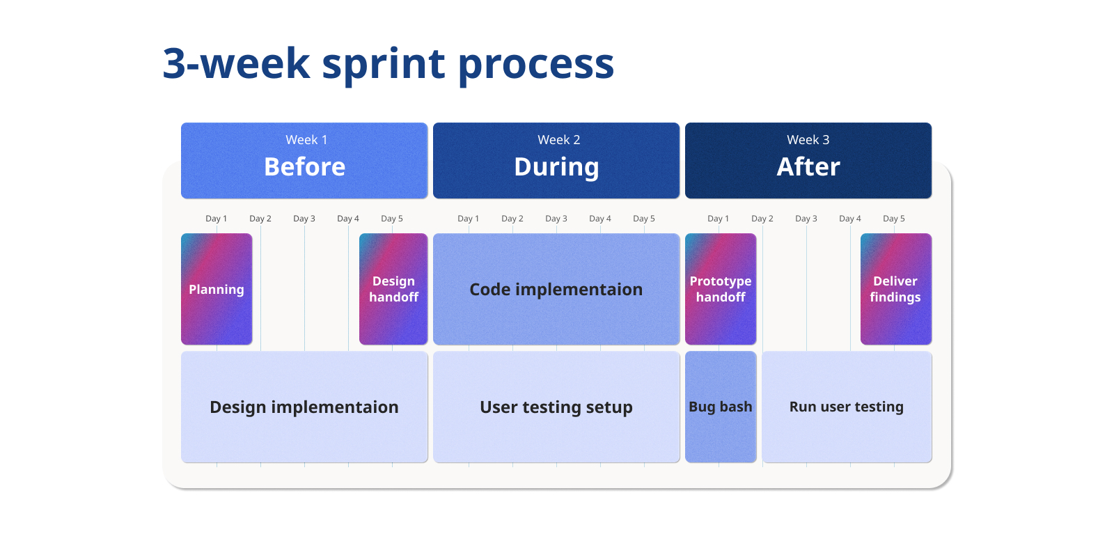
Unmoderated user tests are great for quickly identifying usability and comprehension issues before engineers invest time and effort into developing your features. However, these tests aren’t well suited for predicting the success of a feature. Once a feature is launched, the best way to gauge its value is with in-product feedback.
In-product feedback
Asking for user feedback directly inside your product experience can provide valuable insights. Metrics may change when launching a new feature, and it’s not always clear why. Collecting feedback within the product can identify problem areas and broken experiences you might not be aware of otherwise. Indeed’s guidelines help us gather and report feedback consistently across all our products. A couple tools we use can help your team, too.
Yes-or-no questions
To get feedback on an individual feature or section on a page, I recommend asking a yes-or-no question—such as “Is this X useful?” This may not yield significant results when only six or seven user test participants respond. But answers from hundreds of users can deliver a usefulness-percentage metric helpful in determining whether features are viable or not. You can also compare usefulness percentages across features to get a sense of what resonates more with your users. In the past, our team has killed features with a usefulness metric less than 60 percent.
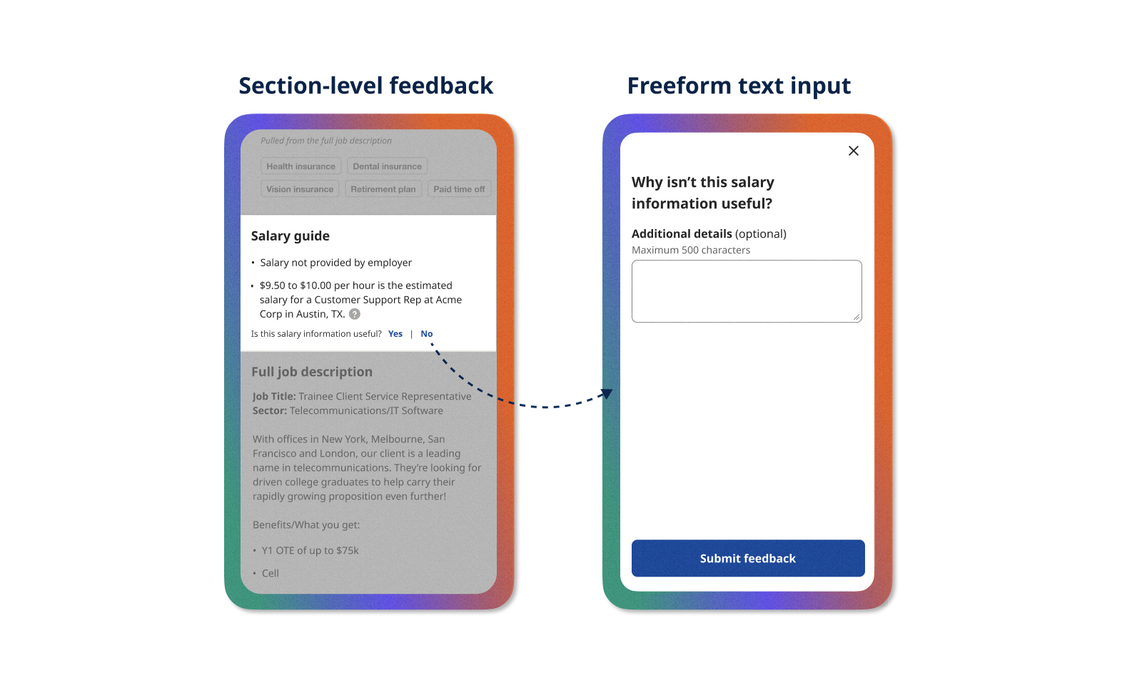
The yes-or-no question typically follows up with a freeform text input that offers users a chance to explain their feedback. Once we’ve collected a good amount of verbatim feedback, we review a sample of around 100 and identify common themes. Afterward, we categorize a larger sample with those themes to get an idea of the size of each problem. In the example above, people often disliked when we showed salary estimates below minimum wage. Without a feedback mechanism, we wouldn’t have known this was an issue.
5-point scales
For page-level or satisfaction feedback, a five-point scale offers a more granular metric. Indeed uses smiley faces instead of numerical ratings because some users have misinterpreted which end of the numbered scale is good or bad, and star ratings are reserved for our company review product. In the example below, we asked users to rate the relevance of their job search results. If users select a poor rating, we ask them to identify the reasons why, which helps us measure progress on solving problem areas over time. The list of reasons you offer can be created from prior verbatim analyses, customer support tickets, and user research.
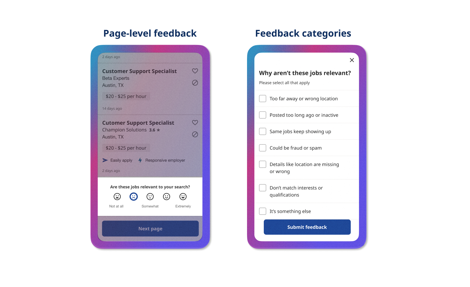
In-product feedback is a great way to help your team measure how much users value a product feature, and findings can uncover problem areas once your feature is launched. You’ll need to partner with engineers to implement the feedback mechanism and create a place to store the feedback, but the benefits outweigh this one-time cost. Keep in mind that feedback analysis often works best as a collaboration between Product and UX because it can shape the team’s backlog and priorities for the better.
Collecting user feedback without a researcher is possible
Ideally, UX designers can rely on UX researchers to answer questions about how their products are used. But at some times in your career, you may not have a dedicated researcher to work with, and that shouldn’t stop you from setting up processes to collect user feedback on your own.
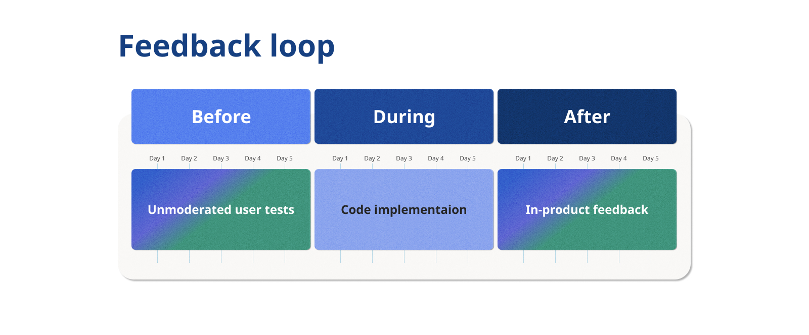
Observing unmoderated user tests pre-launch and collecting in-product feedback post-launch can create a feedback loop that continuously validates and improves your product. And you don’t need a researcher to do either. If you ever feel in the dark about how your designs are performing, your team is your best resource. Start by identifying key needs together, then collaborate to set up feedback mechanisms in your product. Remember these tips, and you’ll be on your way to creating a solid foundation for a reliable feedback loop.


