Visitors to Japan are often surprised by the convenience stores (コンビニエンスストア, konbiniensu sutoa), locally often shortened to konbini (コンビニ). Whether you’ve popped into a 7-Eleven, Lawson, FamilyMart, Daily Yamazaki, MiniStop, or one of the smaller chains, you’re in for a treat.
When you walk into the store, the products on the shelves make you feel like you’ve entered a giant kaleidoscope. Before moving to Japan to work for Indeed in 2018, I’d visit as a tourist and browse for hours. I’d buy instant ramen, midnight snacks, toothpaste, and anything else that caught my eye.
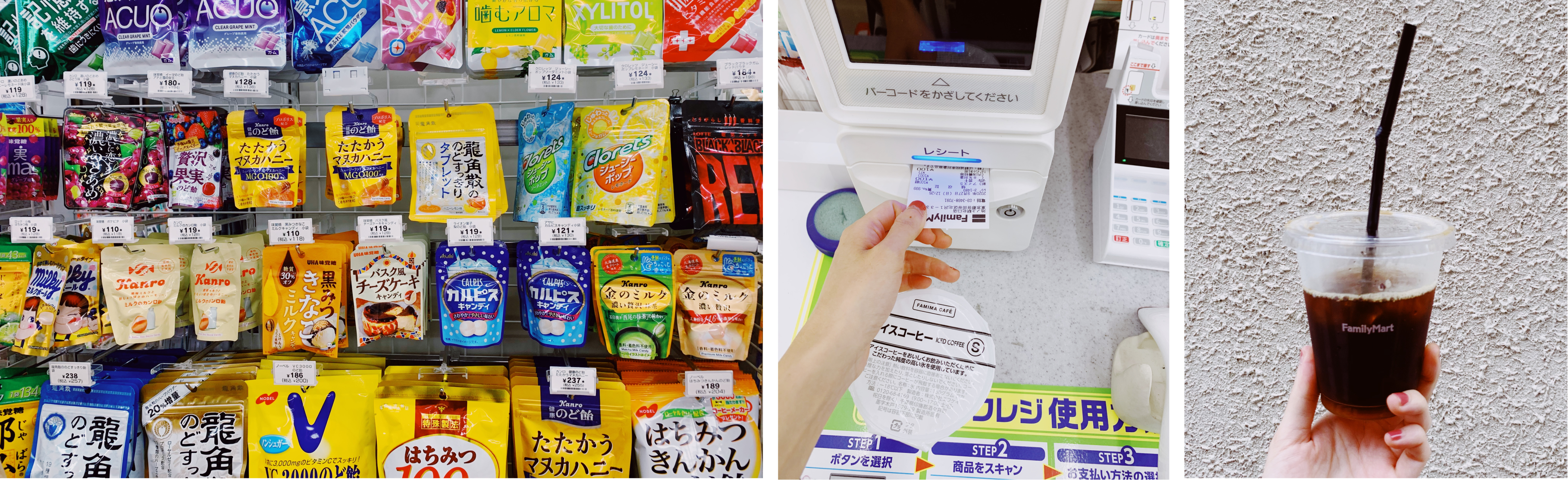
The endless variety of drinks and snacks is still amazing. But when you live in Japan, the konbini is also where you go to pay bills, buy tickets for concerts, send parcels, print documents, get freshly made coffee for ¥100, pay for online purchases, and buy special seasonal and limited-time offer goods.
As a product designer, the konbini experience isn’t just about convenience and spectacle. It’s a source of inspiration for considering how to create engaging and user-focused experiences. From the graphic design, to the way-finding and content, the konbini holds a series of design lessons.
Here are a few favourites.
Onigiri wrapper
Design lesson: Clear onboarding sets users up for success
When you visit a konbini, you must try an onigiri (お握り). These rice balls stuffed with a variety of different fillings are often wrapped in nori (海苔), a dried edible seaweed. They are usually molded into a triangle or a roll shape. One reason onigiri is so popular is because the design makes it easy to eat.
Konbini onigiri has a creative packet design that keeps the rice and seaweed separate until you open it, ensuring the seaweed stays crispy. On the packaging, clear instructions with illustrations show you exactly how to enjoy the product as intended, even if you can’t speak Japanese.
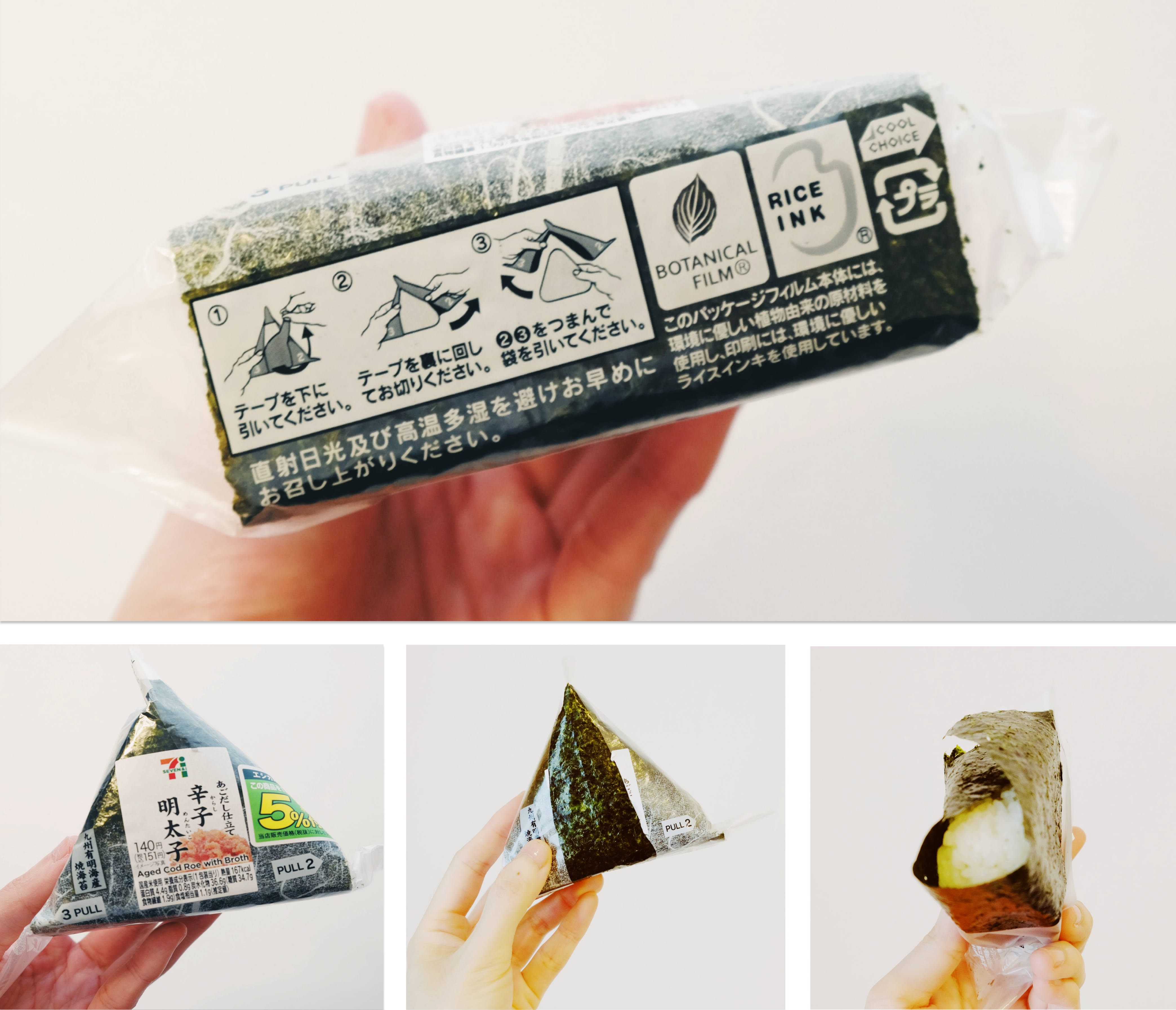
Trying something for the first time can be stressful, but giving clear onboarding instructions can make that decision easier for users. I’ll often buy something new in the konbini because I know that I’ll have the information I need to enjoy the experience.
7Bank ATM
Design lesson: Accessibility accommodations can benefit everyone
When I visit the konbini, I’ll often buy coffee and snacks, and maybe print some documents. Then, when I’m holding all my purchases, I realize I need to get cash out at the ATM. Luckily, some 7Bank ATMs offer a stand where people can rest walking aids like crutches and a cup holder for drinks. The stand is like a butler smiling at you and waiting to provide help.
The 7Bank ATM also provides prompts for the different senses during the process. It uses visual cues with flashing blue lights to remind the users where to start and get their cash from the drawer. After taking out money, the ATM plays audio telling users not to forget any belongings.
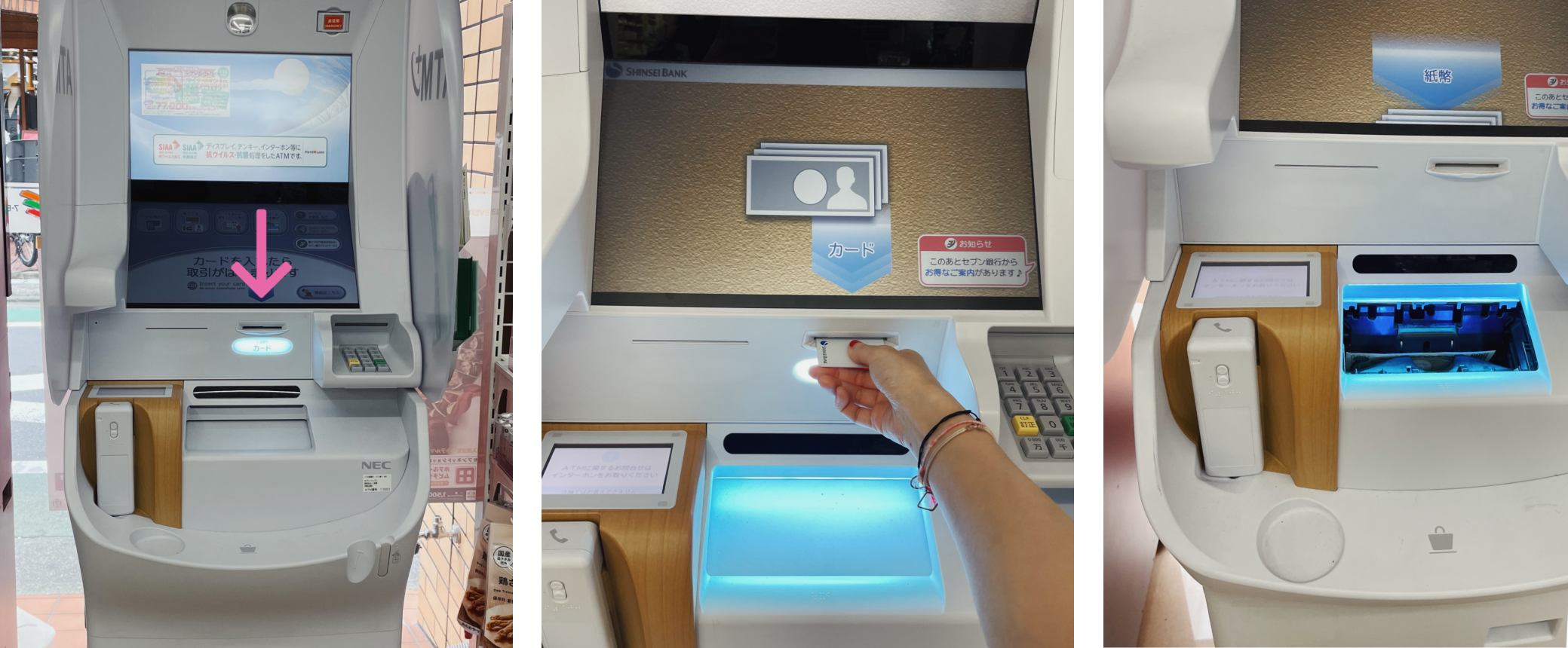
These cues make the process more efficient and provide a safeguard for people who rely on different sensory modalities or those who just might get a bit confused. When I’m in a rush and juggling a few items, I find this really helpful and haven’t forgotten to take my money… yet!
It’s the job of everyone on a product team to champion accessibility. By making your product accessible, you can help more people benefit from what you’re offering.
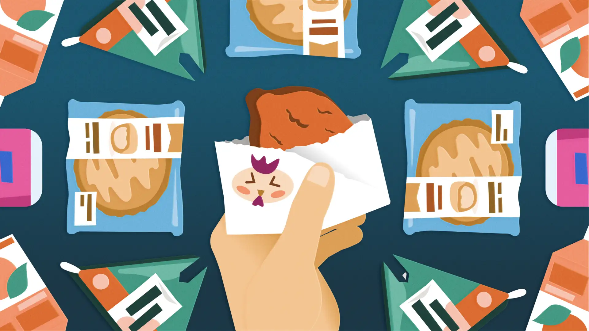
Fried chicken bag
Design lesson: Observe and fix broken experiences
If you need a quick snack, konbini fried chicken is the perfect choice. It might seem like an unusual thing to eat on the go, but konbini fried chicken is so popular because it’s solved the problem of greasy fingers with a perfectly designed bag.
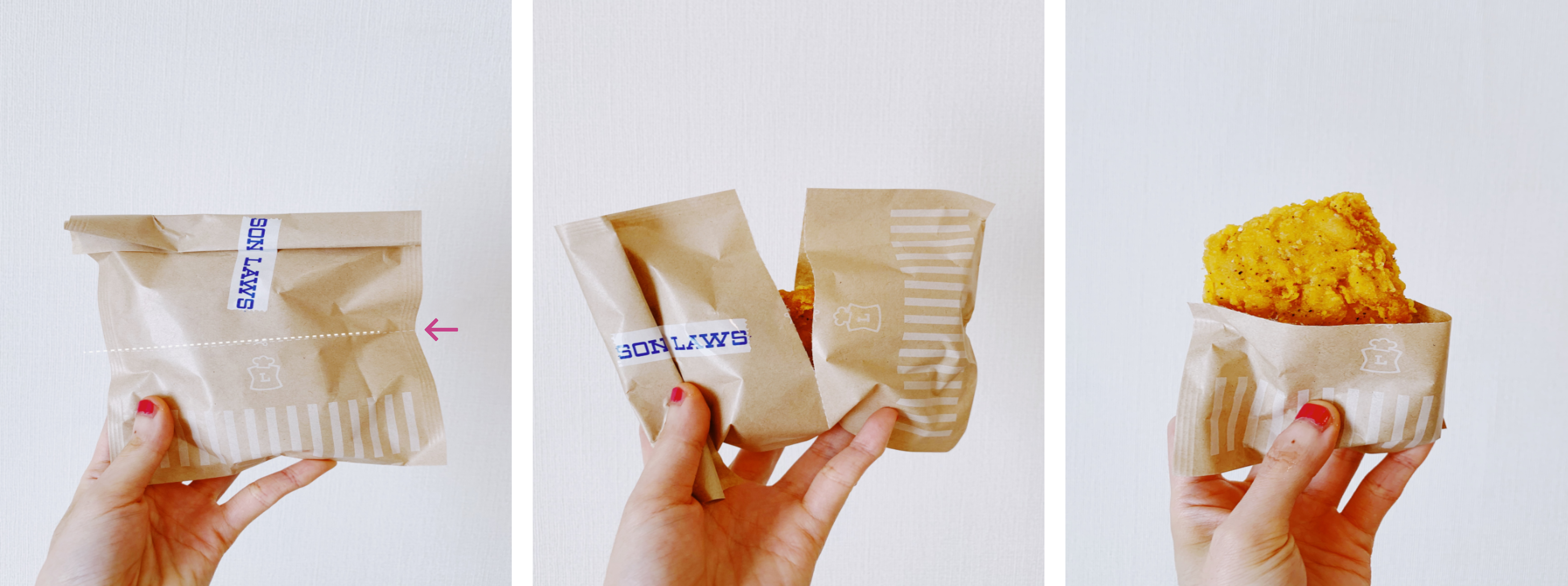
The design is simple. Tear the bag at the perforated line that runs down the middle, and use one half to hold the hot chicken while you eat. A greasy food you might not usually eat in public has been transformed into a tidy and mobile snack.
Thanks to the well-designed bag, konbini chicken is huge in Japan. Online, you’ll find rankings of the fried chicken in different stores and reviews about each option, detailing everything from the texture of the coating and juiciness of the chicken, to the seasoning and the presentation.
Identify your users’ needs by researching their recurring tasks. In this case, a simple design modification creates a smooth and delightful food experience. Itadakimasu!
Self-service checkouts
Design lesson: Set user expectations before they begin their tasks
In the FamilyMart convenience stores, self-registers (セルフレジ) help the customers’ shopping flow. Especially during rush hour, an office-heavy neighborhood konbini is packed with office workers. The waiting line can seem too long when it’s time to grab a quick lunch, but the self-register (セルフレジ) provides a faster option.
The self-register (セルフレ��ジ) doesn’t accept cash though, and users need to know this before they get to the front of the queue. Some stores have big signs hanging on top of the machines and around the tables that remind people of this. Paying in a preferred way and collecting points is important to locals. So even though cash isn’t an option, the self-register (セルフレジ) accepts multiple forms of digital payment, like transport cards Pasmo or Suica, point cards like WAON, credit cards, the social app LINE, or even FamilyMart’s own system, FamiPay.
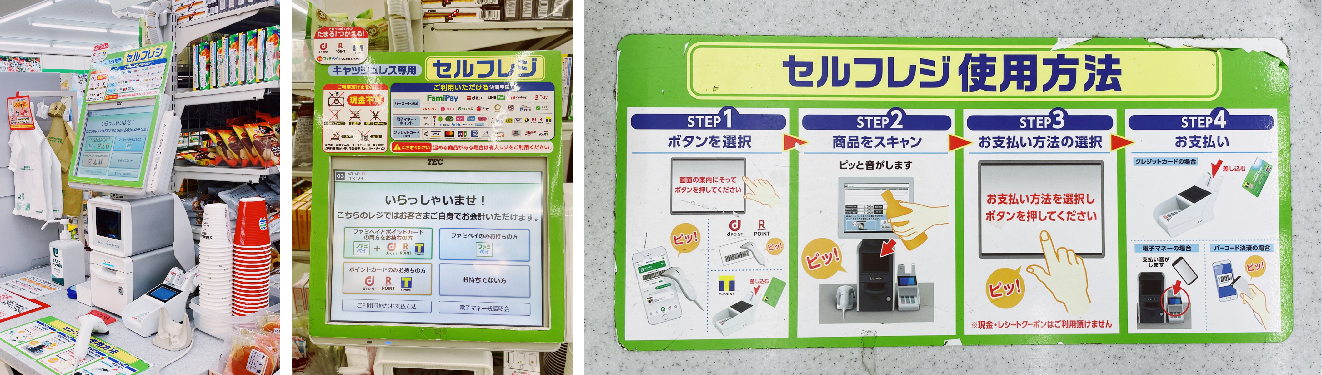
By understanding their options before they choose a payment queue, users can have the quickest experience possible and pay in the way that suits them. Find small ways to support your users, and empower them by providing the information they need to complete their tasks.
Soy milk carton
Design lesson: Consider the entire user journey
In product design, we often say we need to design for the end-to-end experience. So what’s the final experience of enjoying a carton of soy milk? Some might say it’s when you finish the drink or throw it away. Kikkoman soy milk is one of my favorite drinks I discovered at the konbini. One day, as I folded my soy milk carton, I noticed some copy: “Thank you for folding me ❤️”
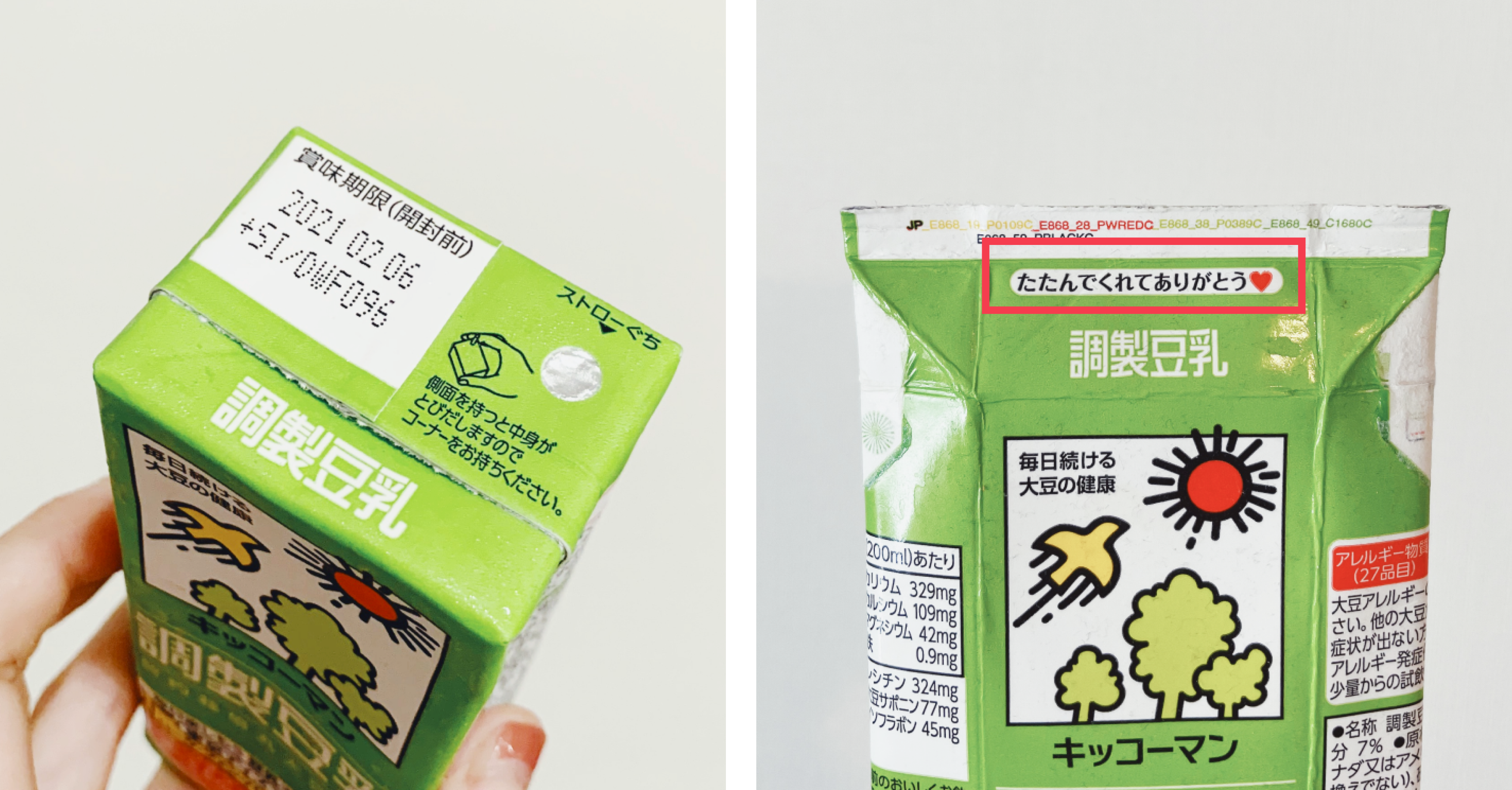
The packaging design anticipates the user’s behavior when someone flattens the box for recycling. The added copy rewards the user for doing the right thing. Next time you finish a milk carton, you might wonder if there’s another secret message waiting for you. Good UX design can make routine tasks that people typically don’t enjoy more pleasant. The copy on the carton doesn’t just recognize users for recycling, but the design also brings some joy into the process of using the product and may even influence users’ future behavior.
The considerate konbini
思いやり(omoiyari, consideration, thoughtfulness) is a Japanese word I always remember because my Japanese teacher specifically mentioned how important it is. He told us that 思いやり(omoiyari) should be the way we treat people. It means being considerate and putting ourselves in the shoes of others before we comment or make a judgment.
Many design lessons from konbini are good examples of 思いやり(omoiyari). Keep your users firmly in mind when designing your product. Create a clear onboarding experience, set expectations upfront, observe your users, and fix the broken experiences. Furthermore, make sure people can enjoy your products by creating an accessible experience and communicating clearly.
I’d love to hear the design lessons you learn the next time you visit Japan! 👋👋🏻👋🏽 Follow me for more inspiration and my design journey on Instagram and Medium.