As a Senior UX Content Designer at Indeed, I’m part of a UX team that partners with product managers, researchers, and developers to design experiences that help people get jobs.
But as a content professional, I’ve dipped my fingers into just about every content cookie jar—from content marketing and operations to UX writing and enterprise content strategy.
Whether I’m writing for a digital interface or developing content strategies for a complex enterprise, I rely on artifacts to help me do my best work. Using (or creating) the right artifacts at the right time helps me work more efficiently, collaborate more effectively, and demonstrate the power of content design.
But what, pray tell, is an artifact?
Artifacts are the documents, templates, tools, and thingamajiggies that help us improve our content design workflow. They’re the buckets we use to collect inputs, the tidy packages we share as outputs, the “thing” we deliver when we need to deliver a thing. Ultimately, artifacts are the connective tissue across content disciplines.
The right artifacts can help you:
- Improve collaboration between you and the people you’re working with.
- Work more efficiently using templates, preventing the need to reinvent the wheel every time you do a content audit or create a project brief.
- Create process from scratch by building your workflow around the right artifacts for your project or goal.
- Demonstrate value by showing your thinking in a highly visual, consumable, and shareable way.
There are dozens of artifacts a content designer might use depending on the project. But it can be tricky to know which artifacts to choose, how to create them, and how to make the most of them in your work.
Let’s take a look at my top three artifacts and some real-world examples of how I use them in my work as a content designer. If you want to learn more after reading, I’ll be teaching a workshop about these artifacts (and more!) at the last-ever Confab this May.
Content design artifact one: readability metrics report
Readability measures how easy or hard your content is to consume at a glance. A readability metrics report lets you visualize the before and after of the readability of your content. It also gives you a way to quantify the improvements you’re making by adding metrics that prove the value of your work.
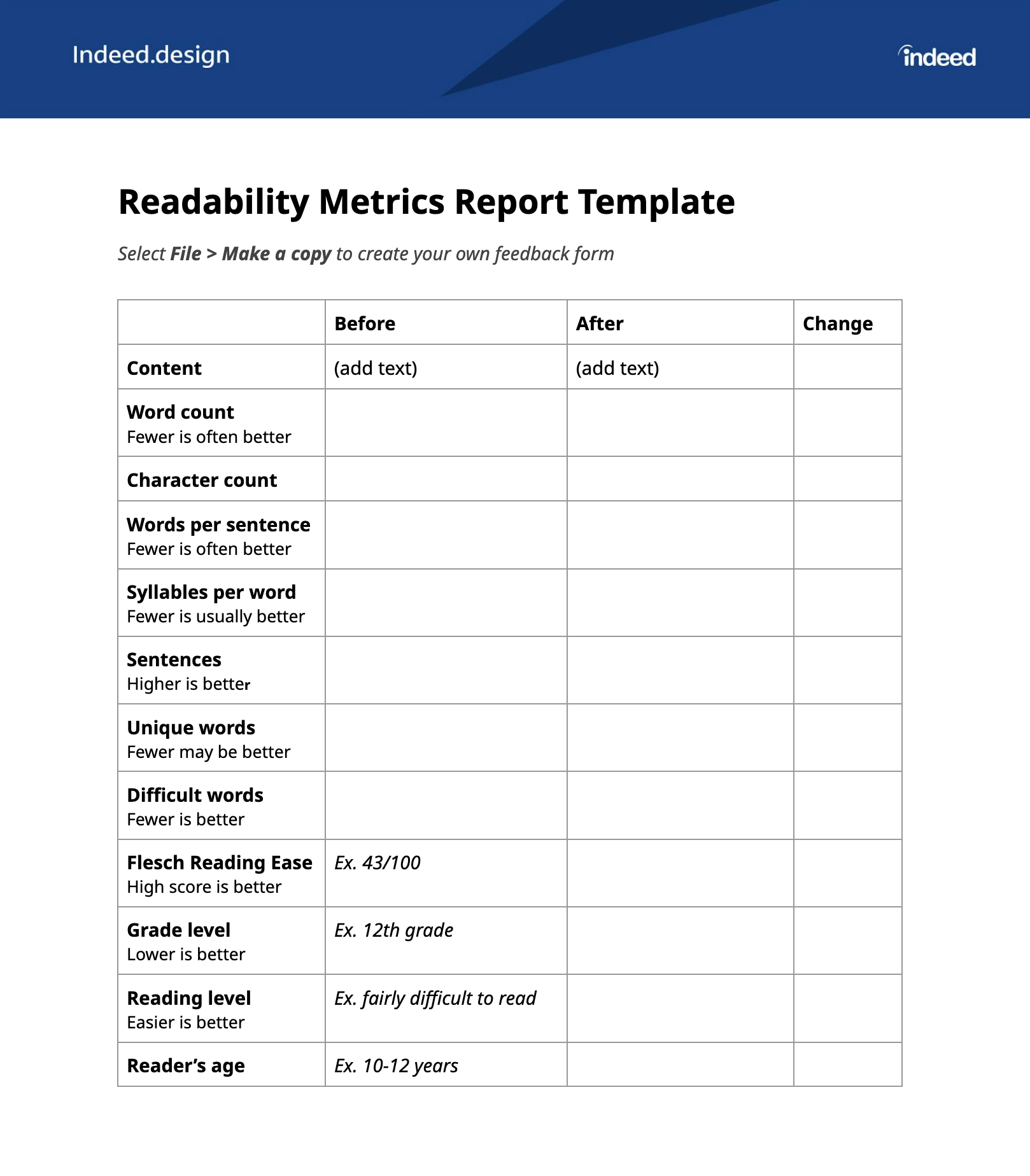
If you’ve ever used a digital writing assistant, you’re probably familiar with common indicators of readability, such as an overall reading ease score, grade level, and words per sentence. All of these factors and more contribute to the overall readability of your content. These tools can spit out a report for you, but they only aggregate the data points for one piece of content at a time.
The readability metrics report is a single-page document that allows you to compare the original piece of text side by side with the revised version. This report also helps you speak the language of leadership. By calculating the percent change for each indicator, you can quantify the degree to which the content has improved.
Case study: Making financial services content easier to read
I first created a readability metrics report while working in a past role at a large financial services organization. My goal was to show a program manager the difference between content design and copy editing. Because he hadn’t worked with a content designer before, I didn’t want to overwhelm him with all the roles we might play and the value we might provide. Digging into readability seemed like a good entry point.
To start, I found the worst piece of content I could find on that company’s website. It was a paragraph that clocked in around 20 lines. Plus, it was packed with jargon, legalese, and needlessly multisyllabic words—the classic blunder of a well-meaning writer trying to sound smart by using big words. As content designers, we know the opposite is true. By not placing a cognitive burden on readers when they interact with our writing, we actually make them feel more capable. The easier the content is to consume, the smarter the user will feel, and the more likely they’ll trust and connect with our content and brand.
After revising the content from an intimidating behemoth to a few short, clear sentences without changing the meaning of the text, I showed my work to the program manager in a before-and-after view. It was easy for him to see how the concise content was more scannable and consumable than the original.
To me, this seemed like a simple win. To the program manager who had never seen this type of targeted editing before, it was groundbreaking. He invited me to present the work to our 100+ person design team, which gave me the opportunity to educate everyone—not just about readability, but on the differences between content design and copy editing.
Anatomy of the artifact
My readability metrics report includes three columns. You can make your own copy of my template here.
Column 1: before
Copy and paste the text you want to improve into the leftmost column to show where you started.
Column 2: after
After revising the text to improve its readability, paste it into the middle column. Maybe you’ve reduced the amount of text from a big chunky paragraph to a sentence or two. Or, you might have broken up that paragraph by adding more white space or choosing simpler, shorter words. However you’ve improved the content, it should be easy to see the changes just by scanning the document.
Column 3: Percent change
The far-right column is the money column, friends. For each indicator that evaluates an aspect of your content’s readability, you can calculate the percent by which it changed because of your revisions.
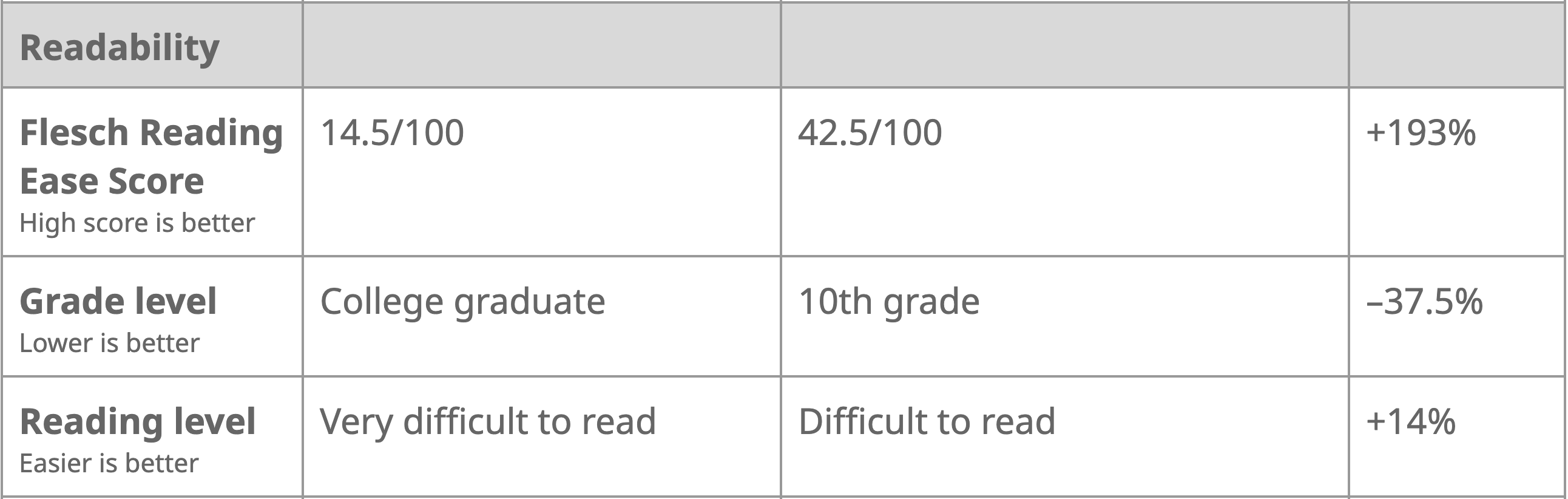
Let’s say the original content had a reading ease score of 14.5/100, where a high score is better. You know the reading ease score because you ran your content through a readability checker like Grammarly or Readability Formulas.
After revising the content, you run it through the readability checker again. Now, the reading ease score is 42.5/100. Nicely done!
Next, you calculate the percentage by which you’ve improved the score. Increasing the reading ease score from 14.5/100 to 42.5/100 is a 193% increase. Shazam!
And that, my friend, is the metric you’ll point out when you share your amazing work with people who like hard numbers and data. Here’s what the percent change column looks like filled out:
How to activate it
A readability metrics report can be a great conversation starter, especially with people who are new to content design and might not understand what the heck you do, anyway.
Activate it by:
- Including a report template in your UX or content project brief
- Sharing the report in content critique or design review
- Adding the report to your Figma file to review before sharing more high-fidelity screens or flows
Content design artifact two: CTA safe list
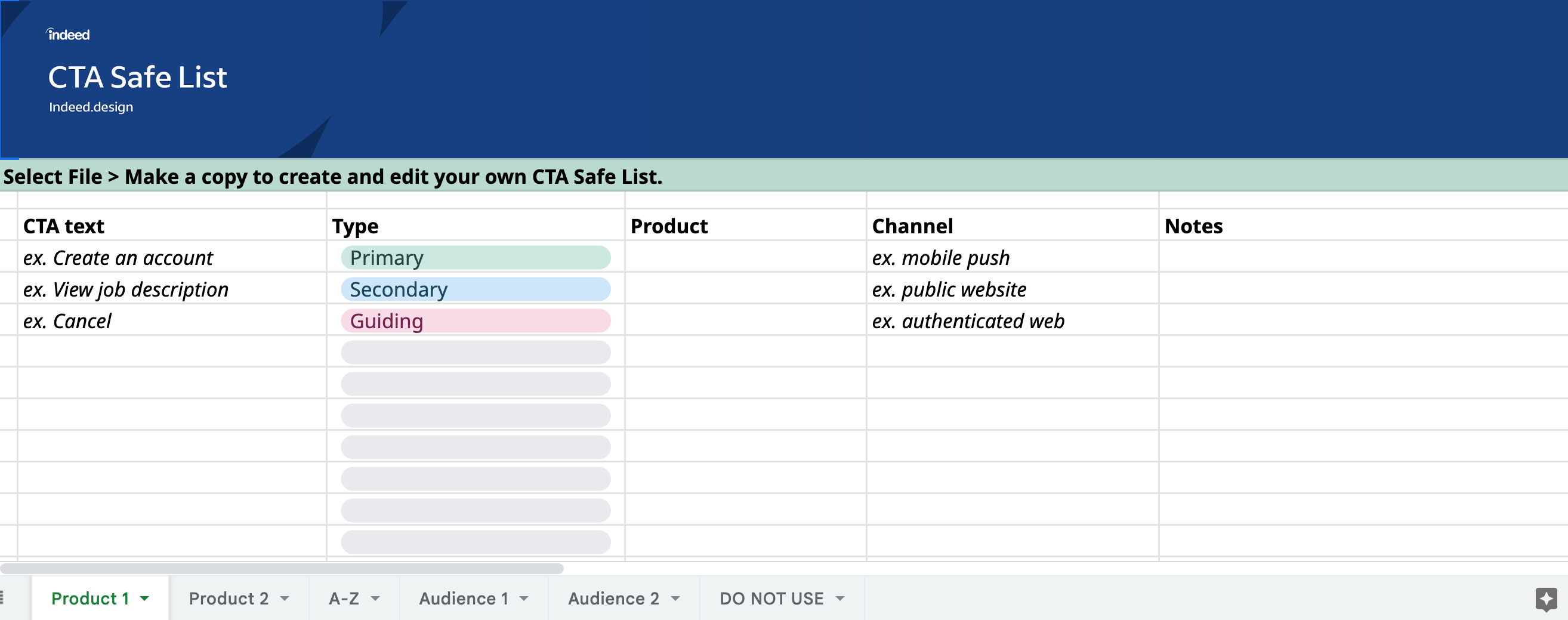
A CTA safe list is a list, spreadsheet, or database of approved, reusable calls to action (CTAs)—specifically the words that appear on a button or link. Your CTA safe list is a holistic approach to content that can be used across products to create consistency and scale the impact of your content design team.
Instead of wracking your brain about which CTA to use every time you’re designing a flow or screen, you can select from a library of pre-approved CTAs. And when you can’t be a part of a project due to time constraints or a lack of resources, you can use this artifact to scale your content reach and govern content decisions. Ultimately, this will save you time and strengthen your strategy by giving your team a cohesive set of terminology and standards.
Case study: “I don’t know, what do you think the CTA should be?”
In a past role at a large insurance company, my team and I conducted an audit of all our CTAs across all customer-facing products and channels. We discovered the CTAs on our public-facing website were wildly different from the CTAs we used in our authenticated experience. The language was inconsistent, the capitalization standards were different, and the voice and tone sounded like two very different companies.
This meant that when a customer purchased a product on our website, they’d be launched into a completely different authenticated experience—moving from a super friendly, cutesy marketing tone (think lots of exclamation points) to a purposefully straightforward style that we typically use in UX writing. The result for customers was content whiplash when navigating between the two experiences, which we wanted to resolve by making compromises across both surfaces.
—
Is this article helpful? Subscribe to get occasional emails with new stories like it.
—
We documented the discrepancies and used the most glaring ones as conversation starters between our product and marketing teams. From there, we met as a cross-functional team to determine where we could make the language more uniform by aligning on templated CTAs that more closely matched our product voice. We captured our decisions in a database created in Airtable and assigned people to keep the list updated.
One of the biggest wins from this project was creating a “Do not use” tab as part of our CTA safe list. This was especially helpful for new content designers who joined the team because it clarified their constraints and documented the reasoning behind the decision not to use a particular CTA.
Anatomy of the artifact
A CTA safe list can be as simple as a list or as complex as a database. Here’s a spreadsheet template you can copy to get you started.
I like to use Airtable to create a CTA database with different views. CTAs can be arranged in whichever way works for you, such as alphabetically by product, channel, or audience, for example, or by where and how they should be used.
Let’s take a CTA like “Apply now.” In your CTA safe list, you can indicate:
- Which audiences should encounter this CTA at which point in their journey
- Where the CTA should appear, such as at the end of the flow or top of the page
- Whether the CTA is primary, secondary, tertiary, or a link, and any relevant design constraints of that content type
- Which supporting CTAs or text should accompany the CTA, if any
Whatever format you choose, your CTA safe list should be accessible to everyone who needs to reference it. That could include content designers, researchers, product managers, UX designers, and anyone who makes decisions about content.
The simpler the format and the easier to find, the more likely people will use your artifact.
How to activate it
- Audit your existing CTAs across all products and properties that are in scope for your team.
- Decide which CTAs should be used and which do not meet your content guidelines. It may be useful to have a separate tab or list of CTAs marked “Do not use” to prevent their use in the future. (This is a great way to address the abomination that is “Click here.”)
- Organize CTAs into categories that follow the mental model of your users, the people who will use the CTA safe list most. These categories could include CTAs by product, team, channel, feature, and so on.
- Socialize the artifact at design reviews, in Slack, or at a lunch and learn. You can also create a walking deck to present to the teams who will benefit most from the artifact.
- Create a maintenance plan to keep the CTA safe list updated. Identify point people who will regularly evaluate the existing CTAs, propose new CTAs, and groom the list to keep it current.
Content design artifact three: feedback framework
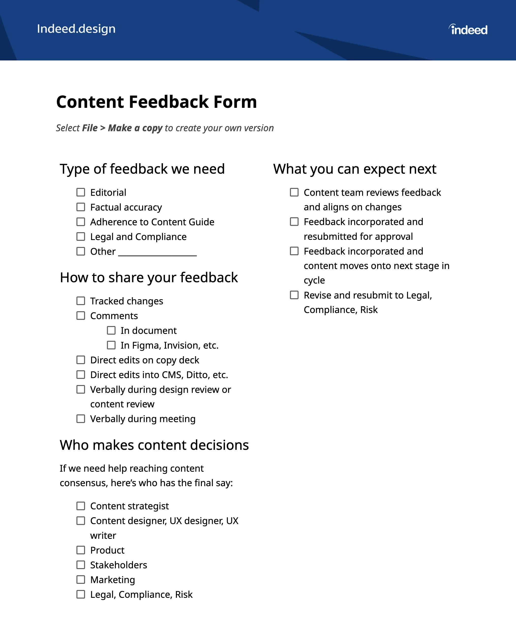
A feedback framework offers product teams a structured way to deliver feedback to content designers. It’s typically a Microsoft Word document or Google Doc and can be a checklist, a list of guidelines, a decision tree, or a collection of principles. Its purpose is to make feedback strategic, intentional, and efficient, so content designers get the type of feedback most valuable to them.
Ditch the arguments with well-meaning colleagues who may or may not have read the content guidelines, and align on a feedback mechanism that works for everyone. If you’re unsure how to start establishing responsibility and accountability, check out the RAPID or RACI methods.
Case study: Not all feedback is created equal
In a past role, my team worked without any kind of feedback framework. When it came time to share our work with our partners, we took an anything-goes approach—which meant anyone could weigh in on any aspect of the content they happened to have an opinion about.
That was no fun, and here’s why.
Without a feedback framework, our content strategists got editorial feedback from engineering and customer service teams. The working team was spending time debating word choices and repeatedly having to educate their partners on content strategy guidelines and standards, UX writing best practices, and how writing for digital products is different than writing, say, an essay in high school English class.
This was frustrating for content folks and inefficient for the subject matter experts they were partnering with. The content team was missing out on valuable perspectives when it came to the engineering constraints for the project, as well as priceless user experience knowledge the customer service reps had from communicating directly with customers every day.
I created a feedback framework checklist to focus the team on the areas where they could provide the most value. On this checklist, I took care to list the different types of feedback one might give when reviewing content.
By showing the team that there are different feedback focus areas, we took a strategic approach to feedback. We were also able to focus their efforts by clarifying that we weren’t looking for editorial feedback on the content, but factual accuracy instead.
I shared this feedback framework at the beginning of our first design review with our stakeholder team. Before showing them any of the screens we were designing, I walked them through the feedback framework and answered their questions about what to expect next. When we shared the actual designs, they focused their attention on technical constraints and accuracy instead of on word choice and style.
Anatomy of the artifact
Feel free to copy and customize my template here. Wherever you begin, your feedback framework should include:
1. Type of feedback needed
If you ask for “feedback” from five people, you’re likely to get five very different responses. This is especially true when you’re asking for feedback on written content. “Everyone’s a writer,” or so the saying goes, which means everyone will have an opinion on the text. But not all opinions are relevant to the content you’re working on, so you’ll want to clarify what you’re looking for feedback on. You might be looking for:
- Editorial feedback on areas like voice, tone, and style
- Adherence to content guidelines
- Compliance and legal considerations
- Factual accuracy of the content
- Something else
Providing these focus areas helps the commenters tailor their responses. It also ensures you’re getting the right type of feedback from the right people. Sure, your compliance expert might moonlight as a novelist, but that doesn’t necessarily make them an expert on content design best practices or your product’s voice.
2. How to share that feedback
Have you ever sent out a document and, in return, gotten 12 documents with 12 separate sets of feedback?
Yeah. Me, too. 🙁
A feedback framework lets you be specific about how you want the feedback delivered. Should it be tracked changes in Word or suggestions in a Google Doc? How about comments in Figma?
Clarify the delivery method to save everyone time (and save yourself some heartburn).
3. Who gives feedback and who makes content decisions
Not everyone gets to give feedback, and not everyone’s feedback needs to be incorporated into your work. Use your feedback framework to clarify who the true decision-makers are and whose feedback is food for thought.
Transparency is key here. If someone is being consulted on content, they should understand their role so they’re not surprised if their feedback isn’t incorporated into the final deliverable.
4. What to expect next
Your feedback framework should include clear next steps about what happens after the feedback is given.
Are you going to:
- Incorporate the feedback and push the changes live?
- Incorporate the feedback and bring the content back to the same group for additional approvals?
- Something else?
Make sure everyone on the team understands where you’re going from here. This is a great time to clarify how many rounds of revisions you’ll be doing to keep everyone focused (and to keep content designers from tearing their hair out).
How to activate it
- Include the creation of a feedback framework as a project milestone, and assign that milestone to a content designer.
- Complete the feedback framework before you need feedback, most likely at the beginning of a project.
- Share the feedback framework during a design review or workshare. Make sure everyone is clear and comfortable with the way feedback will be given and received. If you need to make changes, bring them back to the working group to gain alignment before moving on to the next phase of your project.
Assemble your own collection of artifacts
Building, selecting, and activating the right artifacts can help you work more efficiently, streamline your process, and improve collaboration.
For a more in-depth look at how to tailor these artifacts and other artifacts for your team, join me at the last-ever Confab 2023, where I’ll be teaching a deep-dive workshop on content artifacts. You can find out more and sign up to attend my in-person session here: