Typography
Across our products and marketing materials, type plays an important role in telling our story as a brand, through the words that we use and the way they’re displayed.

Type families
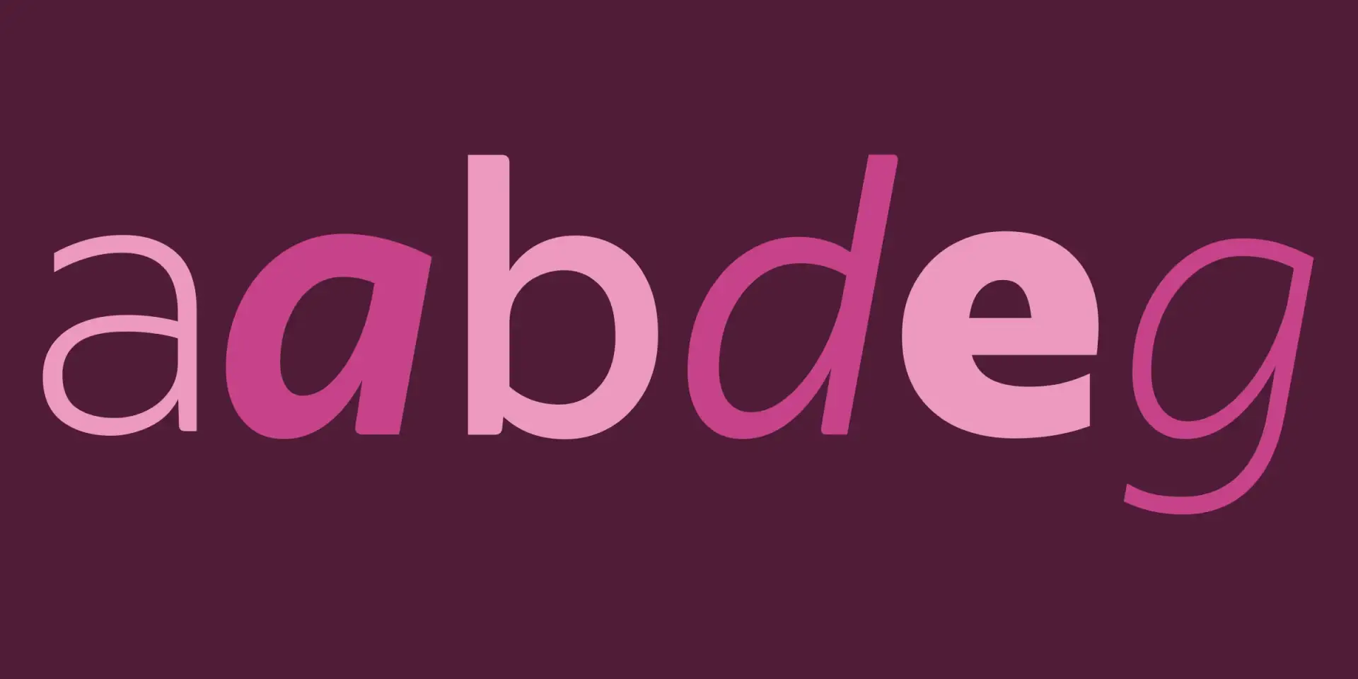
Indeed Sans
Our brand typeface is a contemporary, humanist sans serif in five weights with true italics. It’s optimized for legibility and offers a wide variety of expressions. With these qualities, it achieves a warm, clear, and positive tone, a perfect tool for communicating our brand to a variety of audiences.
Indeed Sans is used for all branding and expressive use-cases, including product marketing websites, events, advertising, social media, and so on.


Design sensibility
Indeed embraces an authentic, helpful, and accessible approach to our designs and layouts.
- Use an underlying grid structure to support and organize contents.
- Embrace negative space.
- Use typographic scale and hierarchy to create clarity of message.
- Keep things simple.

Accessibility
Small images and fonts can be difficult to read for some of our audience, as can lighter font weights. When designing at small size, keep these guidelines in mind:
- Keep font size above 10pt.
- Limit use of lightweight or thin font weights, even on large-scale print pieces.