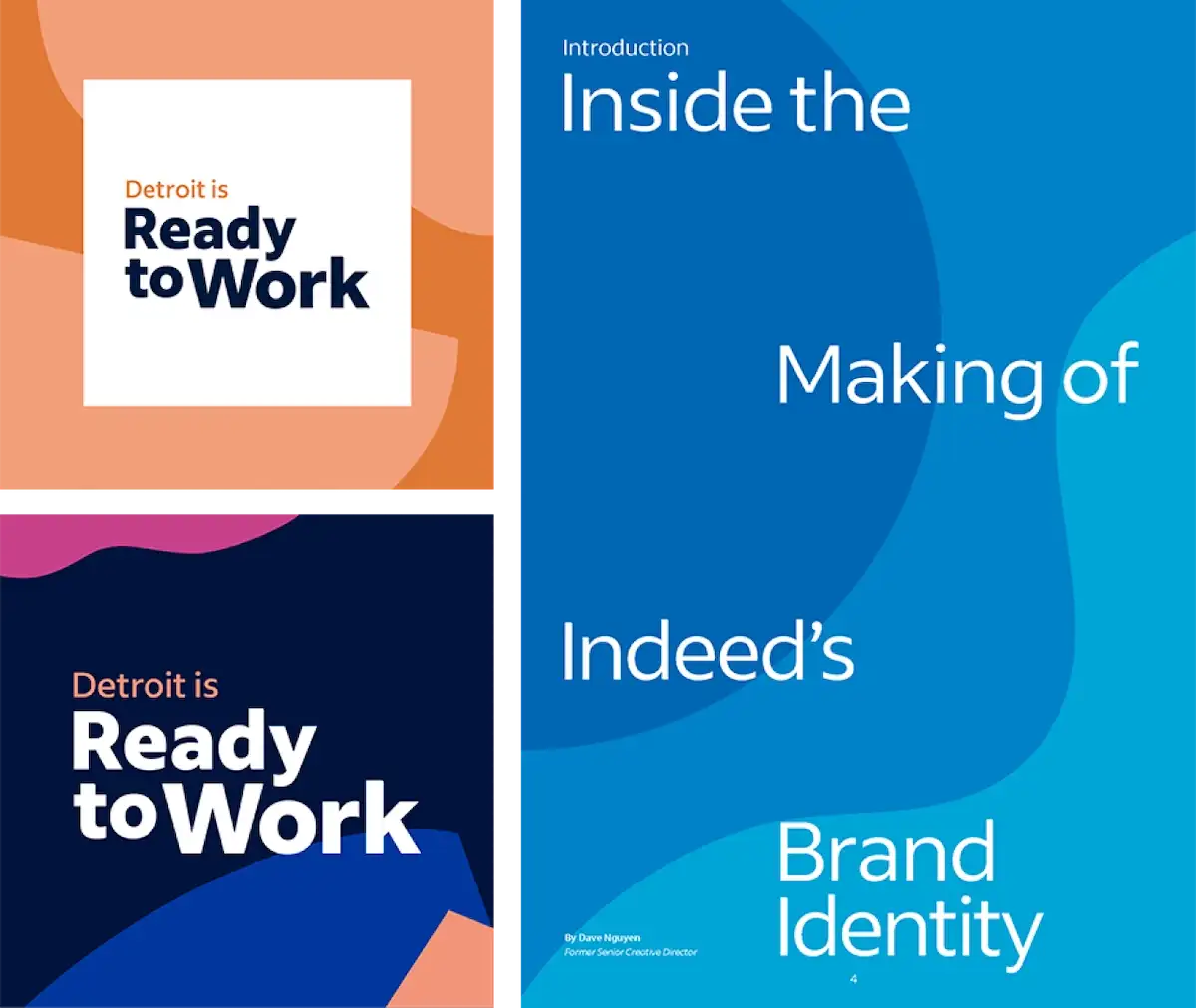
Shape
Many paths and patterns connect job seekers and employers, and our shape language reflects that endless variety. These forms balance our brand expressions and bring them all together.
Shapes celebrate our brand personality by highlighting significant moments and building dynamic environments that move with purpose.
We use shapes to customize photography and to build distinct campaigns. The right combination of shapes can ground product screens or brand illustrations.
Shapes can also be combined to create full-bleed backgrounds to support typography and imagery.

Built to support
Arcs, contours, and colors combine to create a distinctive visual language.
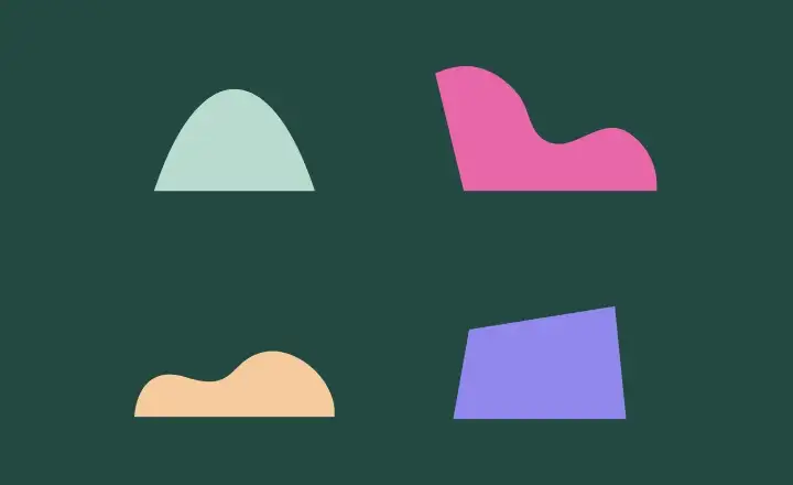
Natural lines
Organic and fluid, these figures combine, scale, and rotate as needed to make each composition whole.

Dynamic placement
Repetition, color, and spacing create movement and rhythm.

Simple design
Straightforward construction and application add hierarchy and emphasis to the graphic elements grounded by these shapes.
Background toolbox
Use these backgrounds to break up solid color in places like presentation decks, social graphics, and program branding. As with shapes, you can edit these elements as needed, following these principles:
- Go oversized and cropped.
- Use two to three low contrast, monochromatic shapes that make overlaid text easy to read.
- Keep them simple, as if cut from paper.
- Avoid high-contrast, repetitive patterns; they’re not on brand and may trigger seizures.
