Logo
Since our founding, our logo has honored what we do best. When you’re looking for work, we guide you to the next step in your career. If you’re looking to hire, we connect you with the right candidates for your opportunities.
Corporate logo
Logo wordmark
The most distinct element of the Indeed identity. The wordmark acts as a signature across all brand communications. Use only approved versions of the logo as outlined in this section. Do not include a registration symbol (®) when using the Indeed logo.
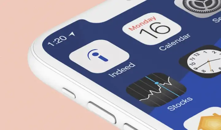
Logo symbol
In some cases, we use the “i” from the logo wordmark as a standalone branding element. Only use this where there’s additional context that clearly labels the communication is coming from Indeed, such as Indeed’s social accounts and app store pages.
Our name
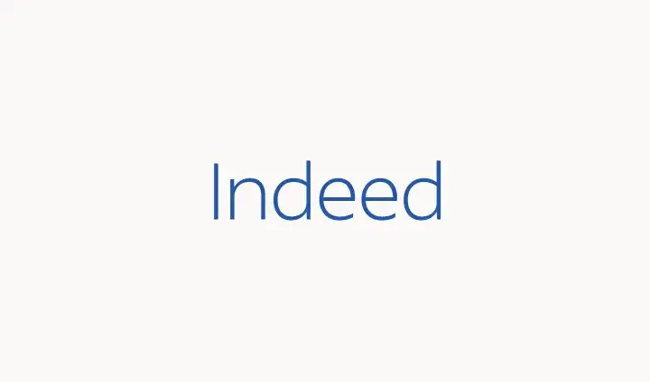
We are Indeed, not indeed.com.
While it might feel useful to differentiate our name from the word “indeed,” we should trust our recognizable brand identity to make this distinction for us. When referring to Indeed in copy (not in logo form), capitalize the “I” as Indeed is a proper noun.
Logo alignment and clear space
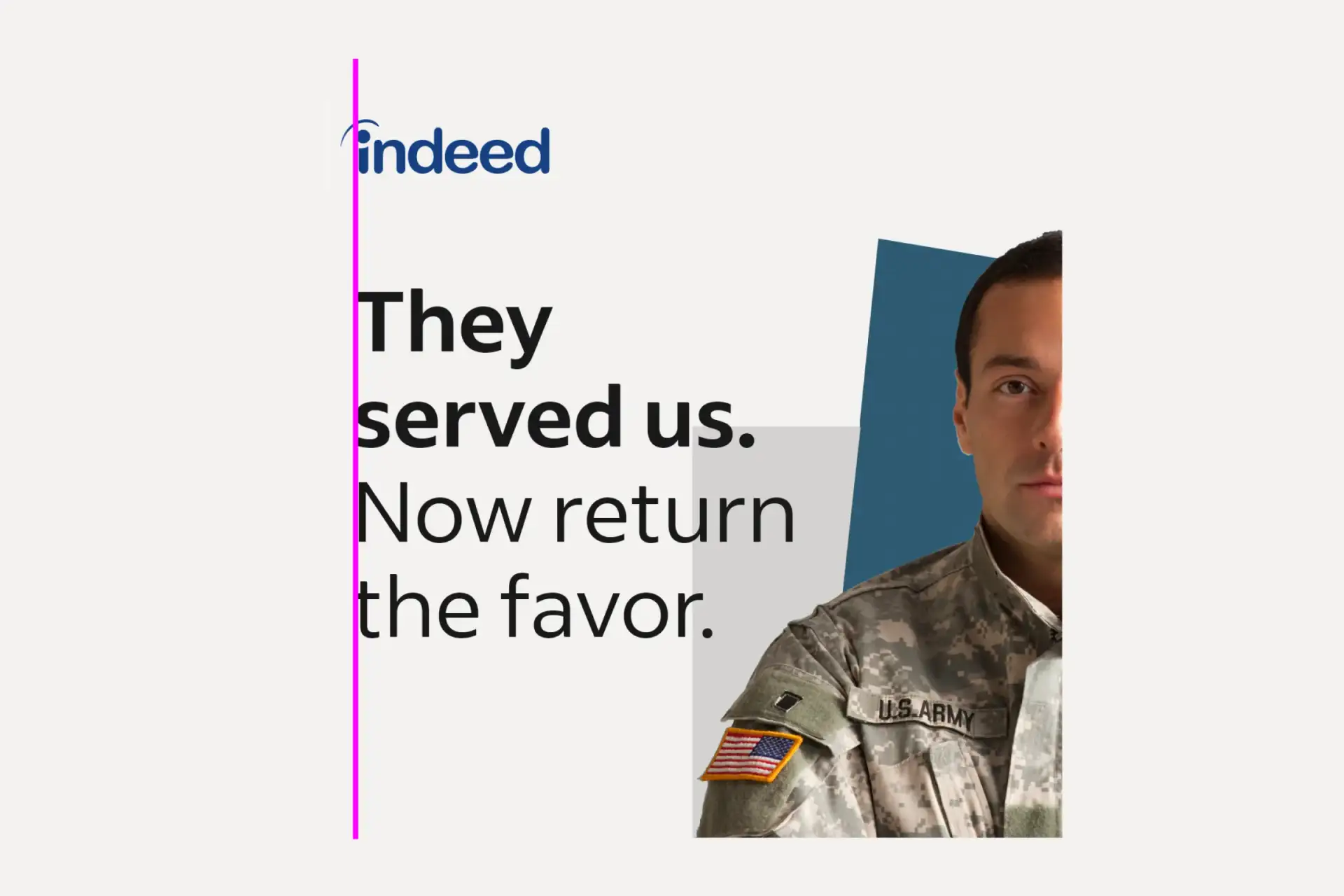
Ignore the eyebrow
Instead, align the logo with design elements based on the leftmost edge of the “i.” The intent is to achieve visual balance.
Clear space
The minimum amount of space between the Indeed logo and any other design element is equal to the “e” in the logo.
Logo colors
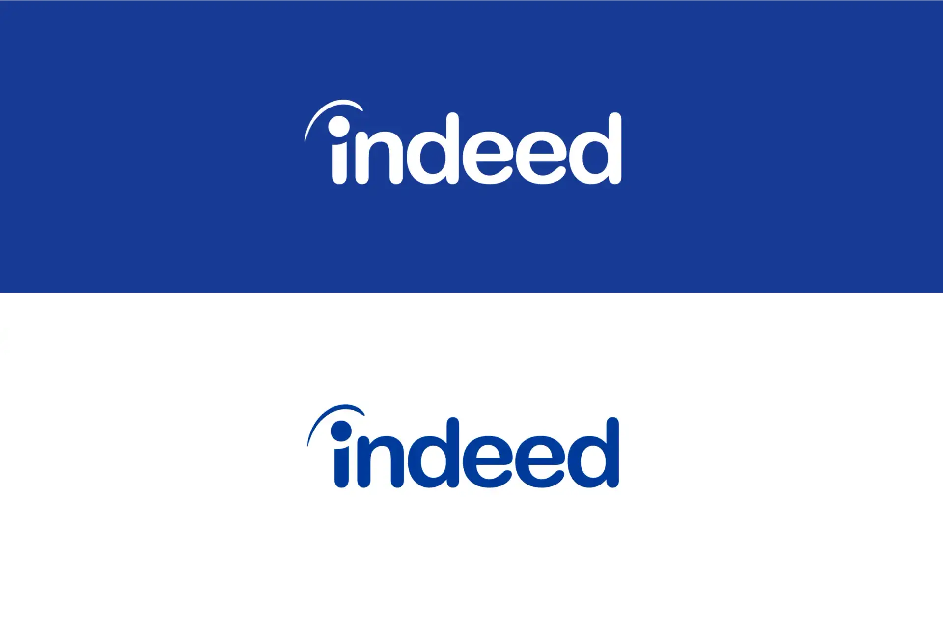
The Indeed logo may appear in Indeed Blue (#003A9B) or white, never in any other colors. The preferred treatments are Indeed Blue on white or white on Indeed Blue.
Use whichever version provides the strongest visual contrast with the background and feels like it belongs in the overall design.
Note: The boxes behind the logos shown here are for illustrative purposes only. They are not part of the Indeed logo itself.
Getting it right
Use only approved versions of the logo and logo lockups.
Do not:
Alter the logo
Violate clear space rules
Add a drop shadow to the logotype
Squeeze or stretch the logotype
Change the alignment of lockup text
Fill the logotype with imagery
Tilt or warp the logotype
Place the logo over a busy image
Change the color of the logotype to anything other that specified
Product lockups
A distinct asset for all products
Our products are what make us a leader in our industry. By maintaining a standardized approach to logo lockups, we build consistency throughout our suite of products.

Our logo in content and campaigns
Lockup construction and usage
Indeed has many examples of content and campaigns, spanning events like Indeed FutureWorks, campaigns such as Virtual Hiring Tour, and content destinations like /LEAD with Indeed and the Indeed Career Guide.
For these branding opportunities, the Indeed logo becomes a secondary element in a bespoke lockup that highlights the name of the event, campaign, or content.
How lockups adapt to small sizes
Since our campaign lockups can feature a smaller Indeed logo, they tend to lose definition at small sizes below the 14px minimum size.
When this happens, use a modified version of the lockup that replaces the logo with the word “Indeed” spelled out in Indeed Sans type.
These modified lockups are most typically used in mobile screens.
Co-branded lockups
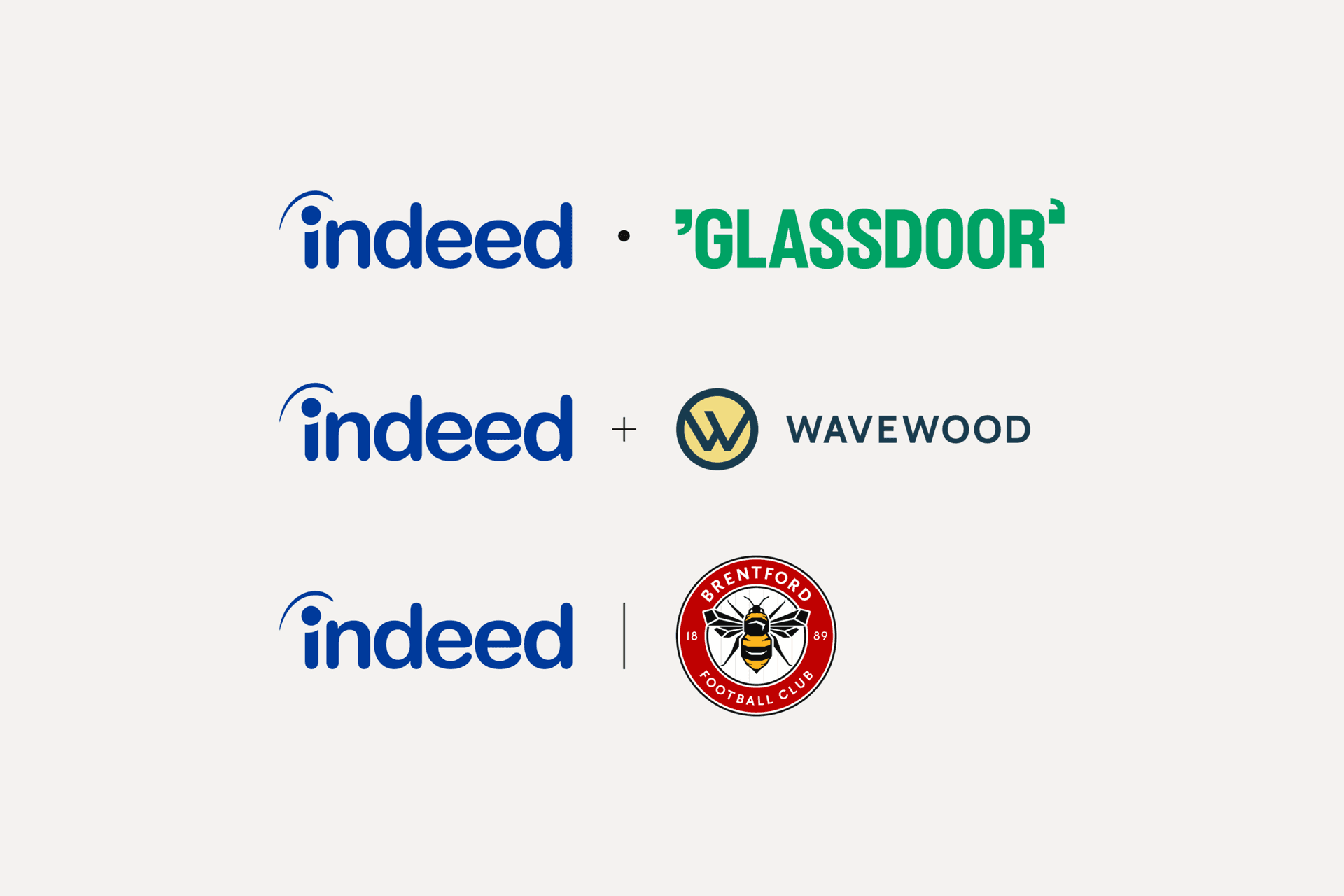
When jointly branding materials, consider the nature of the partnership to determine which treatment to use in anchoring those logos together. Use the small circle for sister brands (like Glassdoor), the thin “+” for official partnerships, and the vertical line for official sponsorships.
