Illustration
Inspired by actual people and places, our illustrations reflect the people we serve in all their variety. They add relatable humanity to a process that can sometimes feel daunting.

We show scenes that are grounded in the everyday experiences of job seekers and employers. Our illustrations include people of different ages, body types, races, ethnicities, abilities, and careers. And while our compositions are idealized, they use perspectives and proportions that match real life.
Different styles for different uses
Illustrations appear throughout the Indeed brand experience to clarify and narrate important moments in the journeys of job seekers and employers. Illustrations fall into two distinct camps, functional and expressive.
Functional
Product illustrations adhere to a consistent style focused on clarity and functionality within Indeed’s own channels. They visually communicate our brand identity.
- Notifications
- Errors
- Promos and targeted ads
- Updates
- Homepage
- Welcome page
- Messaging
- Webinars and training
- Product landing pages
- Lifecycle emails
- Product Marketing videos

Expressive
Marketing illustrations can be more flexible and expressive in style for campaigns and storytelling as they compete for attention and build brand awareness in the world.
- Ad campaigns
- Social
- Commercials
- Social posts
- Events and environments
- Online publications

Stylistic principles
There are three key tenets of color that must appear in our marketing illustrations.
Core brand colors
Indeed’s core brand colors — Brand Blue and Ink Blue — must feature prominently within all marketing illustrations, making up about 75% of the total palette. Product illustrations may rely more on Indeed’s Expressive Brand Palette, but should use Indeed’s core brand colors as accents where possible.
Expressive palette
Additional color choices must come from Indeed’s Expressive Brand Palette, except for skin tones.
Inclusive skin tones
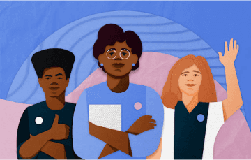
Illustrations must depict people with realistic skin tones. We want people to see themselves in our work.
Realism
Use realistic proportions. Avoid exaggerating body and head shapes to create caricatures. We portray a range of body types, sizes, and abilities as well as disabilities and assistive devices.

Emotions
Humans should appear, well, human. Use references often so that facial expressions convey genuine human feeling and character.

Sophistication
Illustrations should never seem cartoony, even when people are drawn in a stylized manner.
Artistic partnerships
Working with external artists is an opportunity to live our values through design. External campaigns with specific audiences and goals amplify the voices of artists from diverse backgrounds, adding authenticity, variety, and inclusion to our brand work.
Hiring a variety of artists from outside Indeed doesn’t mean the work becomes off-brand. Core elements of the Indeed brand, like our logo, colors, and font, should be thoughtfully woven into the artwork to build consistency with our brand identity.
Moody Center
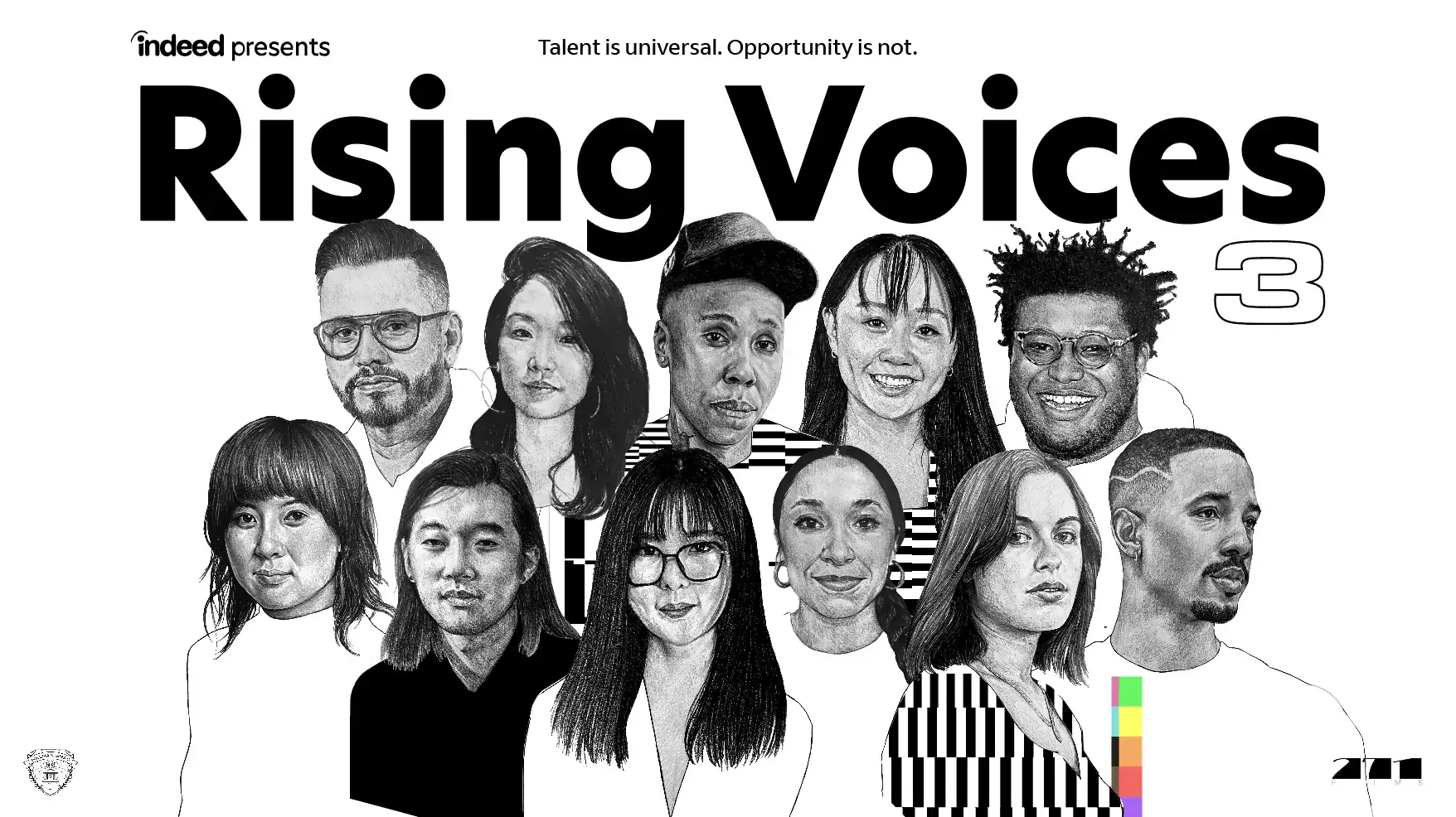
Indeed’s partnership with the Moody Center required a special, local perspective to reflect the world of work in an iconic Austin venue. We hired Texas artist Alannah Tiller to create a mural for the space expressing themes of job search, work and Austin in her unique graphic style.
Rising Voices
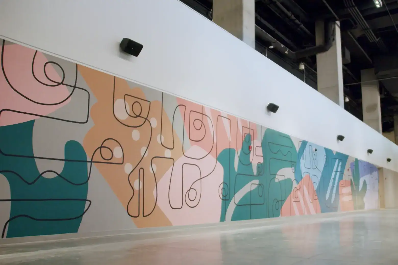
Our work on Rising Voices tells the story of work from the unique perspective of filmmakers from a diverse range of backgrounds and ethnicities. In order to celebrate this work, Indeed hired Black artist Rex Sterling Hamilton, known for depicting people of color in an inspired array of saturated colors.
Inclusivity
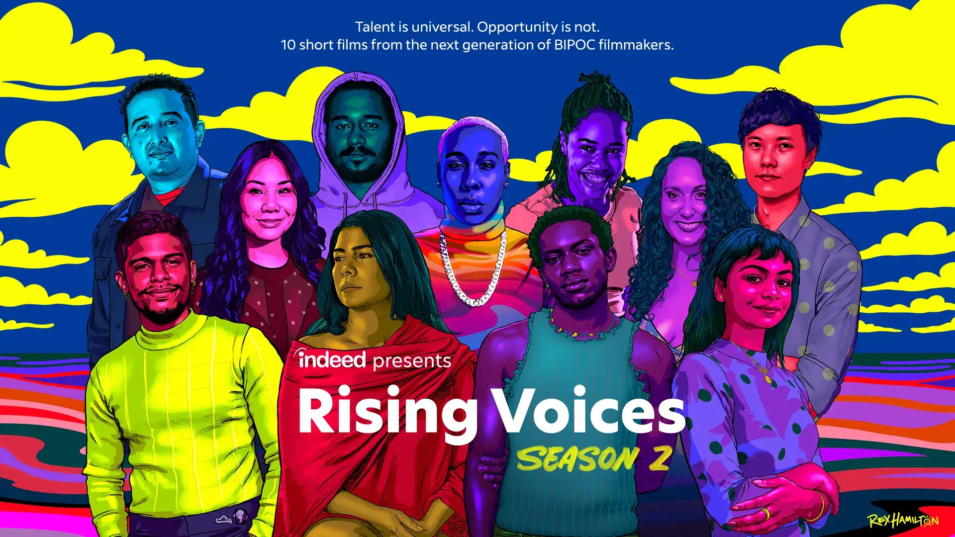
When including multiple illustrations on one page, make sure to feature a variety of genders, nationalities, ages, and ability levels. These should not be the focus of each image, rather, the people featured should all be seen as on the same level: people, doing their jobs.