
Recently, our design system team looked at a request to change some aliases for upload and download icons. There seemed to be some confusion and in some cases conflict around how we portray icons to our users.
For example, the “X” icon in the US means “close,” or “no.” But in some cultures, that icon can have a different interpretation. It can represent “yes” or “check,” as in a completed task. Sometimes when you’re designing for a project, it’s easy to insert an icon that feels right to you, but might not be familiar to your user.
This exploration led to a discussion on how users encounter icons in our products, what actions are taken, and what the best practices are for naming or aliasing icons. Three thoughts we want to pass along to our designers arose out of those conversations:
- Always pair icons with text so the user has context and builds expectations for the experience.
- Look at the use case to determine which icon best fits the context of a UI/UX experience.
- Consider the functionality when determining what kind of icon to surface.
If you’re deciding how to best use icons for your users, you might learn from my team’s investigation. Let’s take a closer look at why context can be so important.
Pair icons with text
Icons must communicate meaning in a user interface. They’re a visual representation of an object, action, or idea. So if that icon isn’t immediately clear to your users, it can be reduced to a confusing or even frustrating visual noise that hinders them from completing their task.
To give your users clarity, simply pair an icon with the right content. Pairing your icons with text removes ambiguity, creates clear understanding, and even instills confidence in users about the expectations of the experience.
Select icons based on the use case
It’s fitting to try and select an icon that best matches your use case. However, this can become confusing when many icons look too similar — especially since most symbols aren’t universal in nature and may not have the same connotation between different regions.
For example, Indeed’s design system has lots of arrow icons. Which would you use for “upload” if you weren’t looking at the names or aliases of the icons themselves?
Without context, it’s hard to tell what the difference is between these icons. The design system provides aliases and names for each icon that relates to its intended function. Instead of choosing an icon based purely on visual design, rely on the alias or name to choose your icon and then pair it with appropriate text in the interface.
The role of functionality
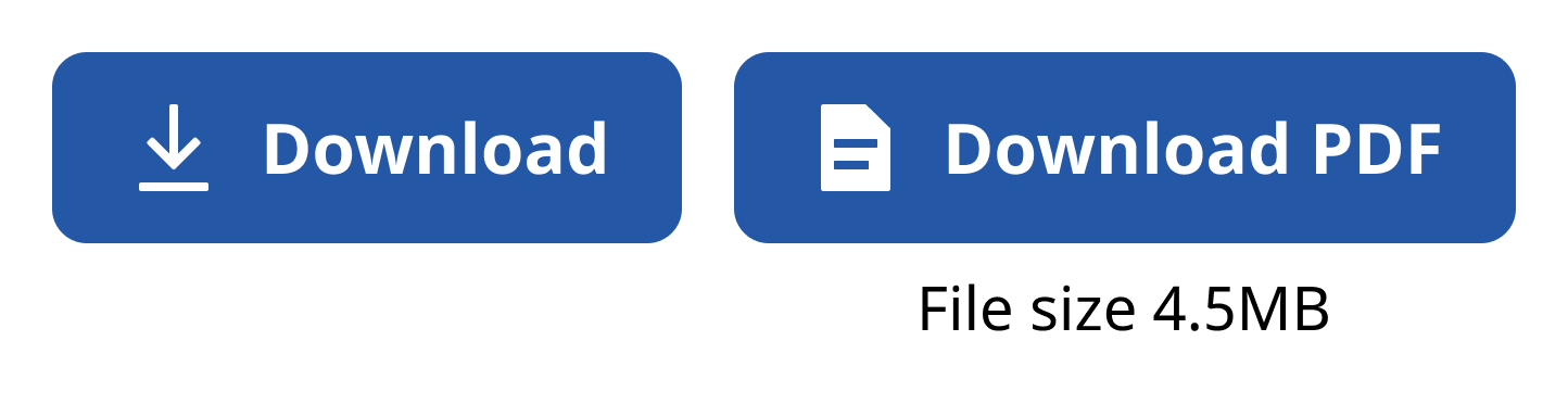
Functionality is an important indicator of what icon to choose for a design, but it can be confusing. For example, if an icon is always going to surface a PDF file, is it better to display the “PDF file” icon or a “download” icon? It’s interesting to think about. What creates a better experience?
My take? It’s better to expose the expectation as best as possible and provide specifics where you can.
If your design asks a user to download a PDF file, I recommend surfacing the “File” icon with the words “Download PDF.” Not only does this make the action clear to the user, but also clarifies what artifact they’ll acquire. To go further, consider giving the user the file size to help build in that expectation of how long it will take to download.
If the action weren’t specific — like a bunch of items in a zip folder — I’d focus on the action of the download icon instead since this action can be non-specific to the item(s) in the download experience.
Sometimes, thinking about the action taking place can be confusing, too. Is it an upload or a download? Is the user taking the action? Or is it on the server side? The user would upload their resume, but if it’s on the server side that same action would be a download from the user to the server. So what do you do to determine the right icon in these cases?
Whenever you doubt the strategy you’re using to make these determinations, err on the side of the user. Otherwise, you risk confusing them.
Even simple nomenclature changes build in the expectation of action. For instance, should a user “upload” a resume or “attach” it? Uploading and attaching can be two different icons because they’re two different actions. At Indeed, one is an up arrow icon, the other is often a “paperclip icon”.
You’ll want to think about the experience and what actions are taking place. Are there steps? Do you upload and then attach? Try to best match your icon to the context of the user actions.
Icons alone aren’t enough
When choosing your icons, always pair them with text, think of the use case they address, and consider functionality. These steps will help you avoid creating confusing visual cues with your icon selection. They could also benefit your products with better conversion rates when clear information is presented.
Some good steps to take when making these decisions:
- View an icon with tools like the website The Noun Project using the nomenclature you’ve chosen in your design for the action. Then you can see, contextually, how others will see these concepts visually.
- Look at the names and aliases of the icons in the design system to ensure proper usage of the icons; don’t just choose them based on visual designs.
- Understand who’s doing the action and what the expected outcome is to avoid confusion in icon selection. Make this user-focused, not system-focused.
- Rely on any established paradigms with icon usage, like universal icons. These universal icons are typically fairly established — like the “magnifying glass” icon, which is used for search. However, only a small amount of icons don’t need an explanation for users to understand what they are and how they function.