In fourth grade, I raised my hand in the middle of a multiple-choice test. “There’s more than one right answer!” I exclaimed in confused excitement. “Perhaps,” the teacher calmly replied, “but there is only one best answer.”
That tiny piece of advice comes to mind when someone in the UX community asks: Should we still use the word user?
It’s a debate that goes back at least 17 years. Today, it seems like a growing number of people feel the answer is no. One of the main arguments they give is that user is a label that strips people of complexity.
That’s true. And I believe it’s a good thing, not a bad one.
It’s important to always keep people’s humanity and diversity in mind. But when we aim to improve the lives of large groups of people, some simplification is necessary. At Indeed, our main users are job seekers and employers, and millions of them come to us every day. Thinking of them at that high level is part of understanding their needs and goals. It’s the first of many steps we take to make meaningful experiences for them.
That doesn’t mean that user and other general labels are all we need to deliver good user experiences. They’re just the top of a taxonomy that helps us learn, empathize, and design. Put another way, there are many right answers when we go to define who we’re helping. Which is the best answer depends on how well we know the people we’re serving.
Why we need taxonomy
Imagine you’re composing a symphony. Everyone in the orchestra is a musician. But the strings, percussion, and other sections each play a different part. And within those sections, individuals make unique contributions. The music for the flute is different from the music for the clarinet, and so on. In UX, we do something similar with usability problems. The more users tell us about their needs, the more we can and should personalize their experiences to help make it easy for them to do what they want to do. At the same time, we look at the big picture: while meeting all those individual needs, we shape a coherent user experience for the entire product.
We want to create experiences that address user needs as directly as possible. But we have to do that authentically. While getting very specific is great for personalization, it’s easy to miss the target. Personalizing to the wrong person is like calling them by the wrong name — they’re not likely to respond well. That’s the opposite of the empathic approach we want.
That’s where user comes in. It’s a term that helps us design for large groups of people who are likely very different from each other yet share a few fundamental needs. Using it as a starting point when a narrower term doesn’t work isn’t a cop-out. Rather, it’s doing what’s best for the people using the product.
That’s not the end of the story, though. Whenever user starts to feel like a poor fit, I take it as a signal to look for a better term. I do that by turning to the designer’s ultimate tool: context.
Context is your friend
Here’s how that works in practice. At Indeed, we want to personalize experiences as much as possible for those looking to find a job and those looking to hire. But we have to do it in the right place at the right time.
Say we tried to guess a person’s profession when they landed at our home page. If we got it wrong, we would alienate a job seeker. Once someone starts a resume, though, we can begin to tailor their experience to their needs. If they tell us they’re looking for work as an engineer, we strive to get even more specific. Knowing the context sets us up to provide the personalized experience our user asks us for.
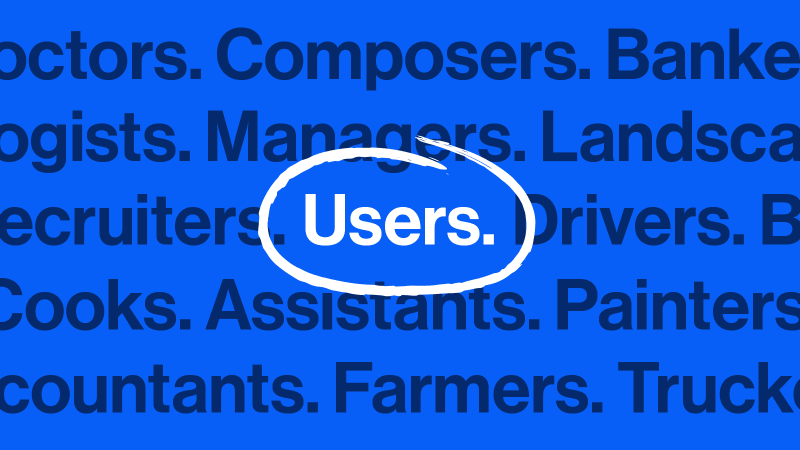
When we don’t have that context, the term user is a force for good. It’s an anti-label that’s general enough to be egalitarian. It reminds us every day that, at Indeed, we speak to many different people. It helps us design so that everyone is welcome to make our products work for their needs. Bus drivers. Composers. Doctors. All are equals on our site. Thinking of them as users doesn’t get in the way of that ideal. Quite the opposite — it’s essential to creating a user experience that’s sensitive and people-centered.
Keep working to understand your users
User isn’t always the best term for the individuals using your product. But it’s usually a great place to begin to understand their needs, their behaviors, and the areas where you can improve their experiences. In those moments when you’re unsure, gathering more context can help define your audience better. Conduct testing to find out what they like, what they don’t, and why that matters. Get to know them — and then work to make each user’s experience as personal as possible.


