When we present UX research, we want people to talk about it. We want our insights to stay relevant in our organizations for a long time. And we want our peers to share and build on those insights.
One powerful way to get there is to use a visual framework.
Consider Maslow’s Hierarchy of Needs. This 1940s motivational theory, famously presented as a five-tier pyramid, has achieved pop-culture status. Few of us have actually read Maslow’s paper (I haven’t). But his five-tier chart of human needs is one of the most recognizable depictions of a psychological theory ever published.
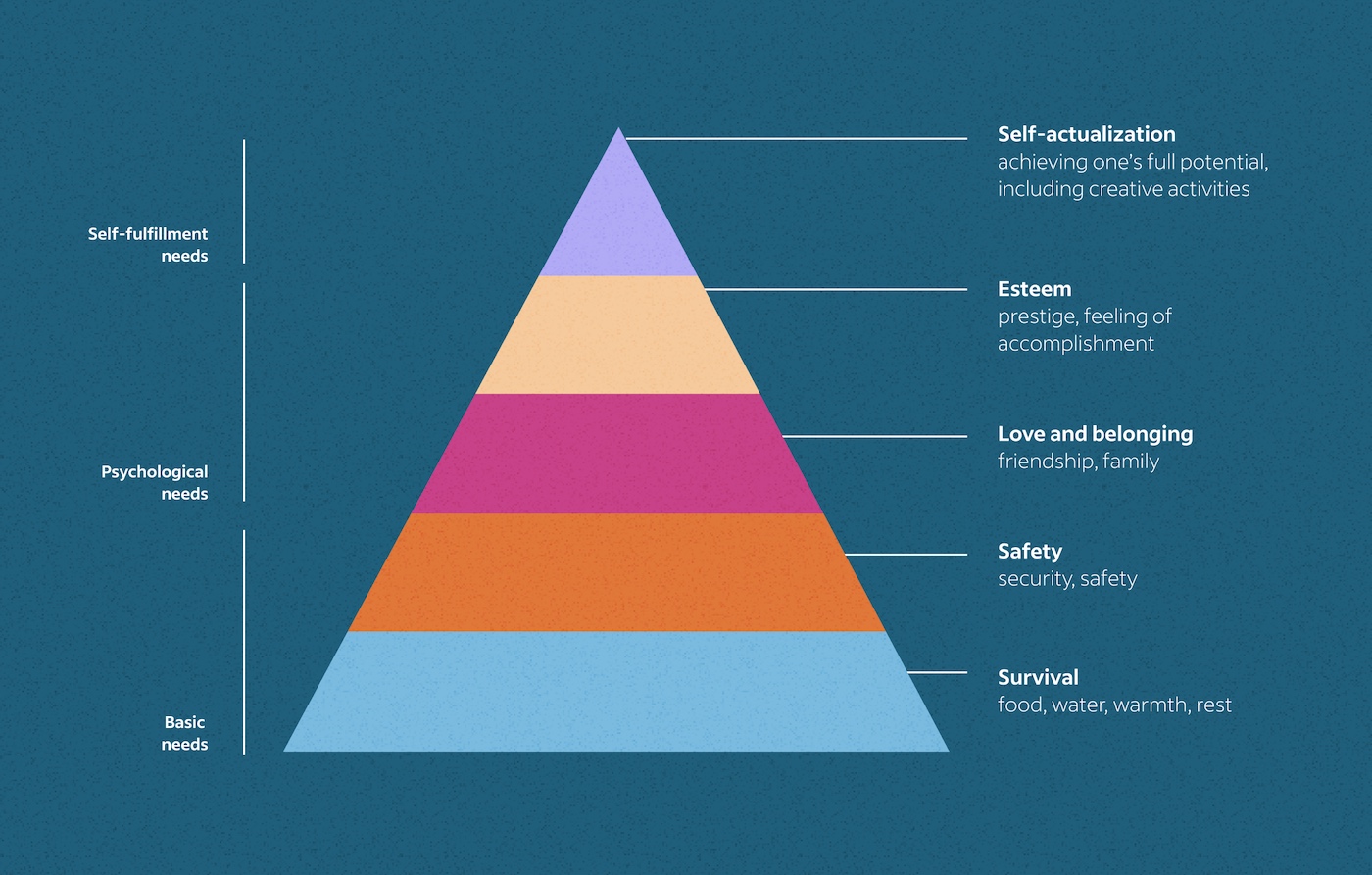
Some researchers will tell you that the visual representation of the pyramid itself is one of the main reasons that Maslow’s work is still widely discussed over 75 years later. Presenting research in a visual structure helps it stick in people’s minds.
When I started as a UX Researcher at Microsoft, I delivered each study’s results as a list of bullets on PowerPoint slides. And after each presentation, my manager urged me to deliver those results as frameworks instead.
He’d seen visual frameworks help his team present research and make an impression. Information shown in a framework travels further and has more impact than research presented strictly as text on a slide.
It took a few years for his advice to click. I wasn’t sure how to do it or where to start. I had learned to communicate through words, not images. But now I almost always present at least one key message of every research study as a framework.
If you haven’t tried frameworks in your own research presentations, here are three you can start with.
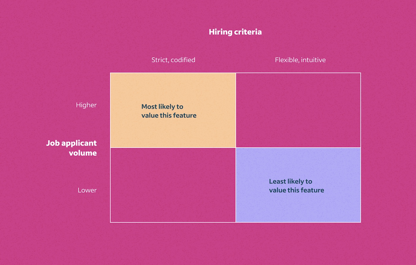
Research framework 1: Quartered box
This is just a rectangle split into four sections, but it’s a surprisingly flexible framework I often fall back to.
When to use
I rely on this four-section chart a lot at Indeed, where we study a diverse user base. I commonly segment users by multiple attitudes and behaviors to point out specific subsets of users we may want to pay special attention to.
Example: In one study, I discovered that employers who had stricter hiring criteria and managed higher volumes of job applications appeared most enthusiastic about a feature we had built. In contrast, employers with less-strict hiring criteria and fewer job applications appeared the least enthusiastic.
A framework like this helps readers see the contrast between groups and makes your research easier to understand. It also provides a natural launching board into what our teams often really want to know about each group: the why.
Research framework 2: Nested circles
Even a few simple concentric circles can make your research more memorable.

When to use
I sometimes discover multiple segments or behaviors in my research. This framework is handy when these segments aren’t mutually exclusive but instead build on each other.
Example: In a study of how job seekers responded to a lack of jobs during the pandemic, I saw three common approaches to job searching. Job seekers who expanded into the second (or third) approach didn’t abandon the first approach. They considered these less-desirable alternatives only as a matter of necessity.
You can present these in a single slide. Or you can add each circle, one at a time, as you introduce a segment and explain how they relate to each other.
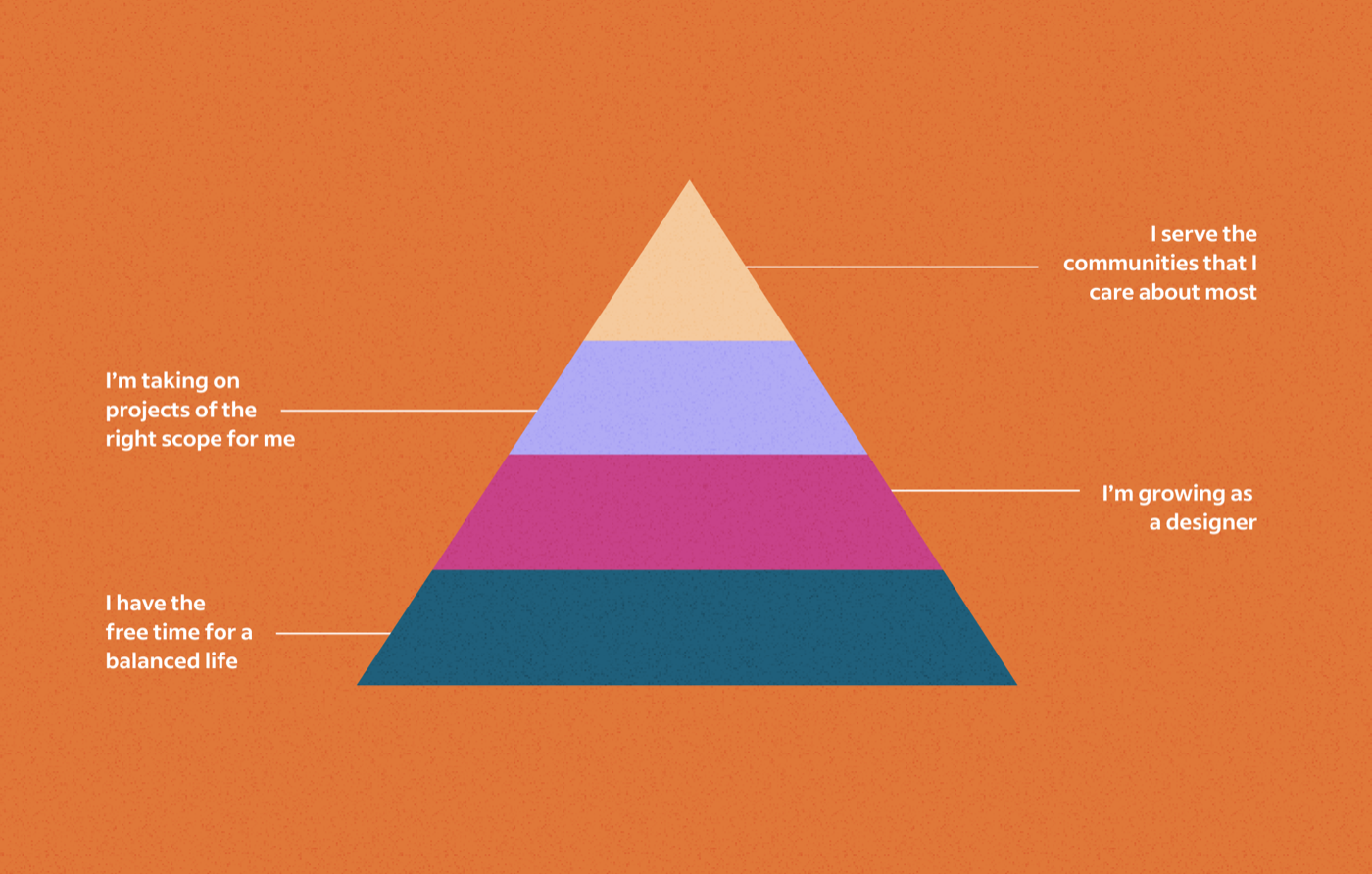
Research framework 3: Pyramid
I’ve adapted the pyramid framework many times in my research. It’s useful when our work captures a prioritized hierarchy of needs.
That’s something we often do as user researchers: identify needs and evaluate how important those needs are relative to others. We use that information to help establish or alter the priorities of a product team.
When to use
The pyramid framework is valuable for presenting both user and organizational priorities:
Your users’ priorities. You might discover you misinterpreted initial assumptions about what your user base values.
Example: I once conducted mixed-method research on a community of independent website makers. We learned that this community’s highest-order priorities were the opposite of what we imagined: these website makers often valued their personal growth and work-life balance much more than their raw income.
Your organization’s priorities. Based on findings, you might make a hierarchy of features a product needs to succeed. The pyramid can help you answer which are essential and which are not.
Example: I once led an international research trip to interview current and prospective users of a newly-released analytics product. From these interviews, we identified a hierarchy of team priorities for success in that international market.
You can easily create your own pyramid in Google Slides (Insert > Diagram > Process), and in PowerPoint (Insert > SmartArt > Pyramid).
Give it a try!
Through frameworks, my research travels further and stays relevant longer. I hope these examples inspire you to try frameworks for a future project.
Once you’ve started using frameworks, you may find yourself coming up with ideas for more. And that’s where the real fun begins.