If the 2019 Clarity conference is any judge, the prominence of design systems in the field of user experience is only increasing. In three years the conference has doubled in size. In August, this year’s edition packed in 700 attendees. Because design guidelines and UI components are the basis of any design system, we could have spent all three days discussing those alone.
But having all the pieces in place doesn’t guarantee you a design system that works. Success has as much to do with relationships, workflows, and your guiding philosophy. That was the top insight I came away with from attending this year. Half a dozen Indeedians joined me, and it’s safe to say that central message resonated with us all.
Other threads stood out as well. Accessibility was an unmistakable theme that ran throughout the event. And several teams described shifting from gatekeeping tactics toward a service model. Their focus now is to assist their organizations in creating products. This welcome shift suggests that companies are getting more comfortable with design systems.
My colleagues had their own aha moments. Here are the top lessons and ideas they took from the conference:
Build your team — it’s as important as delivering components
– Kirsten F, UX Writer
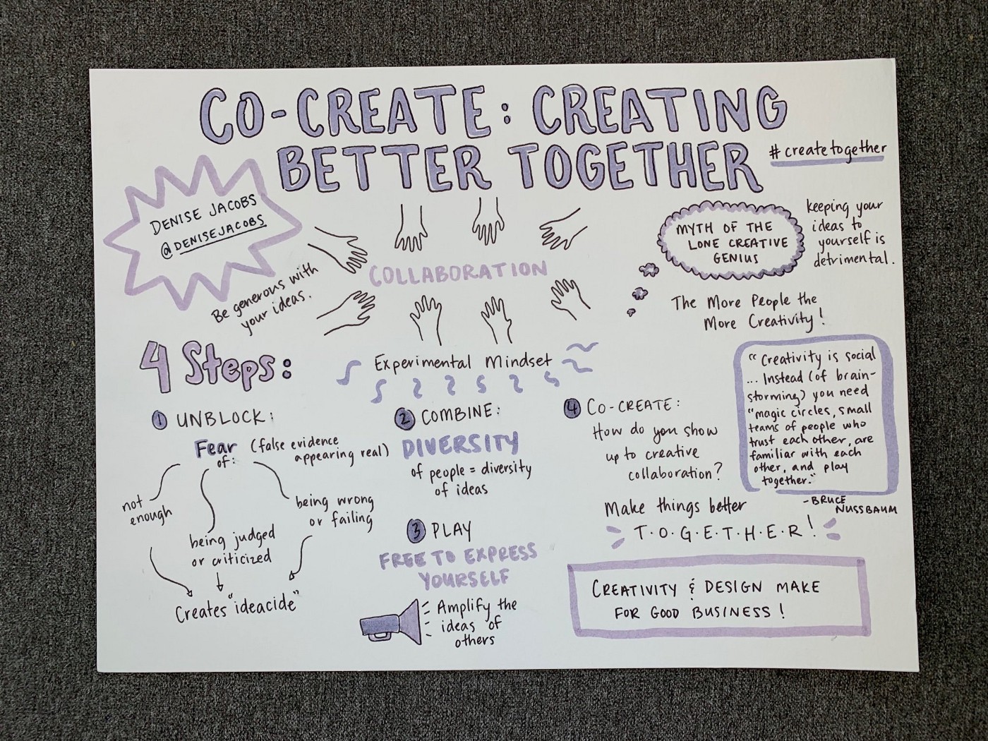
Design systems create cohesive experiences by ensuring that each component works well with the rest. Throughout the conference, presenters kept pointing out that the same applies to the humans building the system.
Denise Jacobs made the case that systems work best when everyone involved is collaborating well. Building those essential working relationships isn’t as formulaic or easy as building a component set. But it’s just as valuable. Creative solutions come out of the relationships we have with our teammates.
Where to start? One recommendation that stood out to me was to bond over shared lunches and events. This helps when it’s time to determine outcomes or handle unintended consequences. Another suggestion was to make time to clarify definitions and identify assumptions.
Take steps to improve collaboration
– Erin Rademacher, UX Developer
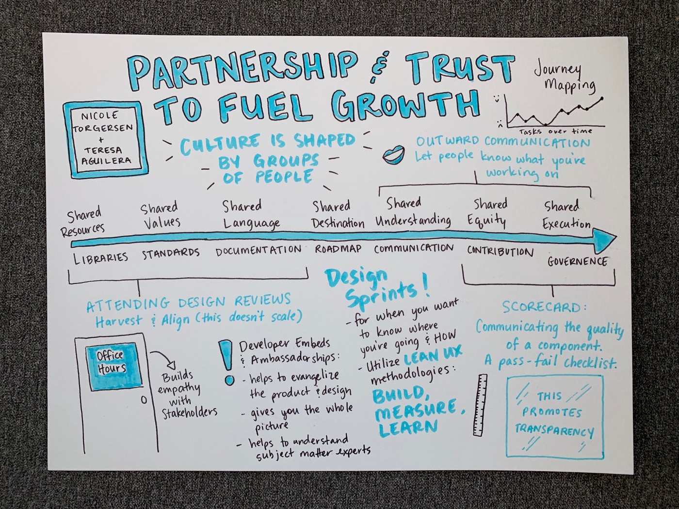
My starting point for any project is to get to know the ecosystem of teams involved, then add empathy for our customers. Getting more collaboration than that requires real expertise. Enter Nicole Torgersen and Teresa Aguilera from Gap, Inc. They offered a whole set of steps to deepen collaboration. Here are my favorites:
Plan for communication: meet, talk, and build relationships
- Set up and attend design reviews and office hours
- Build commenting and feedback into your process
- Embed developers and designers on each other’s teams
Track your results: build, measure, and learn
- Follow design sprints and go deep in journey mapping
- Use scorecards and retrospectives to keep improving
Define motion standards to boost brand personality
– Kirill Mikhaylov, Design Engineering Manager
I got a great sense of community from attending the conference. And I was especially happy to see that the whole field is grappling with how to treat animation.
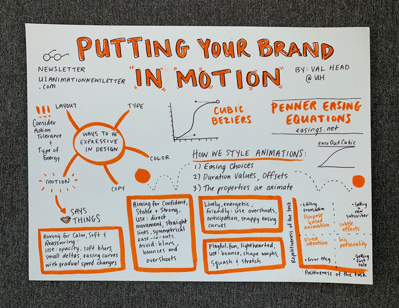
Adobe’s Val Head, author of Designing Interface Animation, laid out how motion helps a brand embody a personality. Of the tools in a brand’s toolkit, motion has a special power for conveying character. I came away convinced that a design system needs thoughtful guidelines for blur, opacity, and bounce to help the brand stay true its identity.
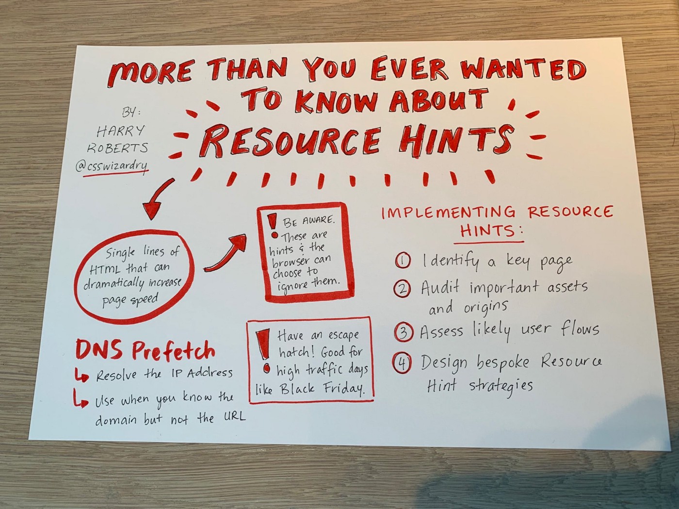
On the technical side, I’m always hungry for specific techniques that I can try on my own. Harry Roberts provided them. It was eye-opening to see how he uses resource hints to optimize browser page loads. I walked away with useful link tag attributes that will help with everything from security to performance priorities. For more details, watch the talk he gave on this topic at Front Conference Zurich.
Design with code to amplify your system’s distinctiveness
– Kim Hutchinson, UX Group Manager
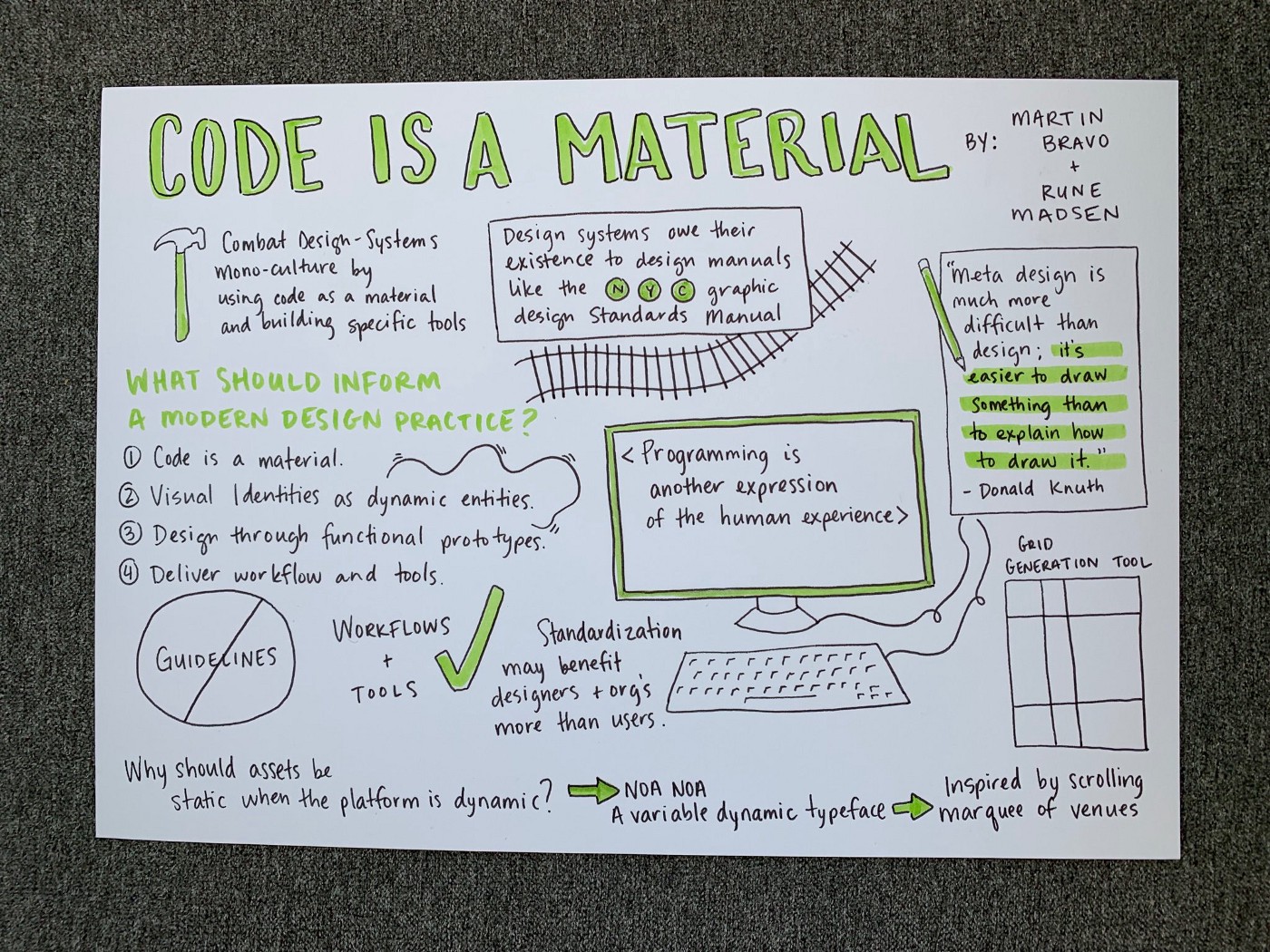
I loved hearing Rune Madsen and Martín Bravo talk about escaping the design system monoculture. Designers can now use public systems to leapfrog right into scalability and usability. After all, something like 80% of a design system uses the same standards as all the rest. There’s a downside to that efficiency and consistency, though: it leads to homogeneity.
How do you ensure the other 20% of your design system has its own character while still being functional? Rune and Martín’s advice is to work more closely with code. Building with code from the start lets you bake in the standards that give your product a unique point of view. At the same time, it keeps components adaptable, so they’re easy for client teams to use.
One practical way to work with code is to create the system with prototyping tools rather than visual design tools. That lets you deliver functional components rather than static artifacts that engineers must develop from scratch. Another way is to build tools that generate components. This “meta design” gives product teams the power to produce UI elements more tailored to their particular needs. That flexibility keeps your system usable. It also ensures that the product stays true to your brand and remains a place to connect with your users.


