Two years ago, Indeed had a mystery to solve. The Japanese labor market was the tightest it had been in decades, and job seekers had plenty of opportunity to pick and choose the work they wanted. Our job search platform had the single largest number of job listings on the market. And we had lots of traffic.
The only catch? People weren’t applying for the jobs we listed at the rate they were in the US.
From the data, it was clear that something was different in Japan. So we dove into user research. What we found led us to remake Indeed’s web app for job seekers here. We pushed our user interface past localization and culturalization to create a customized product designed especially for local needs.
Learning from local job seekers
Our first step was to talk to active job seekers to understand their goals. We spent two weeks on the road, interviewing people looking for part-time work in Tokyo and Kyoto. We met them in their homes and asked them about their experience searching for jobs and how they felt while using our products.
When our team went through the results together, we found some important insights. Location and work conditions were top priorities for people seeking part-time work. That’s because the people we’d met wanted to find jobs that fit in with bigger priorities in their lives.
For example, one was a student hunting for his first job. He wanted to work in a spot that was easy to get to from home and school. He commuted by public transportation, so he was looking for something along the train lines he used.
Another was a stay-at-home mother seeking work she could do while her child was at kindergarten. Japanese companies tend to have firm work hours, and she wanted to be sure her employer would let her leave early enough to pick up her child from school. She needed a job with flexible shifts or a workplace that clearly accommodated people like her.
When they used Indeed, the users we talked to couldn’t easily narrow their searches to meet needs like these. There was no way to sort jobs by location within a city, for example. And it was hard to find phrases like “flexible shift” or “stay-at-home partners welcome” in the text of job descriptions. These aren’t factors that tend to keep job seekers in the US from applying for a job, but in Japan they are.
Building for Japan
Based on the research findings, it was clear that our UI needed more than translation. To really make it work for our Japanese users, we would have to add custom features.
We held a workshop that brought together designers, researchers, engineers, and product managers to discuss solutions from a variety of perspectives. We used our research to create a user story for part-time job seekers. Then we quickly sketched ideas for making things easier for our users and picked out our favorites.
The challenge here was to understand the full context for our users. Yes, we considered the way their needs were different from those of users in the US. But we also took into account the special features of the Japanese job market that make it unique.

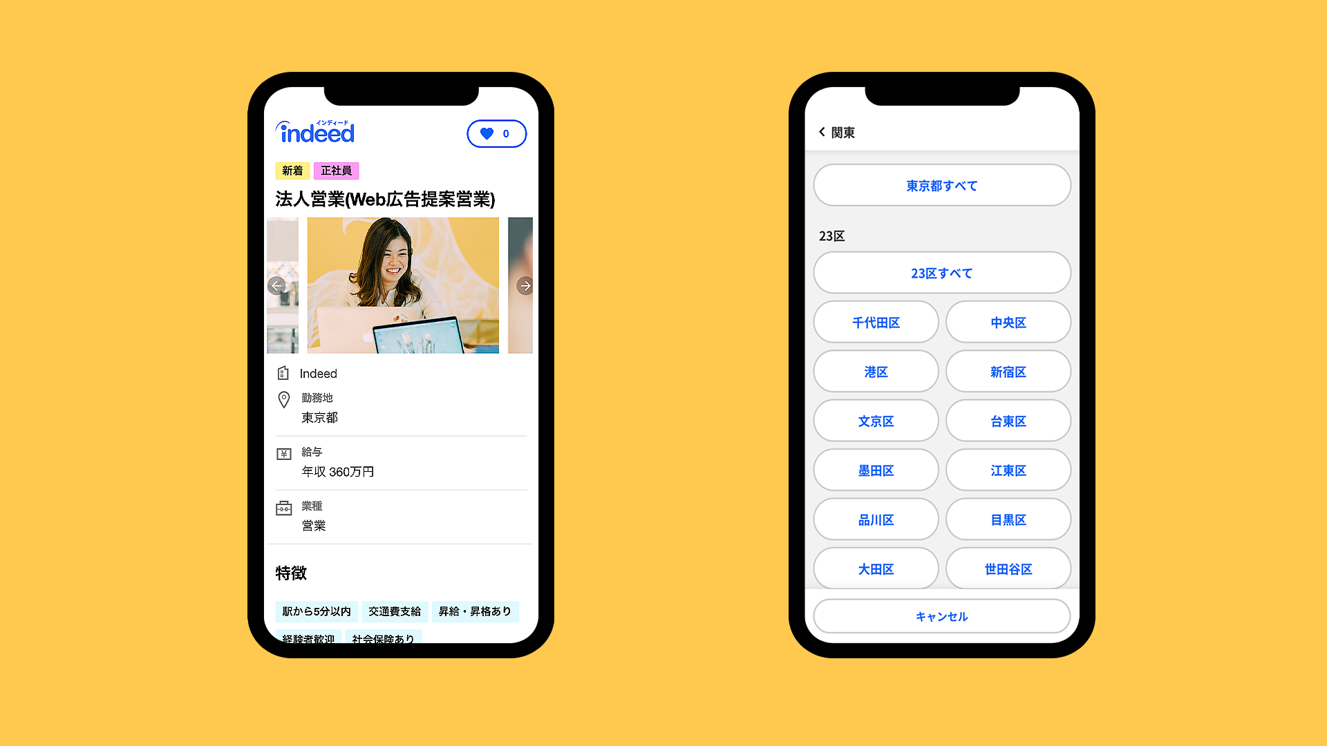
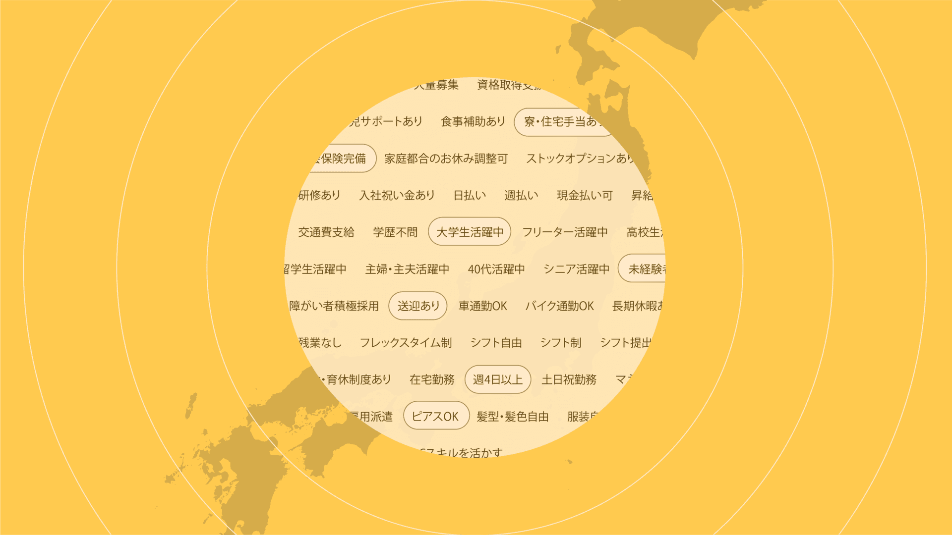
One of the solutions we chose was to turn workplace details into searchable tags. Users like the stay-at-home mom could use them to filter for jobs with “flexible shifts” and “no overtime.” She could be confident that the jobs she found would fit into the rest of her schedule. Other users wanted to find other workplace characteristics like “dyed hair OK,” “uniform available,” and so on.
Another idea we pursued was a way to let job seekers filter their searches geographically by selecting particular wards within a city. This would help the student find jobs closer to the route of his commute.
Prototyping and release
Because our favorite new designs were so different from Indeed’s existing UI, we wanted to test them thoroughly. So we went through multiple rounds of prototyping.
First, we made a simple conceptual prototype that had all of our dream changes and asked users for their reactions. Some features received really positive feedback. Others not so much, but the user interviews showed us what needed improvement.
From there, we picked the features we wanted to implement right away based on our users’ feedback and how feasible our engineers thought they would be to create. We built a second prototype and put the new design in the hands of a group of job seekers. Overall, they found it easy to narrow their searches to the jobs they were interested in. When the interview was over, we had a list of improvements to make but we also knew the concept was good enough to commit to shipping it.
User research was essential to improving our UI
Data showed us that there was room to improve in Japan; user research pointed us toward a solution. To learn the reasons our users here were responding the way they were, we had to hear their thoughts and needs directly. Seeing our product from their perspective helped us make meaningful improvements that mattered to them.
As we’ve implemented new features, the data has been encouraging. Adding office photos to job descriptions, another change we made, increased the number of applications those jobs got. We will continue to add new features and iterate on existing features to help job seekers find the jobs they want.
Frances James contributed valuable advice and writing assistance to this article.


