A holistic heuristic evaluation can be an effective way to create a UX-driven product strategy, especially when a new team takes on an existing product. A heuristic is a mental shortcut that allows individuals to make decisions, pass judgment, or solve problems quickly with minimal mental effort. In this way, heuristics are accessible tools for teams of all sizes and experience levels.
Teams often start with Neilsen Norman’s 10 Usability Heuristics, which does a good job of highlighting potential usability concerns. But it glosses over some areas: workflow gaps, accessibility, equity and inclusion, behavioral hypotheses, and some common content problems.
By evaluating one or more of these areas in addition to straight usability, your team can uncover high-impact product opportunities that you might otherwise miss. This will bring you closer to building human-centered products.
So, how do you complete a holistic heuristic evaluation?

Step 1: Identify the user’s main objectives
Before diving into the evaluation, review your foundational user research to identify and define the problems the design aims to solve. With limited resources, Indeed’s Enterprise Candidate Management team relied on desk research to outline the user flow and primary needs of enterprise employers. This initial work ensured the team focused on the right problems: the ones that address user needs.

Step 2: Recognize which objectives the user can complete in the current product
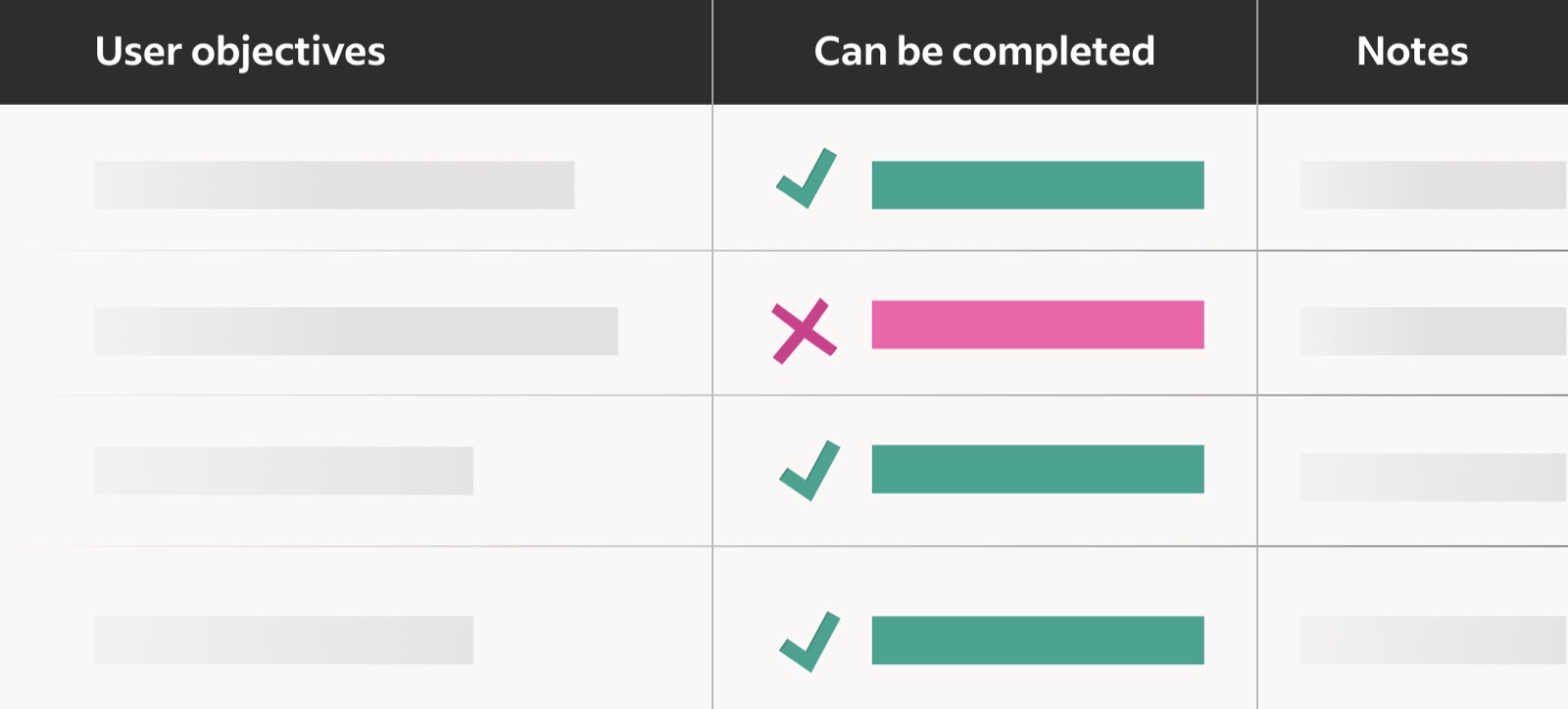
We asked ourselves if the objectives we listed in step one could be fully, partially, or not at all completed on the Indeed employer product we were evaluating. We added notes for context where it was helpful, and labeled objectives that could not be completed as workflow gaps.
At Indeed, sharing candidates with hiring managers is an important part of a recruiter’s workflow. My team found that although the current candidate management system supported sharing applications with hiring managers, it didn’t ensure that the hiring manager would review or make a decision about the shared candidate. We labeled this a workflow gap because it left the recruiter responsible for following up with the hiring manager externally, rather than through the product.

Step 3: Determine how easily the user can complete their main objectives
For objectives that the user can complete, two or more of the following audits can shine a spotlight on how easy those tasks are to do. For example, the accessibility audit might show that some users can accomplish a certain task while other users cannot.
Choose and run audits
Pick from the following to uncover different types of user problems. In our case, we did all four.
- Nielsen Norman’s 10 Usability Heuristics for User Interface Design helped us identify a wide range of usability issues based on design best practices.
- Our team made a custom list of questions to consider for accessibility, inclusion, and equity, Designing Inclusive Experiences, that you’re welcome to use. The audit removes visual, auditory, physical, speech, cognitive, learning, and neurological barriers. It ensures we meet Indeed’s accessibility commitment to Web Content Accessibility Guidelines (WCAG) 2.1 compliance. And it also addresses stereotype threat and technological limitations to better serve all users.
- Our behavioral scientist conducted behavioral mapping with the EAST framework to identify and prioritize hypotheses to influence key behaviors.
- Our content designer used three Content Analysis Heuristics that aren’t included in the Neilsen Norman evaluation to highlight content-specific usability concerns.
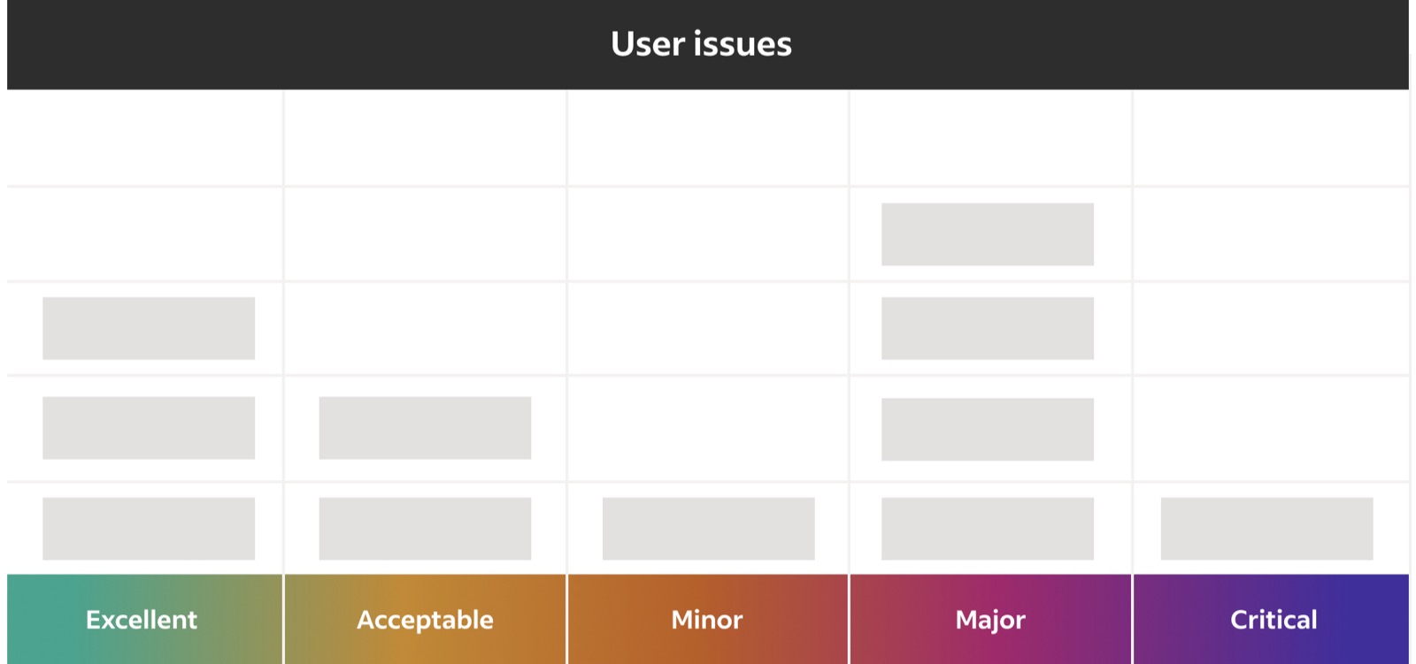
Rate the severity of the problems
Use a severity scale to set a standard language and align your team on how to prioritize the issues you’ve uncovered. There are a few well known scales your team can use, all of which can help with prioritization.
Pick your team
Choose a diverse set of team members to participate in the audits so the outcome isn’t skewed towards one way of thinking, especially for severity and prioritization. I included team members from different functions across product and UX to account for different perspectives.
Consider time and other resources
This process can be a big lift for a small team with limited time. If that’s the case, pick the most impactful audits for your product. I recommend the usability and the accessibility, inclusion, and equity audits because they require minimal expertise and have high impact. If your product team is small or you’d like to get a wider perspective, you can bring in folks from engineering, customer experience, sales, and so on.

Step 4: Set your project priorities
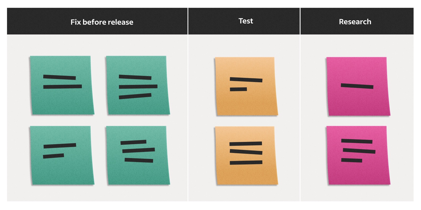
Addressing all the problems you’ve identified at the same time will be impossible and overwhelming. You can make them more manageable by grouping similar critical or major problems from the various audits into common themes.
We found most of our major issues fell into three buckets:
- Issues that needed to be fixed before release. These were mostly features that weren’t compliant with WCAG 2.1 standards, which Indeed had committed to meeting.
- Issues where we had previous research that we could use to design a testable solution. These were low-risk areas because we could confidently propose design solutions based on best practices and what we already knew.
- Issues that needed more user research before we designed a viable solution. These mainly came from workflow gaps where we had less knowledge of how to solve these user problems.
We defined our final roadmap by aligning severity, urgency, and business metrics.
A UX-informed product roadmap
At the end, your team should come out with a plan that’s relevant for at least a couple of quarters. We finished this exercise last year and still refer to the evaluation when priorities shift. This way, the product continues to address a wide range of user problems and remains holistically human-centered.


