Color
Each of our colors helps make it clear that you’re interacting with Indeed. A rich range of tones and contrast lets us build for accessibility and tell a distinctive brand story. Together, our colors work to ensure that every digital and physical thing we make feels like part of one visual family.


Indeed’s color palettes
Brand colors
These colors should be the star of the show across Indeed’s marketing. This is especially important for media placements outside of Indeed-owned channels. Leading with our brand colors helps Indeed get credit for the work and helps our global audience recognize it as unmistakably Indeed, whether it’s an event, campaign, experience, or something else.
Lead with brand colors to build equity within your work. Then use notes from the expressive colors in subtle ways to create emphasis and variety without usurping the brand colors.
Expressive colors
Our expressive colors add variety and flavor to our marketing work. Expressive colors can work especially hard on Indeed-owned channels such as organic social, where our following is already familiar with the Indeed brand.
Try to lead with brand colors, using the expressive colors to round out your color story. Lean on the expressive colors to drive distinction from competitors or in crowded visual spaces where necessary. Reference the hierarchy when considering color prominence in your work.
Accessibility
Contrast
At grade 600 and higher, our expressive colors will pass specific accessibility contrast requirements for type and functional elements. Refer to the Web Content Accessibility Guidelines and use a color contrast checker to ensure you’ve applied them properly.
Pairing brand blues
The combination of Indeed Blue and Ink Blue doesn’t pass accessible contrast requirements for type. Replace Indeed Blue with the Blue 600 expressive color in these cases.
Examples
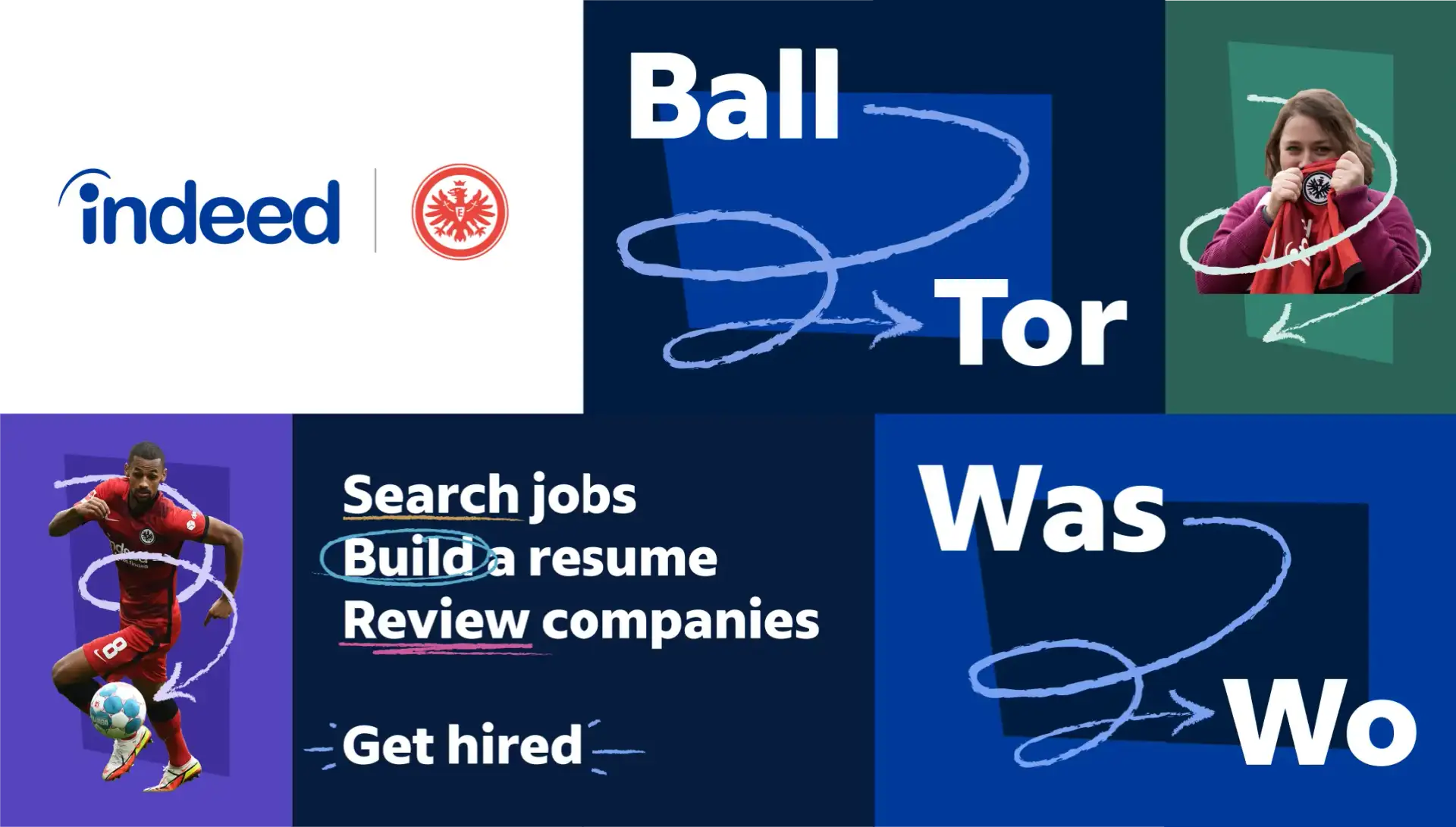
Eintracht Frankfurt
Team sponsorship
Indeed’s sponsorship of Eintracht Frankfurt combines Indeed’s brand colors with the team’s own palette. The color palette is consistently applied across our German marketing to build a cohesive brand presence.

Partnership with Elle Active magazine, Italy
Digital marketing
This partnership promotes women in the workplace, women professionals, and gender equality. Pops of brand color highlight core messaging while tying back to Indeed.

Tasmania Airport Campaign
Out-of-home marketing
This campaign blends core brand colors with high contrast and a bold accent to draw maximum attention while staying on brand.


Job Search Academy Indeed and San Antonio Spurs
Partnership
This campaign blends core brand colors with bright, unique accents and real, human photography with eye-catching results.


Ready to Work
Integrated campaign
A coalition of businesses, nonprofits, and civic partners connecting job seekers virtually and in real life to the opportunities and support they need on their journey to better work.
Bright, energetic colors pair with authentic job seeker photography. Each of the seven host cities got its own signature color, and the color palette was woven throughout the campaign.